Claire Thomas is no stranger to designing a space.
The creative behind The Kitchy Kitchen blog, Food For Thought TV series and a line of cookbooks has renovated a number of mid-century homes and always finds a seamless balance between respecting the past and adding touches of the present. So when it came time to decorate her son James’ nursery in her Los Angeles home, she approached it the only way she knew how, with the same level of intention and curation. The result? An unbelievably chic kid’s room that, to be quite honest, we are definitely pinning for inspo of our own.
We took a peek inside and caught up with Claire to learn more about her eye for design, tips for decorating a nursery and how she made this stunning gallery wall with the help of our new line of Lil 6ers art prints.

Can you tell us a bit about your home and what drew you to it initially?
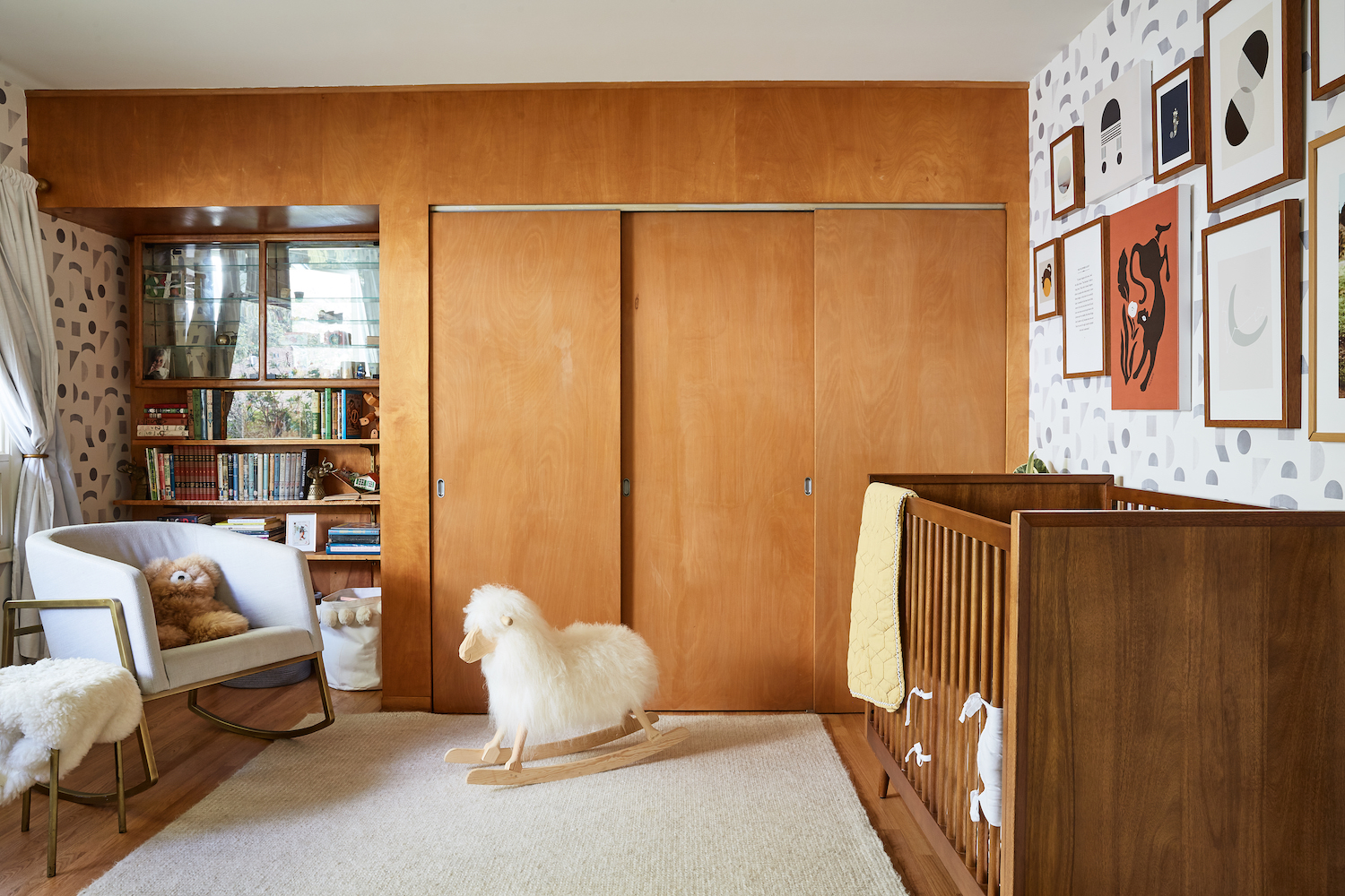
I’ve renovated a few single-owner mid-century homes before, and it’s always a balance of respecting the past while adding modern comforts, but with this house, that was on an entirely other level. I walked in the house and didn’t want to change anything – it was like a perfect time capsule of 1953 Los Angeles. The wood-clad walls, hidden bar, room dividers, the chrome edged streamline kitchen – everything was so rooted in Danish modernism and deco references from the late 40s rather than the atomic “Palms Springs” modern of the late 50s. This was Jack and Marilyn’s dream home, and it showed. I have photos of them digging the dirt as the building process started. They lived there for 65 years without changing anything other than the wallpaper. That’s rare – usually someone gets bored and decides to make everything Southwestern or they tear out the kitchen and add some terribly clunky 90s monstrosity instead. Not in my time machine. I loved it so much I even kept the 65-year-old drapes. This was my first time having fun with color on the walls, rather than just with furniture and objects. I’ve played around with tile and wallpaper for color, but usually keep spaces minimalistic. With this mid-century gem, I used the original paint colors as my jumping off point, and researched the color palette of the era.
How would you describe your overall design style?
I’m really drawn to spaces with an architectural point of view, and then lean into that heavily. I try to draw out as many references and textures that resonate with the original point of view of the home. I take the history of the space and then innovate and update it in a vibrant, modern way, while trying to maintain the integrity of what was there. In my cabin in Big Bear I created a modern take on a 1960s après ski fondue party, for the Sweet Laurel Cottage we’re creating an English country cottage with California modern, and for my home, it’s 1950s mid-century with bauhaus vibes while keeping it cozy and eclectic. I got to play with color in a big way, and Dunn Edwards has a historical color line that made recreating an early 50s style really easy. I actually watch a lot of classic films for inspiration, and the set design from the late 40s is just jaw-droppingly fabulous.

How would you describe the look and feel of your nursery?
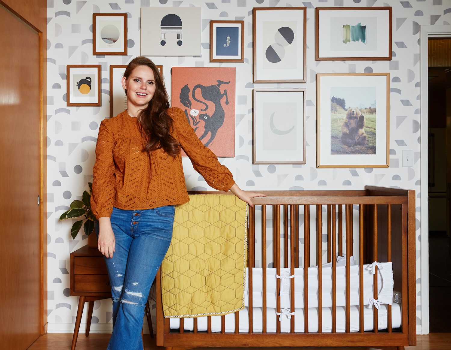
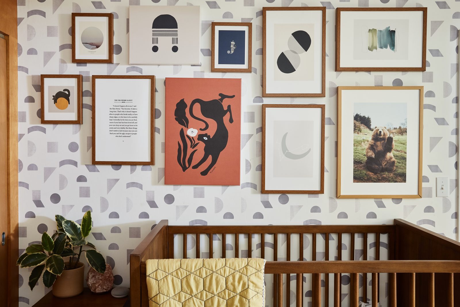
I love the warmth from the original wood panelling, so I carried that throughout the space. Pottery Barn Kids has a mid-century inspired line, so I used all of their teak spaces to pull it together. Society6 has gorgeous pecan wood frames that matched the space perfectly, and the artwork is a mix of modern abstract paintings, kid-friendly art, and more minimalistic elements. I wanted to keep the vintage color palette going, and though this isn’t at all what a 1950s nursery would look like (much bolder colors, like Kelly green and butter yellow, or periwinkle blue and maroon, or bright pink and scarlet-dominated children’s rooms), warm browns and soft blues and neutrals were a common combination. When I saw the rust colored painting on Society6, I knew it would add a dynamic pop and really shift the palette. I didn’t want it to feel too neutral or too “little boy’s room.” I just wanted a warm, cozy space for James that matched the feeling of the rest of the house.
Kids rooms are often an explosion of color but you captured that same playfulness with an understated color palette. Was it important for you to have this room fit in with the style and decor in the rest of your house? Do you plan on incorporating any of these pieces into your home in the future?
I hate when a kid’s bedroom has nothing to do with the rest of the house. I mean, I love whimsy and fantasy in a kid’s room, but it shouldn’t feel like you’re on “children island” when you walk into the space. I love this artwork because it could easily appear throughout the house without missing a beat. My husband is particularly jealous of the waving bear photo – we’re actually putting one in our cabin in Big Bear, he loves it that much!
What’s your favorite element in your nursery?
I love the light. The morning light really pours in, and when it bounces off the wood panelling, the room takes on this lovely glow, even on really drab days. It has a really joyful energy.

It’s no secret that decorating a nursery can take TIME. How much planning did you put into this room and where did you find inspiration for it?
Haha, honestly, not much! It’s a very small space, so you can only have so many vignettes. I knew I wanted to match the period of the house, and once I found a wallpaper I liked, that was it. Everything else fell into place.
The gallery wall is amazing. Can you share your approach for how you selected the different pieces while making sure everything would come together in a cohesive manner?
I’m hyper-decisive and make decisions very quickly – choice paralysis is not a thing for me, so searching through Society6 (my goodness the amount of artwork is astonishing!) was mostly a mission of sorting. I kept adding to my online collection and then edited it down until I felt good with the mix of artwork. I wanted the wall to speak to us as a family – what James loves (bears…mostly) and the aesthetic of our home. It’s his room within our family home and I think the art speaks to that.
What tips do you have for someone who’s just starting to think about their nursery decor?
Start with your house and what it’s telling you – what’s the aesthetic of every other room? And then use that context as a jumping off point. Also, color is color – don’t be afraid of unusual color palettes. Not everything has to be blue, pink or drab and beige.
Kids can be picky eaters. What are some of your recipes/meals that your little one can’t live without?
I don’t want to jinx it, but we’ve been lucky with James – he eats with us, and that means we all eat the same thing. He has a very stubborn, independent streak, and as bonkers as this sounds for an 18-month-old, he really hates being babied. His favorite thing in the world is feeling like a big boy. So, eating the same meal as mom and dad – demanding bites from our plates, is our dinner time ritual. Craig and I love spicy food, we love a huge variety of culinary styles, so James is just exposed to whatever we’re eating. I will say – we got him and In-N-Out grilled cheese as a special treat and he was truly living his best life. I hope he stays this open to food – but who knows, I was on a self-imposed all corn dog diet at 5 years old, so he might become a picky eater despite our best efforts.
What has being a mother taught you about creativity?
That creativity takes time and silence. You can’t say “and for one hour today at nap time I will be creative.” I am very very lucky to have parents that live two minutes from my door and the world’s greatest nanny, so I get out the door and go somewhere else to work in silence. If James is around, I’m not getting work done, full stop. I feel like there’s this pressure to say “I can do it all!” but no…definitely not. I can do one thing at a time, and that’s it.
Photos by Nicole LaMotte
Comments