Instagram is such an important tool for artists and can be the perfect platform to promote your Society6 products.
It is also an opportunity to show your products in your own unique way. We asked artist Meghan Wallace to share her tips and tricks for making her product shots shine on her feed. Here are just a few things she keeps in mind.
Creating Your Own Product Shots
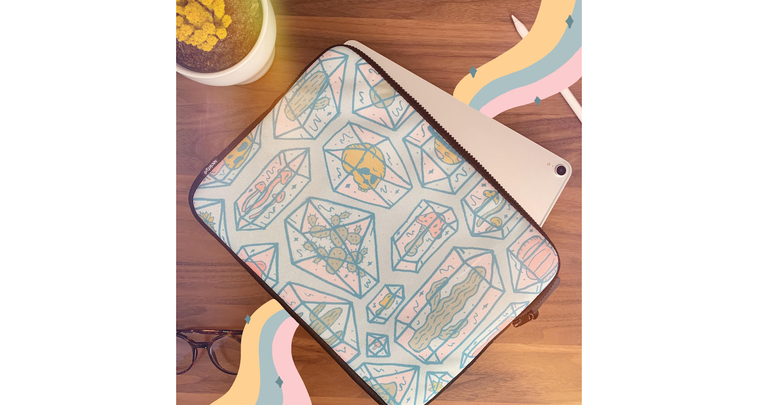
1. Buy Products That Best Fit Your Lifestyle
I love all of my products and designs, but I can’t buy them all. I choose products I actually need or designs I am super excited about. Showing how your products work into your life can be relatable to your followers. For example: This laptop case is the perfect size for my iPad so it was easy to create an environment for the photo.
2. Stage the Scene
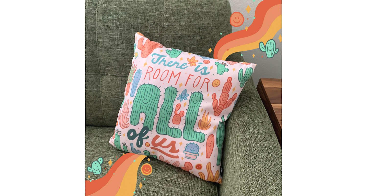
Creating an environment for your photo always makes for the best results. Adding objects and related items to your scene can make it more interesting to the viewer. For example: My pillow works super well with my couch so it was a perfect background for it.
3. Photograph with Care
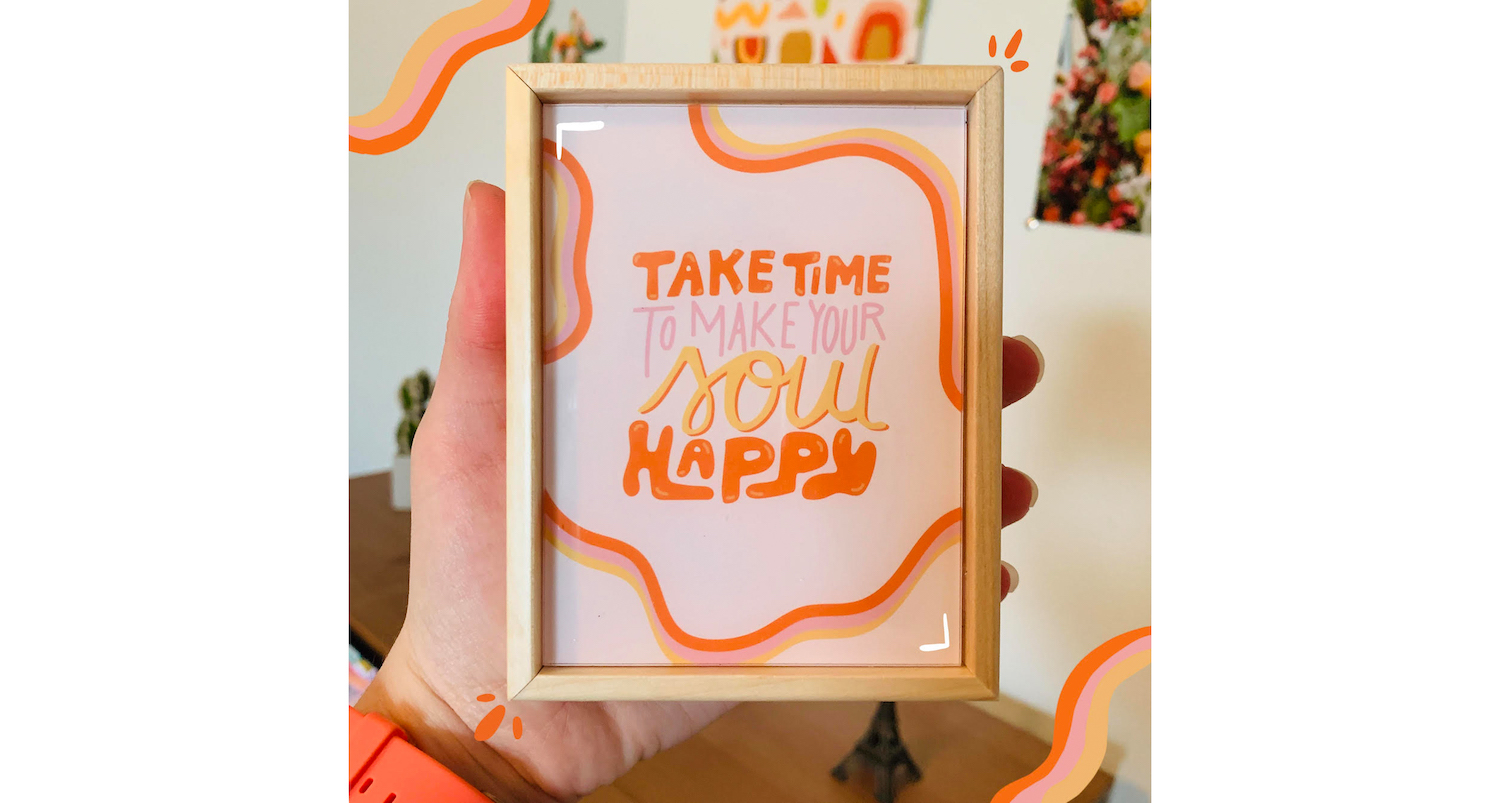
You don’t need a fancy camera to take photos—I take all of my photos with my phone. Make sure you like your lighting (natural light is always better) and pay attention to what’s in the background. For example: This mini print below is so small and I love it so much! I wanted to show its real size by holding it in my hand.
4. Edit Your Shots
Your photos can always use some editing, and there are so many apps you can use to make it easier to do so. Creating a consistent lighting look for your posts can be an important tool for creating a more cohesive Instagram profile.
5. Get Creative
I love to put doodle elements on top of my photos to add another fun layer to them. I personally like to use Procreate and Adobe Photoshop to do these edits. Let your designs drive your posts to create the mood you want to convey.
Creating Posts with Product Previews from Society6
1. Get to Know Your Society6 Product Previews
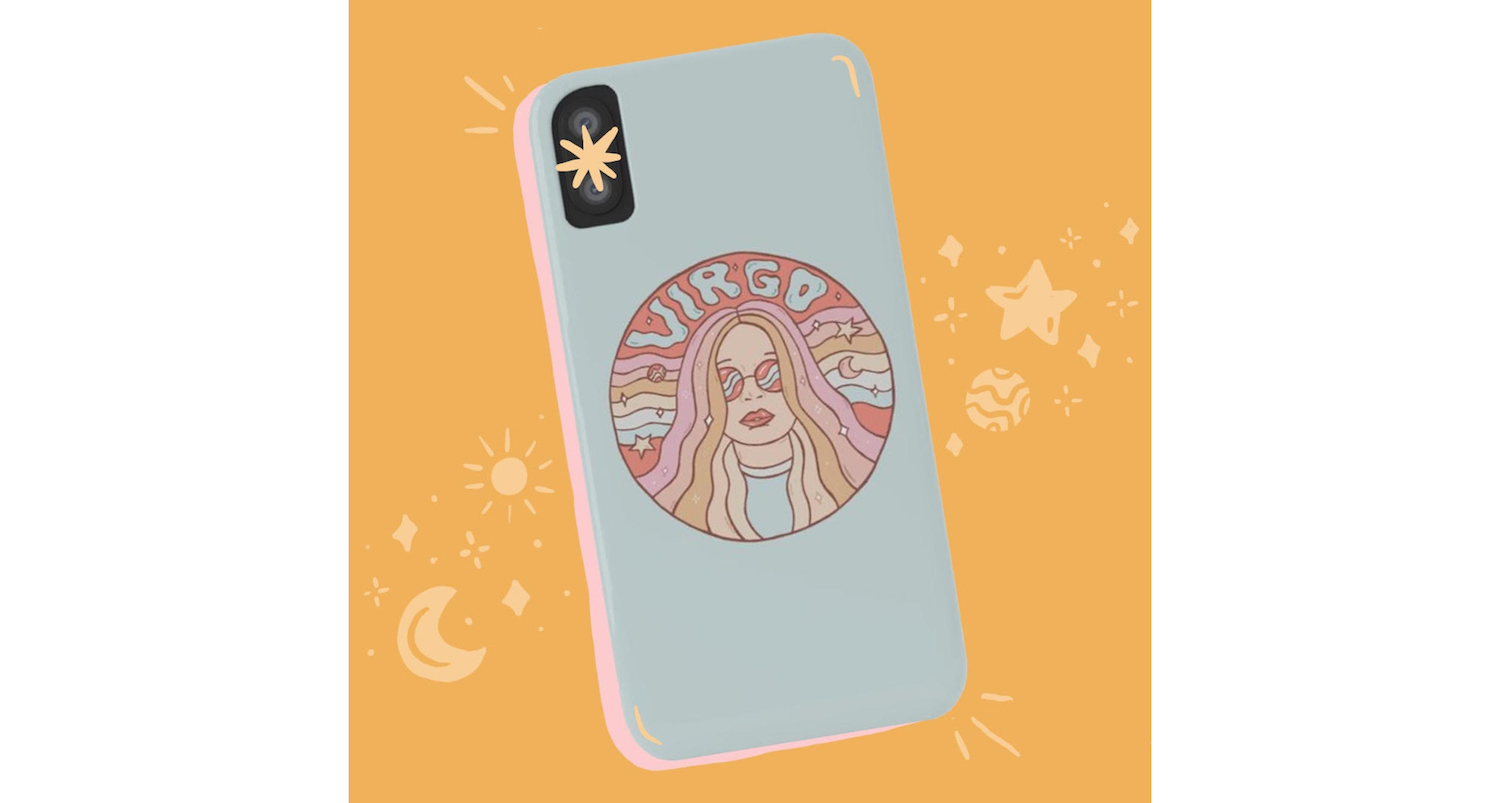
Society6 already provides a lot of product previews on their site that look amazing. Take a look at them and if your design works with that setting, use that image to promote your work. Their previews make this a lot easier.
2. Don’t Feel Limited
Having a provided product shot might seem limiting because you didn’t initially create it. Don’t let that deter you! If you want a bright pink background for your phone case, drop that shot into Photoshop and change the background. The phone case preview is especially easy to work with in Photoshop due to the neutral background. My Virgo design is very celestial so I wanted to create that kind of mood with this post.
3. Utilize Your Resources
Incorporate the tools that you already use to create your art. For example, I like to use my iPad to make my art so I will also add those elements to my posts. Think about what you are promoting with that post, whether it’s your design, the product itself or showing customers how it can fit into their lives.
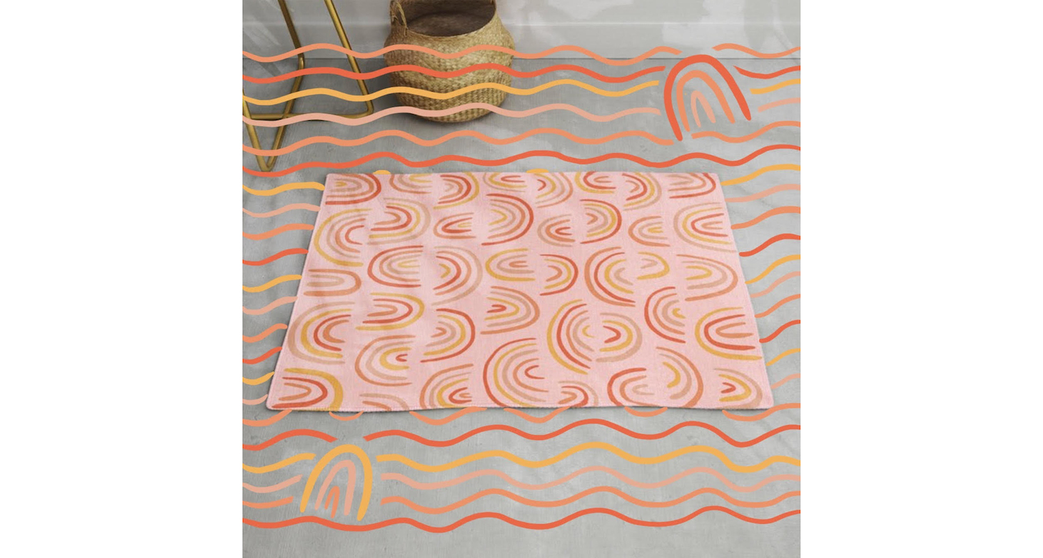
I like Society6’s rug preview because it shows how it can work in an actual home. The rainbow design is a prominent feature in that design so I chose to play with those elements above.
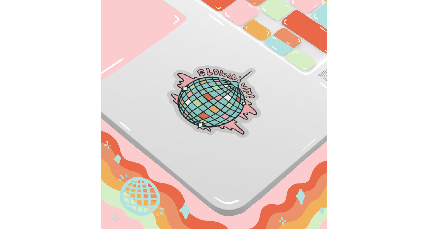
Stickers are my favorite Society6 product, and the preview shows exactly how a customer could place it on their laptop. I added some fun colors inspired by my design to draw attention to the sticker.
Your instagram followers will enjoy a post if you really take time to create and share it with them. Your hard work will pay off! Take pride in your designs and promote the heck out of ’em!
Comments