Our design guide for yoga mats is your go-to resource for making the most of this cushy and uniquely shaped surface.
Yoga mats are over 2.5 times as tall as they are wide–or vice versa. We’ll share insights on what we see working well among artists and customers. This post includes key design considerations, what customers seem to like and how artists are making creative use of the yoga mat surface.
If you need help selling yoga mats through your shop, check out our technical guide to activating yoga mats.
What’s the best way to design a yoga mat?
This is more of a guide than a rulebook. We want to help you optimize the surface you’re designing for. In this case, yoga mats. Society6 artists have an impressive knack for creating products that customers can’t get enough of. That includes breaking traditional design rules. We’re excited to see what you do with the surface and trust you’ll create om-worthy yoga mats!
1. Design yoga mats with intention
This may seem obvious, but if you offer yoga mats that a customer can see were thoughtfully created, you’re more likely to earn the attention of a customer. It only takes one carelessly designed product to turn a potential sale away. Plus, you’re giving our curation team something particularly useful to consider for inclusion in official collections, print catalogues, emails, press, partnerships, social, and blog posts.
2. Retrofit your most popular creative to yoga mats first
This one is for your own sanity. The idea here is to keep the workload of launching yoga mats in your shop tolerable. On top of that, you want to double down on what is already working with customers. Start there. If you see people really start to gravitate to your yoga mats, that’s when you want to start adding more yoga mats to your shop.
3. Consider the orientation of a yogi’s body relative to their yoga mat
If you take a look at what yoga mats are popular, you’ll see more vertical and orientation-agnostic creative than horizontal. That doesn’t mean horizontal creative doesn’t sell, rather the human body and the poses preformed on a yoga mat feel more organically in line with vertical designs. The one notable exception to this recommendation is horizontal, large copy that runs the length of yoga mat. Check out examples below.
4. Avoid stress-inducing creative
Given this audience’s commitment to health and wellness–which includes mental, physical and spiritual–be mindful of the fact that people use yoga as an opportunity to let go of daily or persistent stresses. Design with that in mind.
5. Use our templates
We recommend reading our technical guide to activating yoga mats, which includes templates for portrait and landscape designs. We address the importance of safe area, trim and bleed. You want to be extra considerate of the “safe area” relative to your creative. This is where all your critical design elements belong. There’s some good examples below of scale and variations of creative. You want to make sure that you scale your artwork accordingly as well.
6. Review popular selling yoga mats
This is to help you draw your own conclusions beyond the recommendations in this article. We usually have a pretty good sense of what’s popular and why, but every now and again a trend will sneak up on us and become a runaway hit. With that being the case, we always recommend you to do a little bit of research yourself.
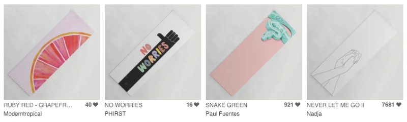
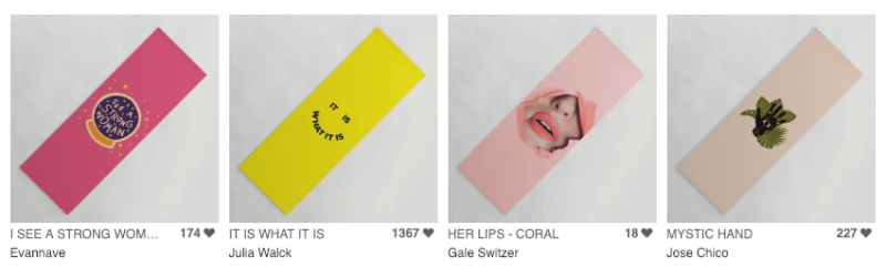
What creative themes do customers gravitate to?
You get a quick sense of what Society6 customers are into when you take a look at popular yoga mats. We pulled out some of the popular yoga mat themes that Society6 customers are gravitating towards (with their wallets). Here’s a handful of designs to look through.
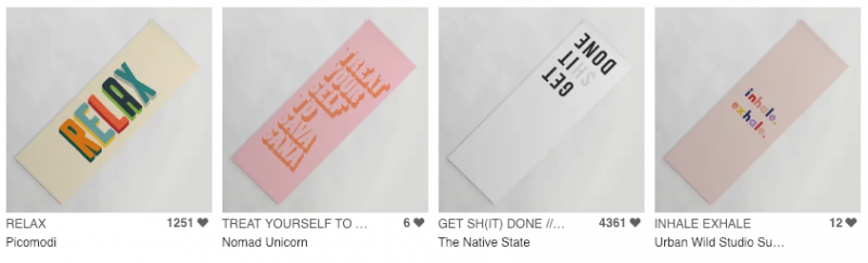
Typography
Good typography is creatively communicative—its readability isn’t sacrificed for its design and vice versa. So try embracing both boldness and minimalism via big letters but short phrases. And it probably wouldn’t hurt if, in this instance, the wording feels inspirational—yogis are bending and building muscle, after all! Give em’ some encouragement! (Nor will it go unnoticed if the phrases relate directly to the practice. Namaste…know what I mean?) Regardless of alignment, legibility is key, so keep your kerning clean and your statement strong.
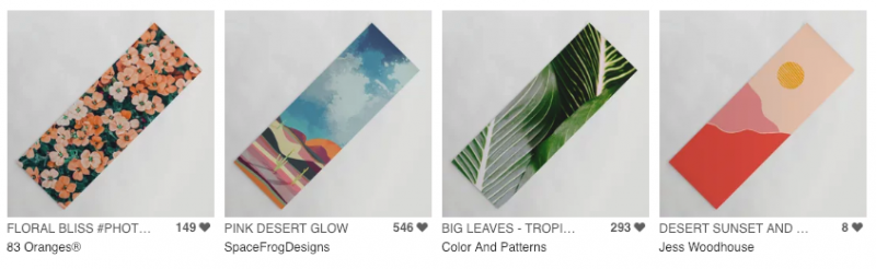
Nature
While nature scenes no doubt give nod to yoga’s serenity—be they of sunrises, still waters, or desert sands—wide landscapes don’t necessarily bode well in these narrow frames. But layered depth can still come in the form of overlapping illustration, and photography can still keep it (literally) real by getting up close and personal with all the eye-pleasing textures offered in outdoor environments. Get outside!
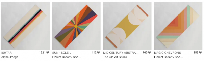
Colorblocking
Thinking less literally, to appeal to the senses of the more abstract-minded, try presenting chunks of color in striped, geometric or modernly minimalistic settings. That means embracing symmetry, simple shapes, and structured lines, and reducing your artistic elements to just the essentials. And think about employing a color palette—whether muted or bright—that’s complementary, not chaotic. (These buyers are trying to Keep Calm and Yoga On, remember?)
How are other artists approaching design for yoga mats?
There’s a lot of room to play with yoga mats. We pulled out some common approaches to design to help guide or inspire your approach.
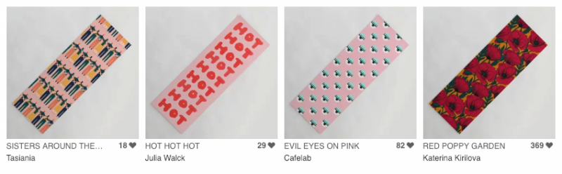
Repeating patterns
Repetition as a design choice can create routine and motion—and it’s not lost on us that the same is required of yoga. You can essentially “echo” your art in a number of ways: a single column, a faux wrap-around, a border-bucking full bleed. Ultimately, the important thing is that it’s exact. Inaccuracy would just render the repetition, well, nonexistent.
Designs that play with the perimeter
Since yoga mats have to be rolled out to be revealed anyway, why not make that moment worth it? Place your designs on one end but not the other. Allow objects to unexpectedly emerge from all the available edges. Cut creations in half and line their centers along the mat’s margins. In other words, try treating the surface like an actual frame, with your subjects sticking out or sneaking a peek.
Centered and floating designs
We know that centering a subject rejects the Rule of Thirds. But, to be fair, it also allows you to draw attention to nothing but your art (isn’t that the point?) and to explore and embrace negative space (if you haven’t yet, why not try now?) If your design can essentially “float,” unrestricted by hardline boundaries, go on: set it smack dab in the middle and stretch its background to the border.
Designs that maximize surface space
The opposite of the above, you can (also) make the most of the yoga mat’s narrow nature by implementing a visual story that works best vertically. Sans repeating any elements, try designing something that would unfold end-to-end, and that’s value is equally weighted on each side.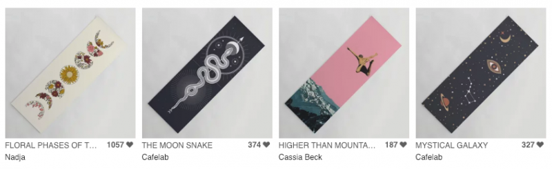
How do you promote yoga mats?
The yoga community is a whole new world compared to other products for sale on Society6. Read our Marketing Guide for Yoga Mats to understand the market you’ll be promoting in. Yoga mats were an instant hit among customers and this marketing guide helps you, specifically, with how to message your product offering to people who are buying yoga mats.
Marketing Guide for Yoga Mats: Learn to Promote & Improve Sales >
If you have questions or comments, feel free to leave them in the comments below!
Comments