If you’ve ever spent time on the west coast, you’re bound to have been wooed by the strong geometric lines and unique floor plans of the mid-century modern home. Here, writer Nikki Volpicelli interviews the lucky owners of one such space, Portland-based creatives Haley Ann and Thomas Bradley.
If you’re anything like me, you’re guilty of peeking into other people’s homes. Could be you went to grab a coffee and your neighbor’s blinds are open, or maybe it’s the first day of Spring and the whole hood is scrambling to open every window, door, or orifice to let the light and breeze in. Whatever the case, your wandering eye always lands on walls full of perfectly-curated art, glossy wood floors with rad rugs, textiles, pillows and a brigade of indoor plants that look like they’d take an army of upkeep leaving you thinking: How?
Portland creative couple Haley Ann and Thomas Bradley have the answer. Last year Haley, owner of Studio Hecha, and her husband Thomas, co-founder of creative branding agency Pizza Friday, got hitched and bought a 1950’s model house with the goal to renovate. Using the space’s original mid-century charm and their own aesthetic blend of modern graphics, bright pieces, and Southwestern style, they created what you see below: a bright, spacious home interior that’s both contemporary and classic, rich in color, texture, abstract art and, of course, plants.
Snoop around their home (without getting caught!) and gain inspiration for your own space. You might just need a new coat of paint, the right pile of pillows or an eclectic set of bold wall prints to turn your space into the envy of every passerby.

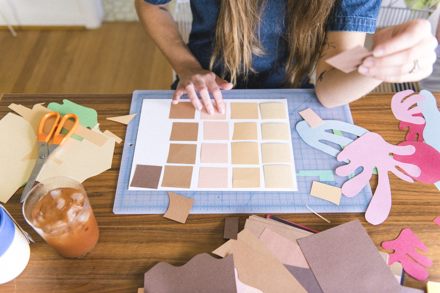
Your house has some history. Care to share?
Our house was built in 1951 by the Portland Home Builders Association as a model home to showcase the latest in modern home-building innovation and technologies. It was actually featured on a tour of homes which brought thousands of people into the house and then was written up as a cover story for Western Building magazine. Luckily, that issue has stayed with the house.
What did you learn about your space from reading the article?
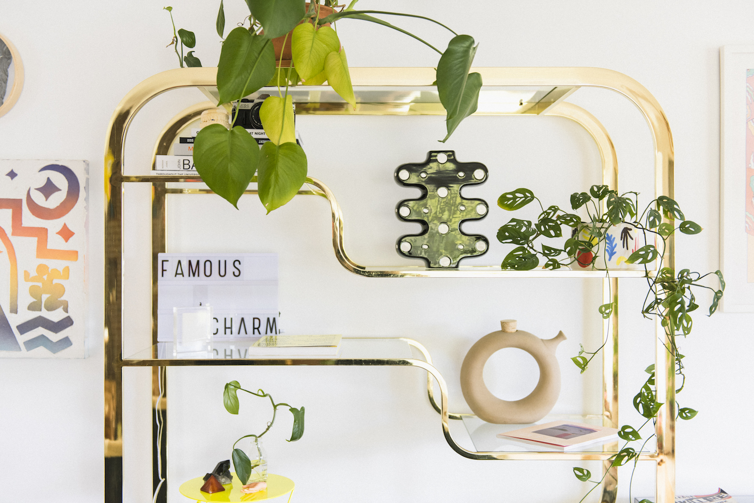
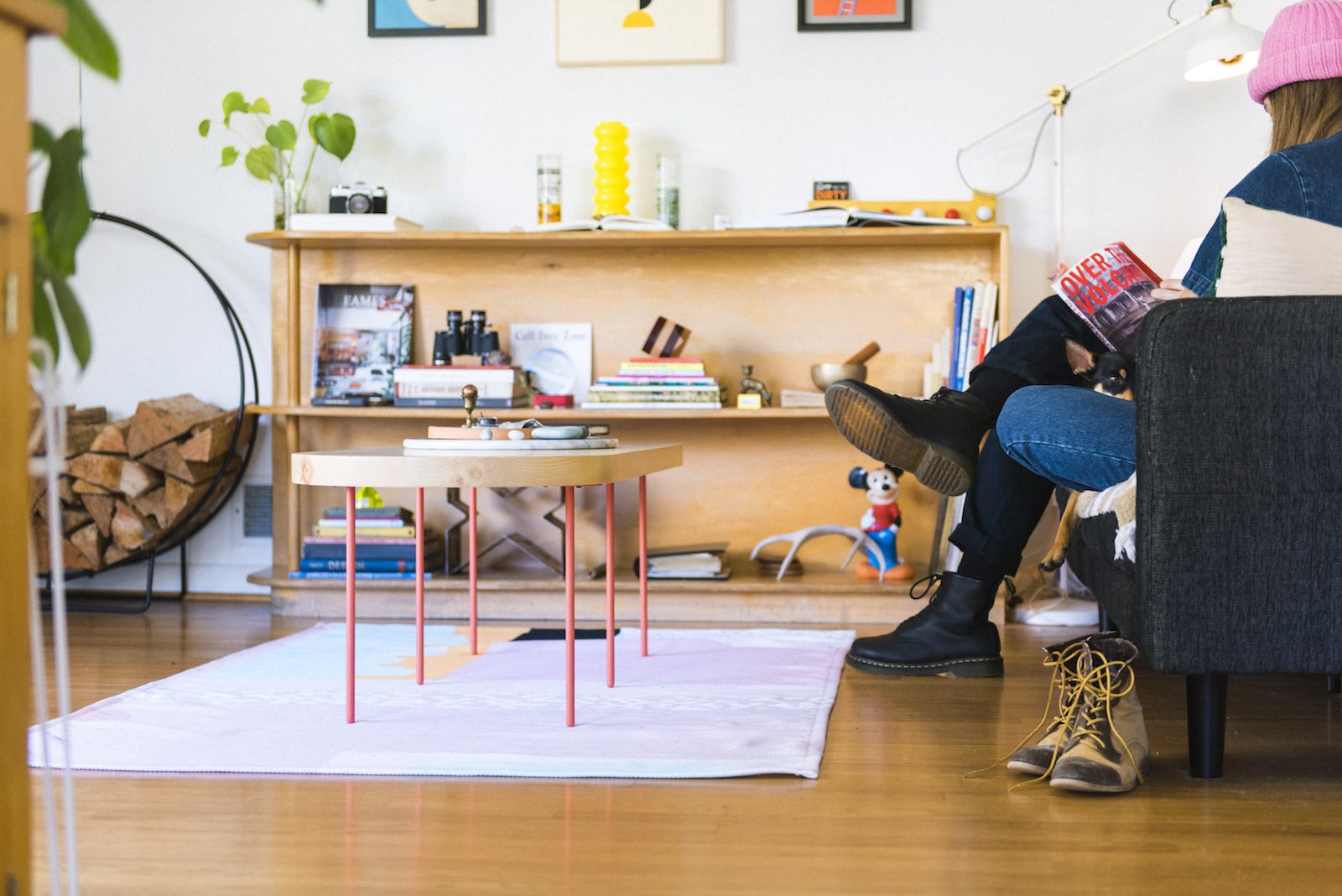
Besides our sweet shelf on the cover, in the article, there’s our floor plan, some shots of the original interior, along with two pages of insights and reasoning behind certain design decisions that were considered while building the home. A couple of these 1950’s decisions make a lot less sense functionally and stylistically to us these days. Like how the kitchen was designed to be so condensed that everything could be in easy reach of one person… and why the house was riddled with accordion doors. But there are other cool, thoughtful things we would never have considered, like the way the bathroom door is completely blocked from view from every room in the house, and the way the height of the windows in the bedrooms allows for complete nudity undetectable from outside the house. We wish every home came with a magazine article written about how and why it was built. Design matters.
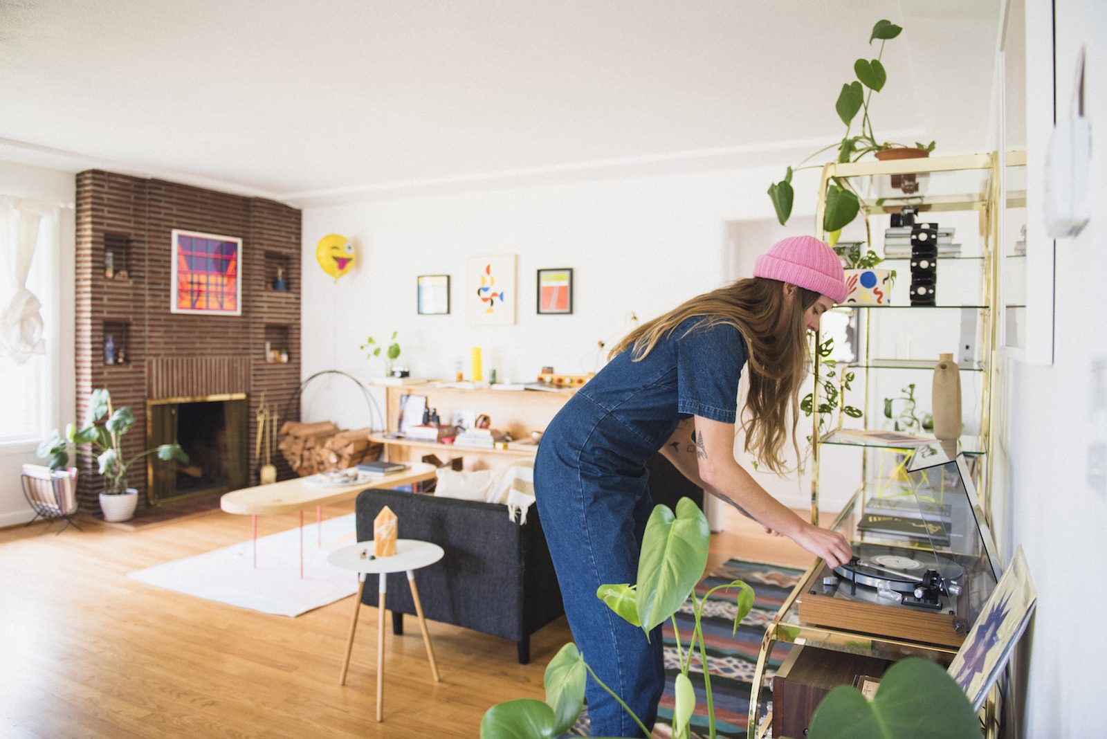
What made you fall in love with your pad in the first place?
As silly as it is, the magazine article really sold it. And the dueling fireplaces. And the potential to spiff the place up with rather minimal effort. The original pink corrugated fiberglass in the bathroom was also a very high selling point for Haley.
Take us through a tour of your space as it stands today.
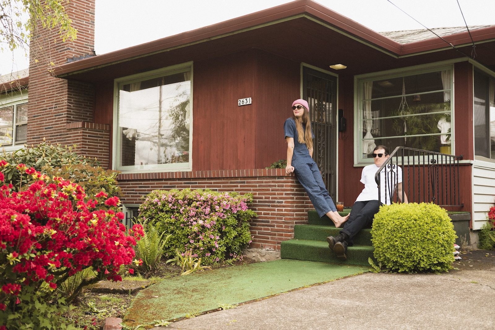
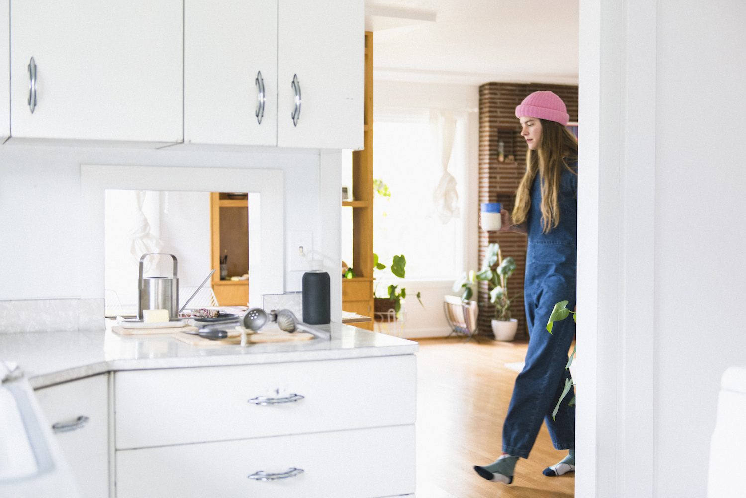
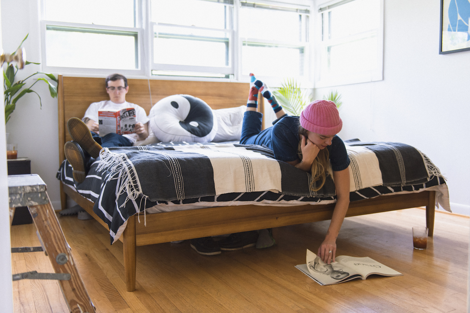
The first thing you might notice walking up to our house is our glorious Astro turf. Inside our front door is the star of our house’s built-ins, a really cool floor to ceiling wooden shelf. We’ve got a big brick fireplace in the living room and some art, sculpture, and readymades scattered around. Our original 1950’s kitchen is almost completely intact. Our weird old electric stove has tons of character. Around the corner from the kitchen is our first bedroom. It’s kind of our cat’s bedroom, and it’s where Thomas paints. And it get’s the most sun so our cacti like it. Next to that is our guest bedroom. It shares a wall with our alarmingly pink bathroom. And next to that is our bedroom. And then we’re back in the living room. It’s one big loop. Back thru the kitchen and down the stairs is our basement. There’s another fireplace down there and our largest, comfiest couch, so it’s where we spend most of our time. The big basement rumpus room is flanked on either side by utility rooms, one of which serves as our garage, and the other is Thomas’s cave.
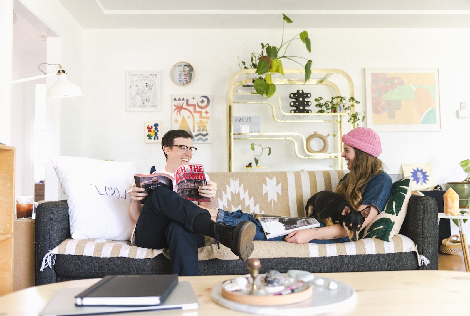
What’s the first thing you did to overhaul the yucky, dated stuff?
As soon as we got the keys we started ripping up the carpet. It was some nasty old shag that was peanut butter and jelly colored. We also learned the way of the paper tiger and removed three or four layers of wallpaper from our hallway. There was also this bizarre, enormous hand-painted bonsai tree in our dining room that we had to get rid off. One side of our cool built-in shelf had panes of brown tinted glass that looked super dated. Thomas had a great time smashing all of that out. Then we went to work trying to turn the grays, khakis, and taupes into white. That was tough. 50+ years of a dirty old oil-burning heater had left black soot in the corners of the ceiling. Everything took at least two coats of paint, including the ceilings. Most of the light fixtures had to go, and we pulled three or four accordion doors out as well. It seemed like a lot of work to get done before we moved in, but it wasn’t that big of a deal compared to remodels our friends have done. It was all mostly cosmetic. Since then we’ve pulled out the old oil tank which we discovered still contained over 100 gallons of crude diesel.
You’re both artists. How does that play into the aesthetic of your home decor?
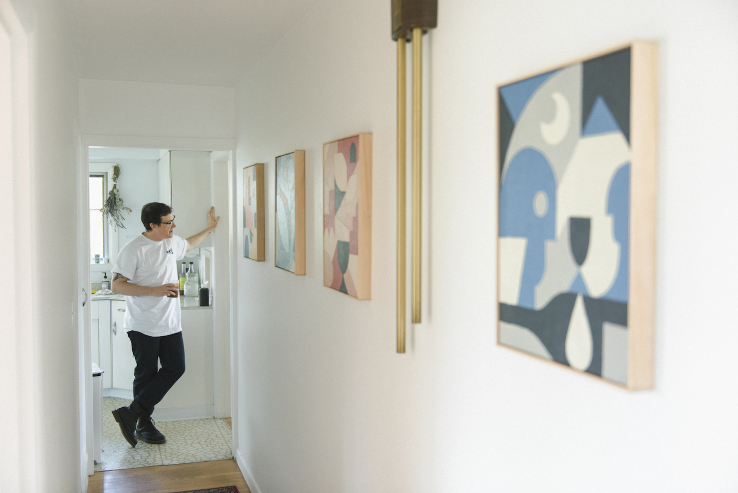
Thomas has a super keen eye for art. Most everything we have hanging on our walls he’s scored on eBay or talked directly to the artist to purchase. Being such advocates for the arts we find it important to support artists and find pieces that are more one-of-a-kind.
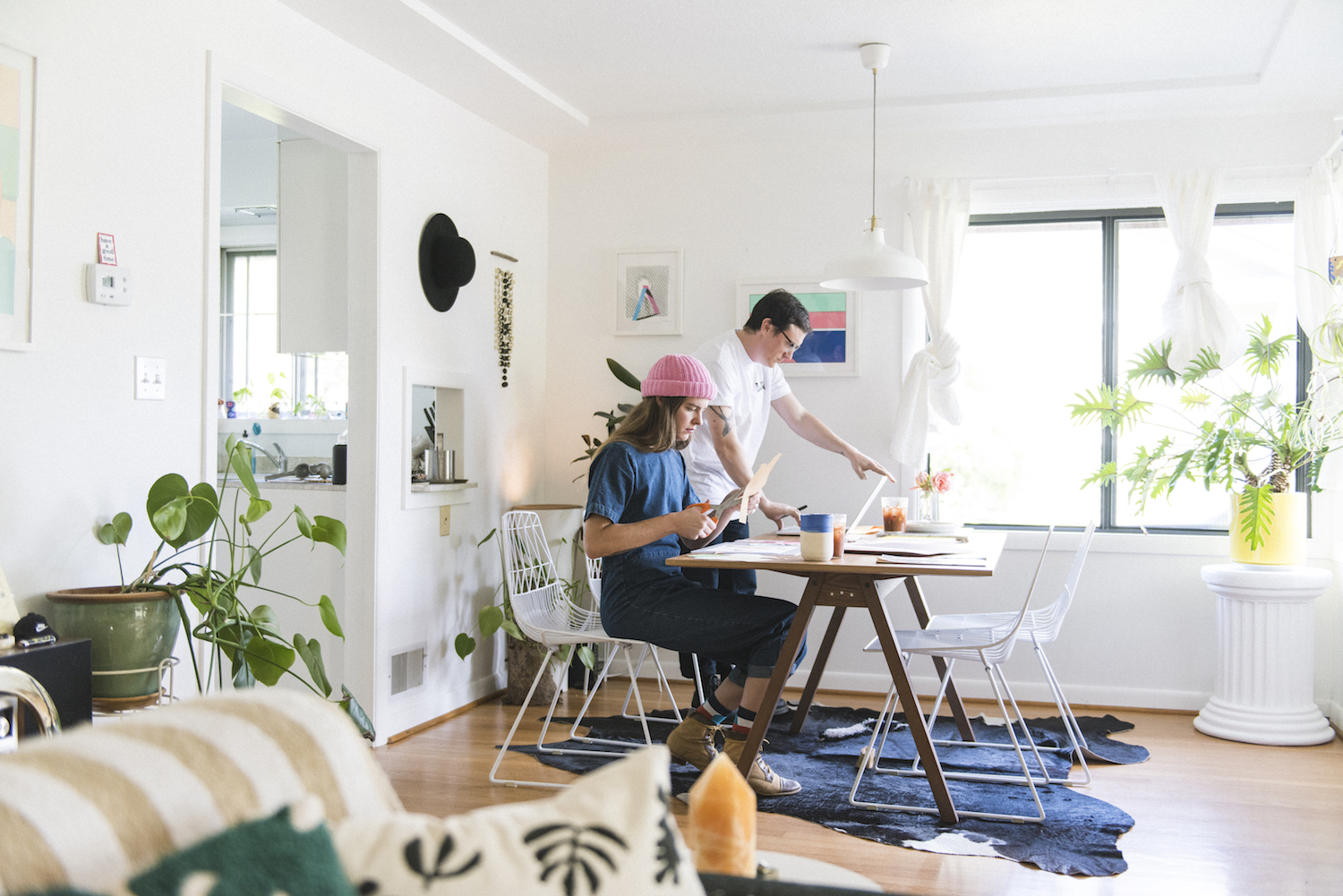
Haley’s more the vibe-setter. She arranges the house and finds furniture that fits our aesthetic. A lot of our furniture is vintage which makes it affordable. Our philosophy is pretty simple really, we both have very similar taste so we’re pretty easy going. We agree on the things we like. Good, rare design is kind of what it comes down to.
What’s your favorite room to hang out in?
We do a great job of utilizing all our rooms. We intentionally put our tv in the basement to make sure we spend time down there and to keep the boob tube out of our day-to-day living space, keeping upstairs as a record listening/chill zone. But our happy place is our basement couch with a movie on, a blanket, and a fire in the fireplace. Especially during Portland’s 9-10 months of rain.
Do either of you work from home?
We both tend to take on quite a bit of work in addition to our 9-5 jobs, which allows us to spend time in our designated studio spaces. Weekends are filled with home projects and side hustle activities.
Do you delegate different spaces to work and unwind?
Haley converted the garage into her work zone, where she does her ceramics and other messy projects. It’s nice in the warmer months to pull the garage door up and let the natural light in. You can usually hear sounds from Reverberation Radio echoing from the studio.
Thomas’ studio is downstairs. He’s also got one in a warehouse he shares with a bunch of friends (shoutout to the 7k fam) so his basement studio is more of a storage/shipping zone and a shrine to the weird stuff he collects. Thomas has been painting a lot lately, so he recently took over our cactus room since it gets the best natural light in the house.
In terms of unwinding, we usually end our days in the basement with some wine and our stories. Usually, Fondo the cat and our pup Pantone are down there too enjoying the fireplace or hiding under the covers. It’s a very relaxed life.
Photos by Thomas Teal.
Comments