Megan Galante‘s works are greater than the sum of their parts.
An art history aficionado, the painter and textile designer pays particular attention to the individual components of her works, whether that means selecting a pared-down color palette or carefully balancing positive and negative space– her intricate floral and minimalist figurative paintings are as much about what you see as they are about what you don’t. We caught up with the Art Quarterly No. 3.3 artist to talk art history, fashion inspo and being a hustling freelancer.
Can you tell us a bit about yourself?
I’m from New York. I’ve been drawing since a young age. My mother taught me how, as drawing and painting was a pastime of hers.
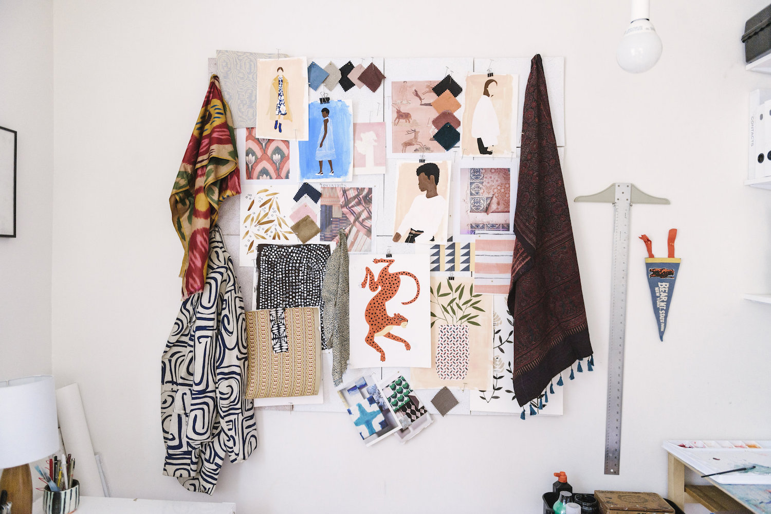
I lived in NYC in my twenties and studied painting and art history while living in a loft in Bushwick, surrounded by a great community of artists. I worked in the home textile field for several years after graduating, and still do. Textile and surface design has become a big part of the way I apply my skill set and developed a sophisticated taste for objects found in the home. It’s also expanded my knowledge on design and craft history around the world.
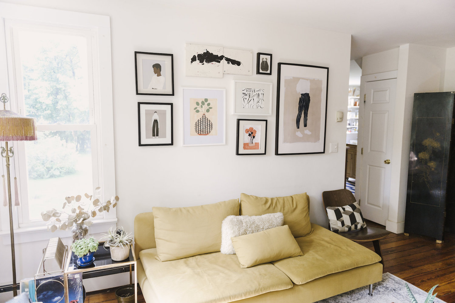
As a jump from textile design, I recently started painting figuratively, as it was a style I had an affinity for when I was younger. I would describe my style as figurative minimalism with a focus on color theory. The negative space carries itself and exhibits a sense of weight and movement because the positive space is so deliberate. This style has been fun to explore and helps shake up my routine of painting floral textile designs.

You work with a variety of mediums, from different types of paint to textiles. Which is your favorite and why? Do you find each of these practices informs one another?
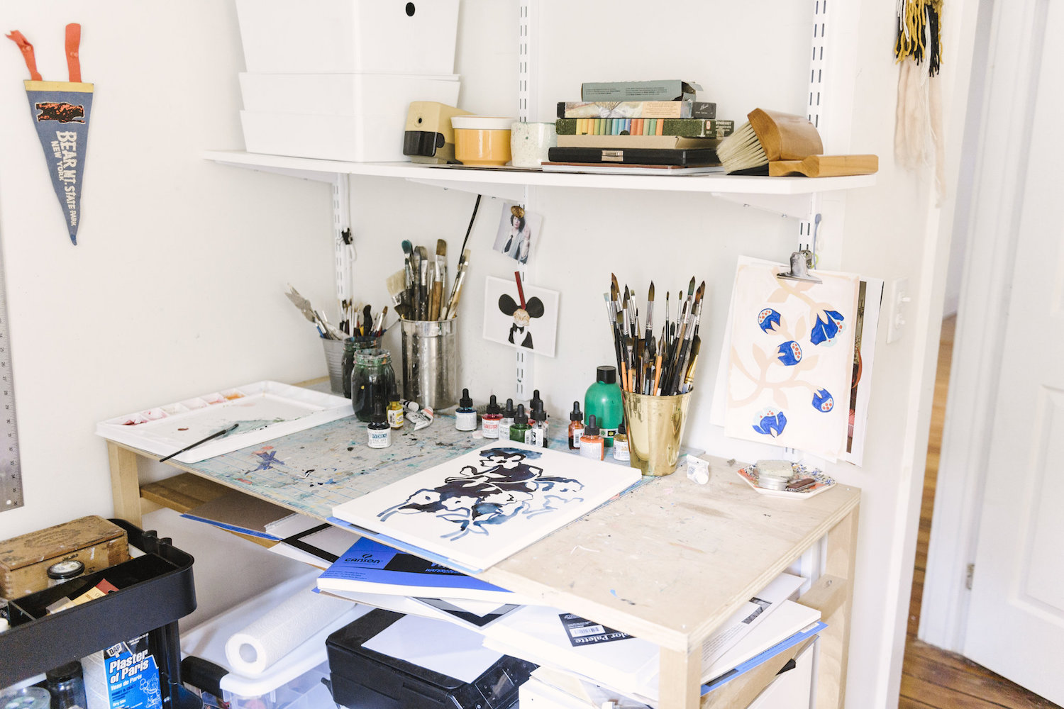
For the figurative work I primarily use gouache because the pigment doesn’t vary unless you deliberately add water and want it to have a washed look. It’s important for the variances to be kept to a minimum so the color can carry a prominent form. I will, on occasion, use gouache for textile designs for a more flat, graphic look without appearing to be a vector image. However, I typically use watercolor for this type of work because the variances in weight, in this case, add to the whimsical movement in most patterns.
It’s fun for me to jump from traditional and modern textile patterns to figurative work. I find that it helps balance my urges to paint both. The floral textile designs are so therapeutic to paint. The figurative work is a bit more of a challenge. I want each painting to be unique and appear abstract at first glance, so I really consider the palette, the way I treat the negative space, and how the positive shapes are framed. I can paint watercolor florals in my sleep at this point, but the gouache figurative work is a project I have had in my brain for years and getting it on paper and canvas has given me such a sense of fulfillment.
Your fashion illustrations have a very NY vibe to them—they remind me of editorial fashion spreads or a cool It Girl you’d see on the street. Has living in New York influenced your practice in any way? How does that differ from when you’re in Portland or the Hudson Valley, if at all?
I love fashion illustration. I studied at the Fashion Institute of Technology and I took a fashion illustration course that definitely peaked my interest and had me up at all hours building a portfolio. I love that fashion illustration differs from any other figurative work because the focus is on the garment and it, in itself, suggests the figure. NYC is a gold mine for inspiration. You can’t step onto the subway without seeing a person leaning a certain way, creating a silhouette that begs to be drawn. Portland, Oregon and the Hudson Valley are inspiring in different ways and are similar to each other in the respect that they both offer majestic landscapes and a bit more head space for me to expedite the many ideas and images I have had in mind over the years. NYC can really occupy all of your time, space and sanity in exchange for creative stimulation. I teeter between both lifestyles, but for now, I don’t see myself leaving the Hudson Valley.

What draws you to your subjects, from fashion and the human form to flora and fauna?
Form. When I see an interesting shape—it could be a black dog, a person wearing an oversized coat, or a bramble of blackberries. I see how they can translate to a drawing, peeling away the details and really focusing in on the shape that is most distinct and familiar.
Are the people in your fashion illustrations based on real people you know or see on the street, in magazines, etc?
Some are images and situations I imagine. The first one of the series,“Turtleneck,” was just an idea I jotted down one night and painted the following morning. Many are definitely from fashion magazines or interesting people I stumble upon on Instagram though. If I find an image that moves me I will try to replicate the stance, add or subtract some elements, and apply a palette that I find appealing.
You also studied art history—can you talk about how this background informs your work? I read your fashion illustration series is about color theory and negative space, and your Tumblr is named after formalism.
Yes! I’m glad you caught the Tumblr reference! I started that Tumblr to just keep hold of the things that brought me joy in design and color in keeping with the theme of Formalism. It has since become a scrapbook of things I make or hold dear. Yes, I studied art history and Western theory, and still continue on with my studies with a heavy, dilapidated bookshelf. Art history and theory keeps the gears turning and helps move my work forward. Josef Albers has taught me create a palette that gives emphasis to color and form. Althusser has taught me that classism dictates art’s popularity, and ultimately that the idea of “good” or “bad” is a construct, which applies to many things outside of the art world, I’m sure you can agree. So, outside of Formalism and color theory or Gestalt, I think it’s just as imperative to be well-rounded on the effects aesthetics have on economics and your personal relation with society’s structure.
Are you inspired by any particular art historical movements or artists? I can see elements of your work that would fit right in on a Greek vase or a Pre-Columbian mural.
Yes, indeed. I visited the Louvre earlier this year actually and found that I spent most of my time in the wing with all the Roman and Greek antiquities. I have such an appreciation for meticulous craftsmanship and fine detail. In most still life paintings of floral arrangements, there seems to be an obvious emphasis on the contents of the vase. I paint flowers just about every day and I wanted to give merit to the vessel in this series. Coincidentally, I was doing a bit of pottery work of my own this winter as well.
In the vase painting series the vase’s pattern takes hours to apply and the labor itself was paying a bit of homage to the craft of pottery. It appears to be a simple still life but its greatness comes through the detail of the vase and the simplicity of its contents. I really want to expand on this project.

You’ve created artwork for brands such as Ralph Lauren, One Kings Lane, Apartment Therapy and Nanette Lepore. How did these come about? What is your creative process like for these projects?
All of these projects came about as being a hustling freelancer with some absolutely amazing mentors in the fashion and home textile field. I work with some amazing women that have taught me so much and have treated me with great respect. I treat each project differently depending on what the client wants but I will typically hand paint the designs initially and modify the patterns digitally. It can be tedious at times but never boring, always inspiring. It’s been such an honor to have my work out there under these big names!
What’s your dream collab?
I would love to do a fashion illustration series for Celine! I would also love to do a series of textile prints for Samantha Pleet.
How do you balance personal and commercial projects?
I wake up and work on my personal art while I drink my coffee before checking my email. It definitely sets the stage for the day and puts me in a good mood. When it comes to the commercial work, sometimes I will work until 8pm and other days I walk away at 3:30pm because I know I’m not doing my best and I will most likely pick up and work with more vigor the following day. It’s important to know your limits and not just run yourself into the ground. Overextending yourself just results in poor work. I’ve never had a poor work ethic, but I’ve had issues with biting off more than I can chew. Time management is an ongoing work in progress.

What’s the best piece of advice you’ve received as an artist?
This may be a bit too revealing, but in college I would drink while I painted. In the loft I resided in for years, I had a neighbor, a bit older, a phenomenal artist, and a recovering addict. I spoke to him about my process and how I felt so begrudgingly married to it. He told me that in his experience: “you will never be a better artist than you are when you are sober.” I took his advice and I can’t even fathom how I could mix drinking with painting. You are robbing yourself of the real cathartic delight you receive from your “ah-ha” moments in the process. My work also changed because of it—it’s more thought out, clean, more striking. I am an extreme advocate for tackling your creative efforts without a drink in hand.
And finally, who are some of your fave S6 artists?
Zach Nagle creates these exquisite black and white portraits.
And Patricia Vargas is an amazing abstract painter. I love her work!
Photos by Alicia King
Comments