$100 can get you a number of things: a glorious year of Amazon Prime, a much-needed massage or like, a hundred donuts.
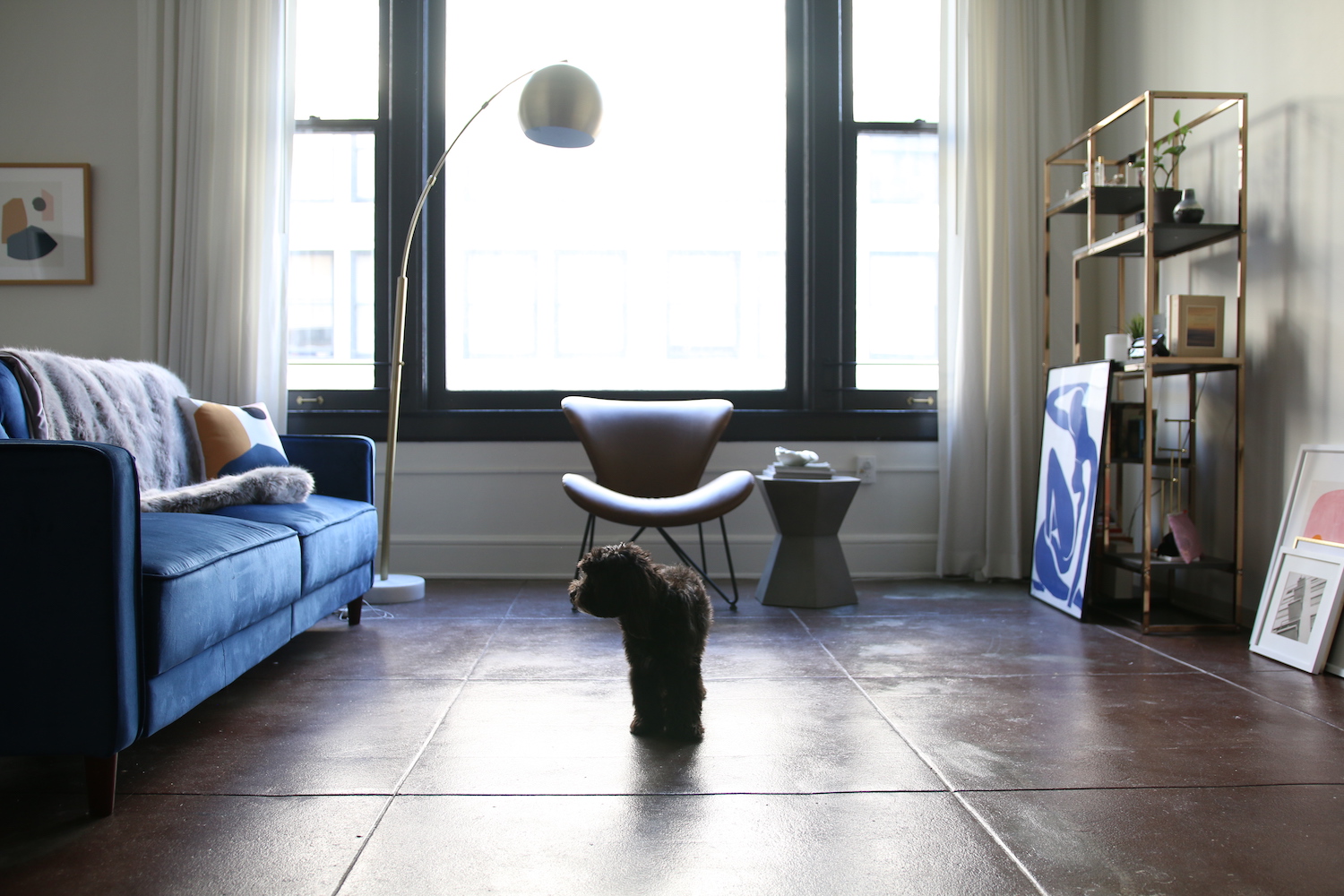
When it comes to decorating your apartment, though, it may not seem like a Benjamin will get you very far. But with a little careful curation and a few statement pieces, you can get your space looking like a million bucks. We asked Amy Lee of Vagabond Youth — who just moved into a chic DTLA loft with pupper Komey– to share her top tips for sprucing up your space, each for under $100.
1. Have a Color Mood
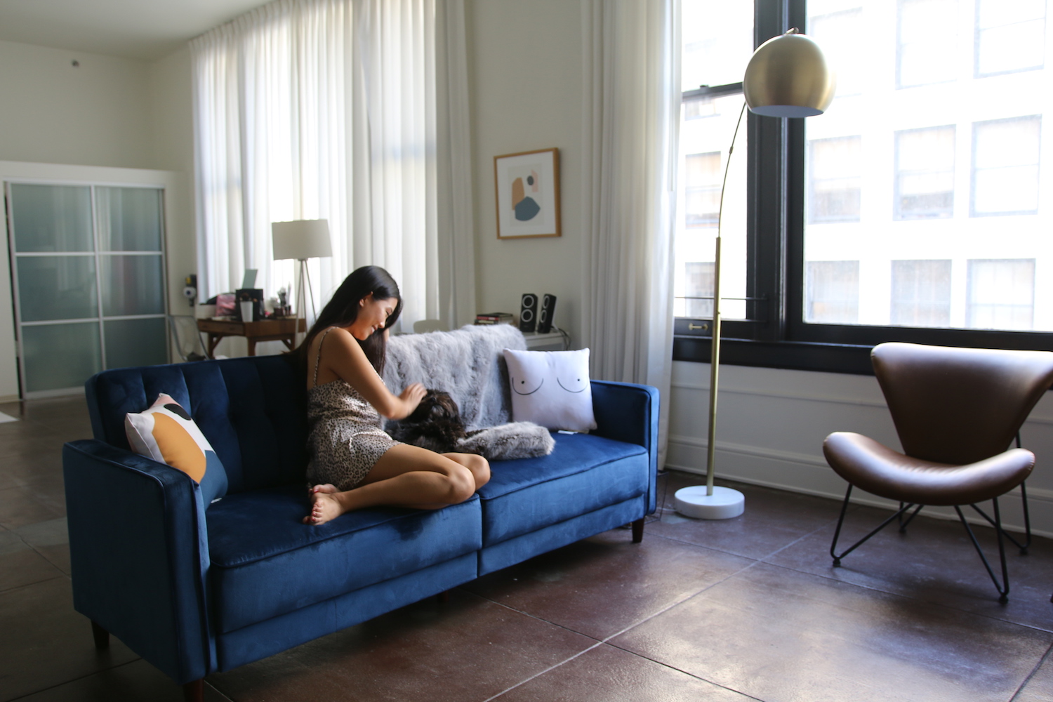
Personally I think it’s quite hard to stick with one interior design style (i.e. mid-century modern, glam, retro, etc) but I do find it easier to just pick what I call a “color mood.” Colors inspire my day-to-day life from my Instagram feed (lol) to my home environment. My first tip in upgrading your apartment for less than $100 is honestly free! Pick a good 3-4 colors that resonate with you and your vibe, and curate items that contain them. For my apartment, I love earthy colors such as browns, golds, but I am also a fan of rich deeper colors like navy and light bright colors such as millennial pink. I picked this abstract piece in both a pillow and framed artwork version from Society6 because surprise, surprise, they fit my color mood. Having a color mood also allows your place to seem cohesive even if the design styles are ultimately different.
2. Different Elements
3. Put it All in a Tray
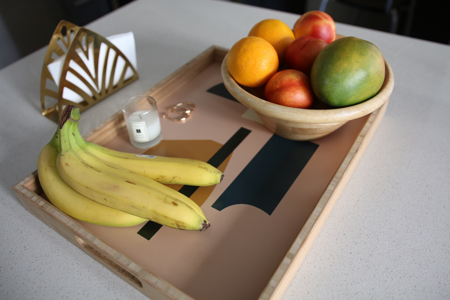
Most of the time, as a young twenty-something-year-old, I don’t have my life together. But surprisingly, if you just put everything in a tray, you can at least look like you do. I learned this design trick where, instead of having “clutter,” you simply place and arrange items nicely in a tray. Thus, you still have your clutter, but just Martha Stewart style! Anytime my friends come over, this tray really helps them think I have it all together. Little do they know.
4. Have Fun and Get Quirky
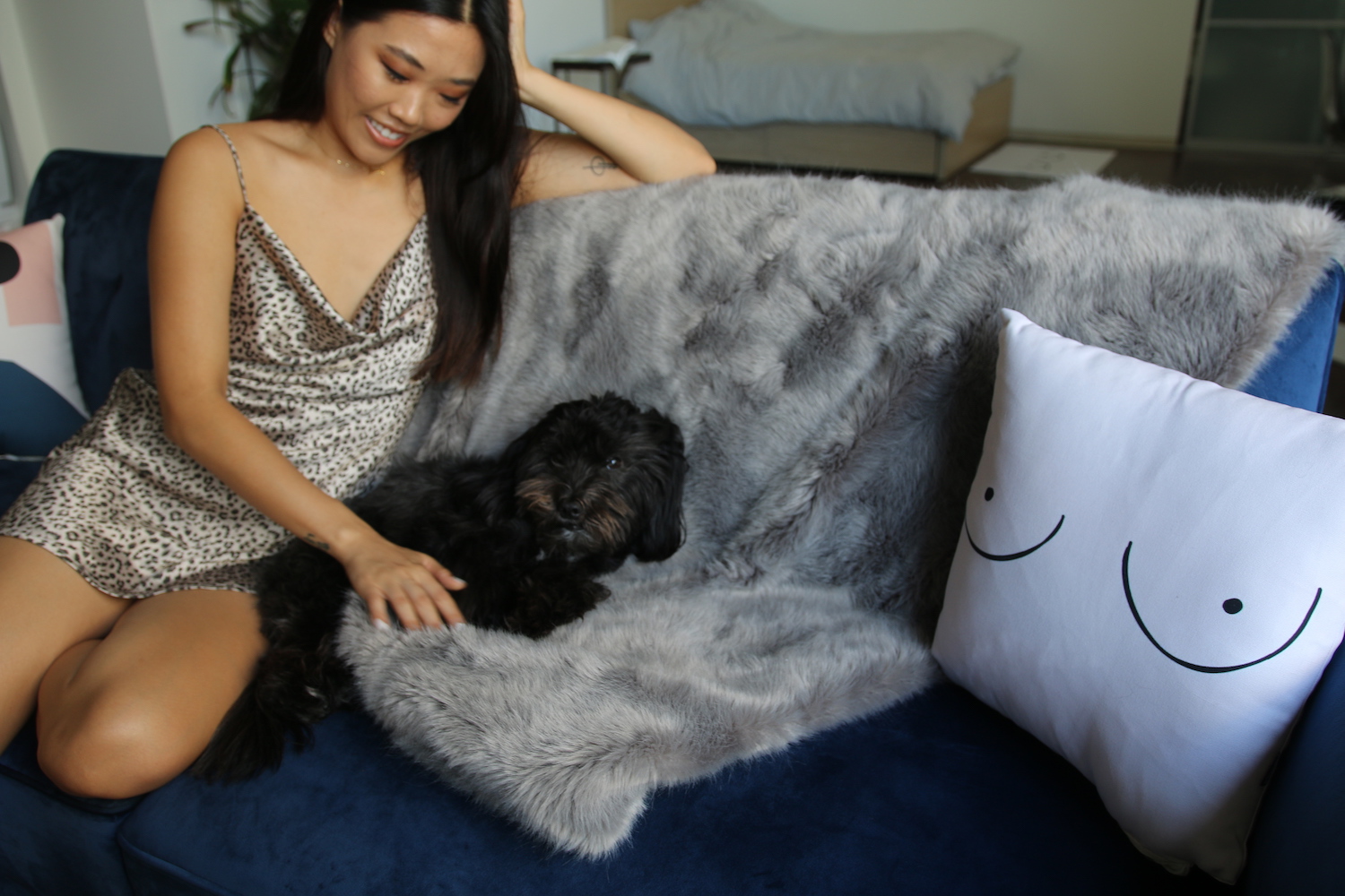
Designing your space should be pleasing to the eye, no doubt, but don’t forget to also have fun and get quirky. To lighten up the mood of my space more, I like incorporating cute little slogan-printed mats like this one to remind me of my nice bootay. Just kidding. But I am so pro-body-positivity that I thought it was fitting that I had a boob-printed curtain. This curtain helps to make an otherwise pretty sterile environment like the bathroom a bit more quirky. #FreeTheNipple, am I right?
5. It’s Better Altogether
“Sometimes we’re better together.” – unknown art pieces
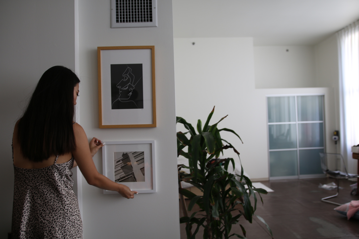
While I totally just made that quote up, I do think an easy way to upgrade your apartment is by not having just one giant art piece, but having a slew of many. Here I just paired two rather small art pieces I had (both under $100) and arranged them into somewhat of a mini gallery wall near the empty space between my kitchen and living room. While these pieces might not be that eye-catching or make a super statement on their own respectively, they look great and make a bold statement together.
Comments