In our Behind the Designs series, we will explore the stories and inspiration behind some of our artists’ favorite pieces.
Here, designer Sam Sheridan talks about the common thread in his pieces and the nuanced nature of his work.
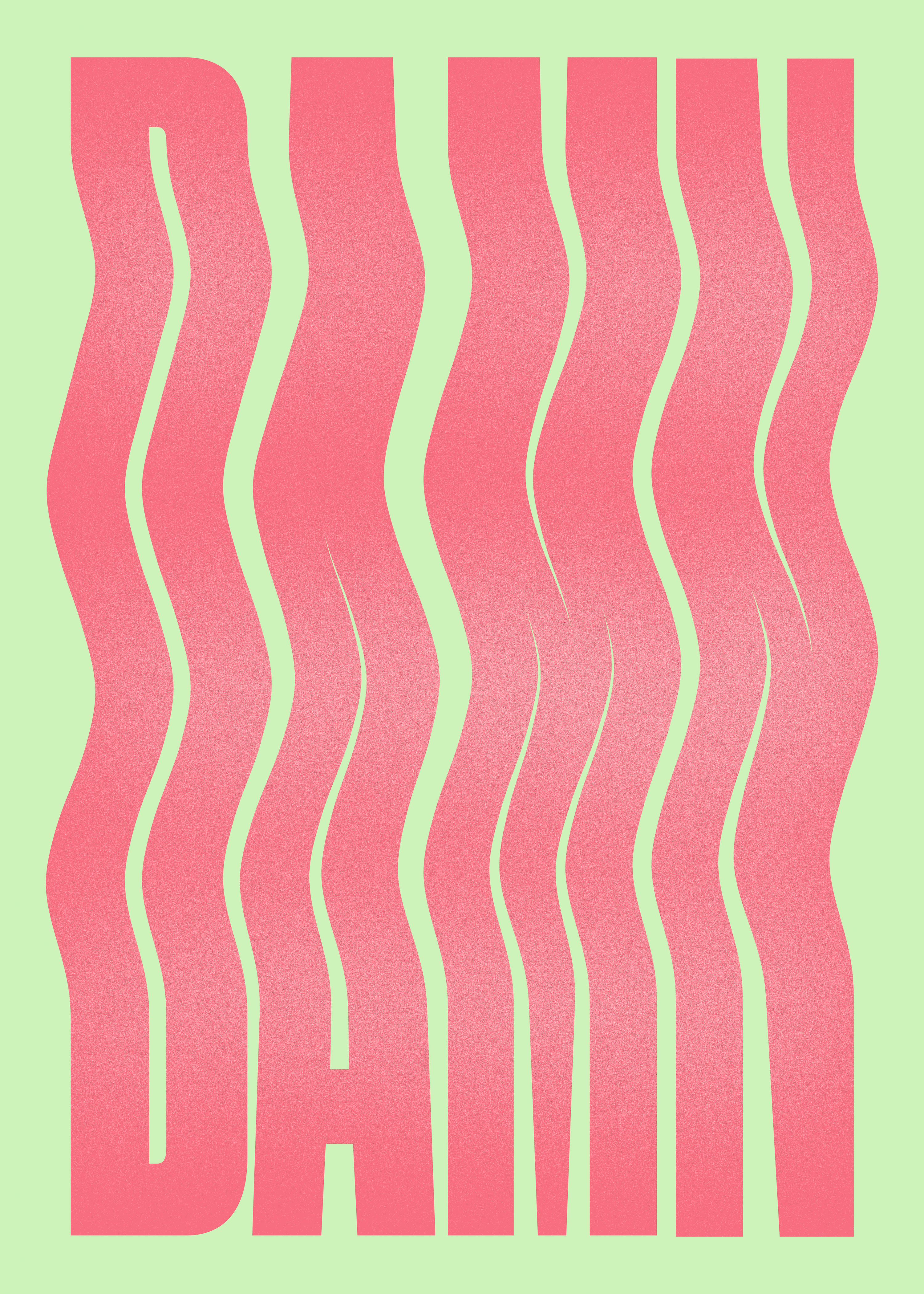
“Damn”
A common thread through all of my work, and very much my style, is the use of type as illustration—sometimes subtle but usually graphic and expressive. With this piece, I wanted to capture the attitude of the word in a humorous way and felt the waves in the typography communicated a sort of rhythm, which conveyed a light-hearted tone to the piece. Personally, I use the word “damn” in more of an “oh, that sucks” kind of context, and so I don’t see it as too emotive or charged of a word. I wanted to keep it relaxed and simple. I made an alternative of this poster with an ancient statue being digitally pulled apart behind the type in an effort to bring some irony. With this aggressive re-formation of the subject happening, all he can think to himself is “well… damn.”
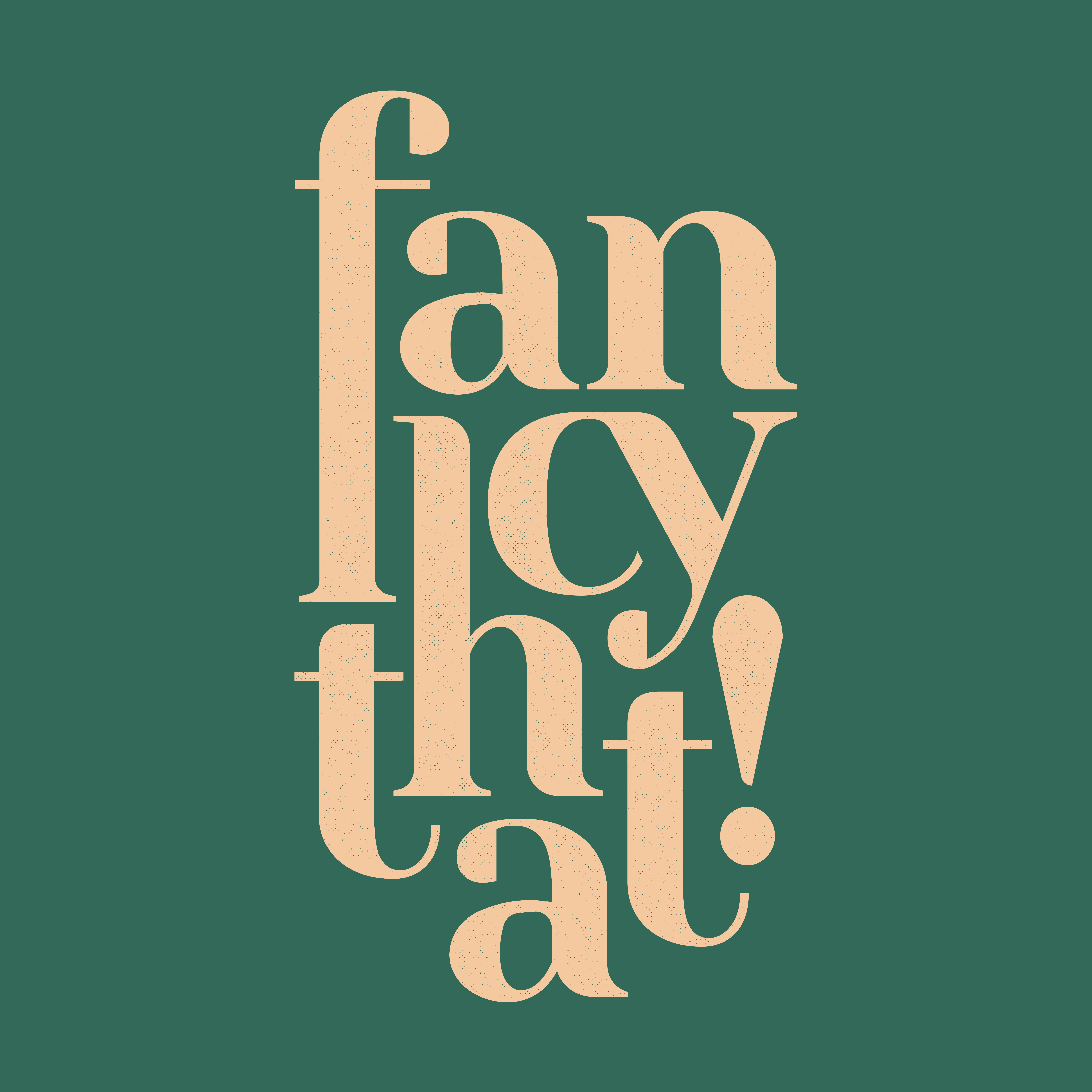
“Fancy That”
This poster was one of my first sales on Society6, and it wasn’t long before it was featured on the front of the Art Prints page. It’s come to mean a lot to me, as it’s what got me noticed. Initially, it was inspired by hearing someone say “Fancy that!”—which isn’t that uncommon of an expression over here in the UK, but they said it with such enthusiasm that I thought it’d make a great, and very British, typographic design if I could portray the same enthusiasm.
“Fire”
Using the word fire to describe something as really good or amazing was becoming more popular, and I found inspiration in that literary comparison. I wanted to represent it as graphically as I could so that the typography would take on its own fierce and aggressive form just like the subject matter. If you look closely in the corner, there is a small body of text explaining the definition of the word “fire” as “1. a process of combustion in which fuel or another material is ignited giving off heat. Or, 2. Kanye’s new album.”
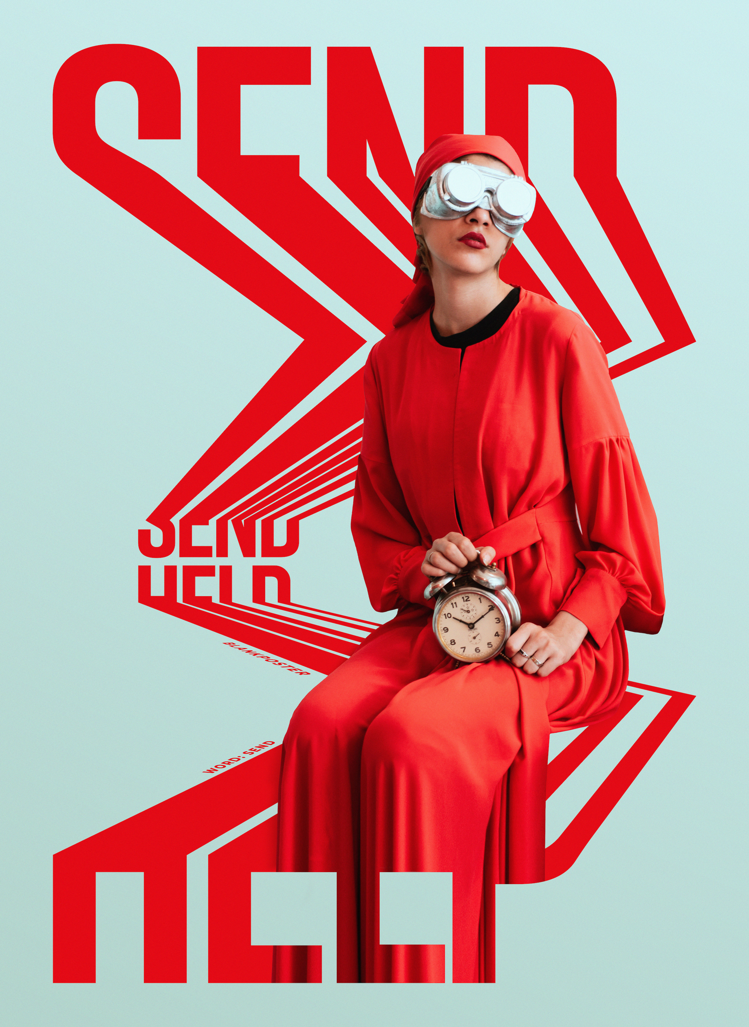
“Send Help”
Inspired by the typographic works of Robin Weissenborn, this piece was born from the constant and relentless sea of deadlines during my typical day in the world of advertising. I wanted to create stress in the typography and used imagery from Mohammad Metri to help illustrate the time aspect. Almost like the subject is the gatekeeper of time and the typography is used to illustrate a sort of timeline fast approaching from the distance.
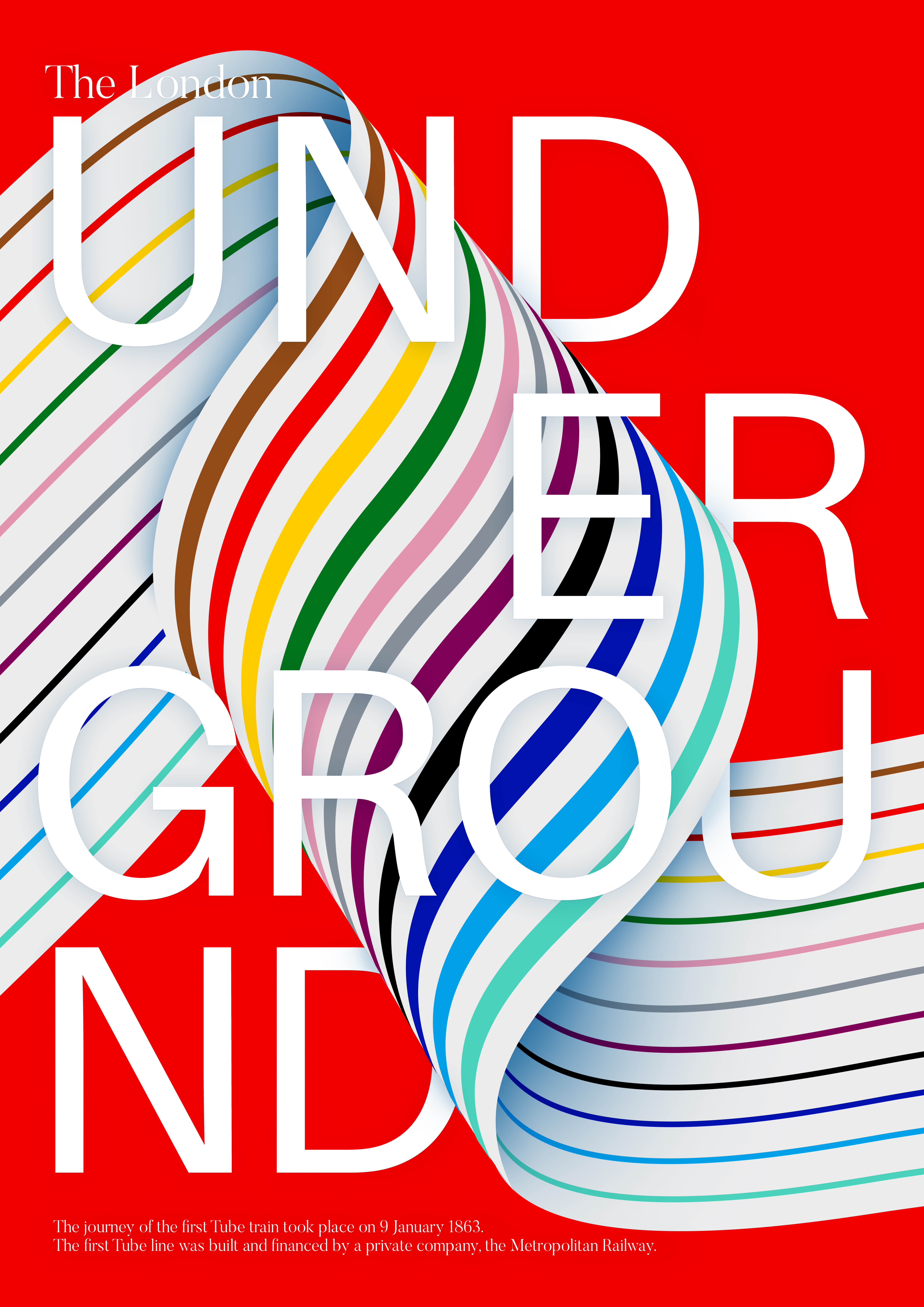
“London Underground”
This design was very much inspired by the London Underground and was made when I first moved to the city. There was confusion and complexity at first when it came to finding my way around on the Tube, and I was trying some new design techniques at the time. So I put them together to create this twisty artwork. The different train lines are imprinted on this ribbon which is folding to create a tunnel of itself and moving through the canvas from left to right to bring about a feeling of motion.
Comments