Stripes, spots, florals, plaids—our eyes are inexplicably drawn to the prints and patterns that surround us.
However, it’s easy to fall for the more is more mentality and suddenly find yourself in a well-meaning decor disaster with floor too many motifs. Franco-American model and artist Alex Noiret has that effortless cool that permeates her work, look and her home. So (per usual) we Americans asked a French girl how to be unique, yet classic when it comes to incorporating patterns into your home decor.
My name is Alex Noiret and I am a model, artist and blogger living in Los Angeles with my husband Scott Vance and our cute cat, Oliver. I’ve lived here for more than ten years, but was raised with my French grandmother who taught me about design, colors and patterns. When I was a little girl she would take me to markets to observe the details in clothing, furniture, fruits and even pastries! When it came to dinnertime, she would have me pick out the “theme for the table” and taught me how to achieve the theme, accordingly. I quickly took note of what looked beautiful and what didn’t, but even so, mixing patterns can be tricky, especially if your style leans towards simplicity. Thankfully, I’ve found a way to mix patterns in a space that can add interest, charm, beauty, refinement and a feeling of intention (or put-togetherness). Here are a few tips (inspired by my grandmother!) that I’ve learned:
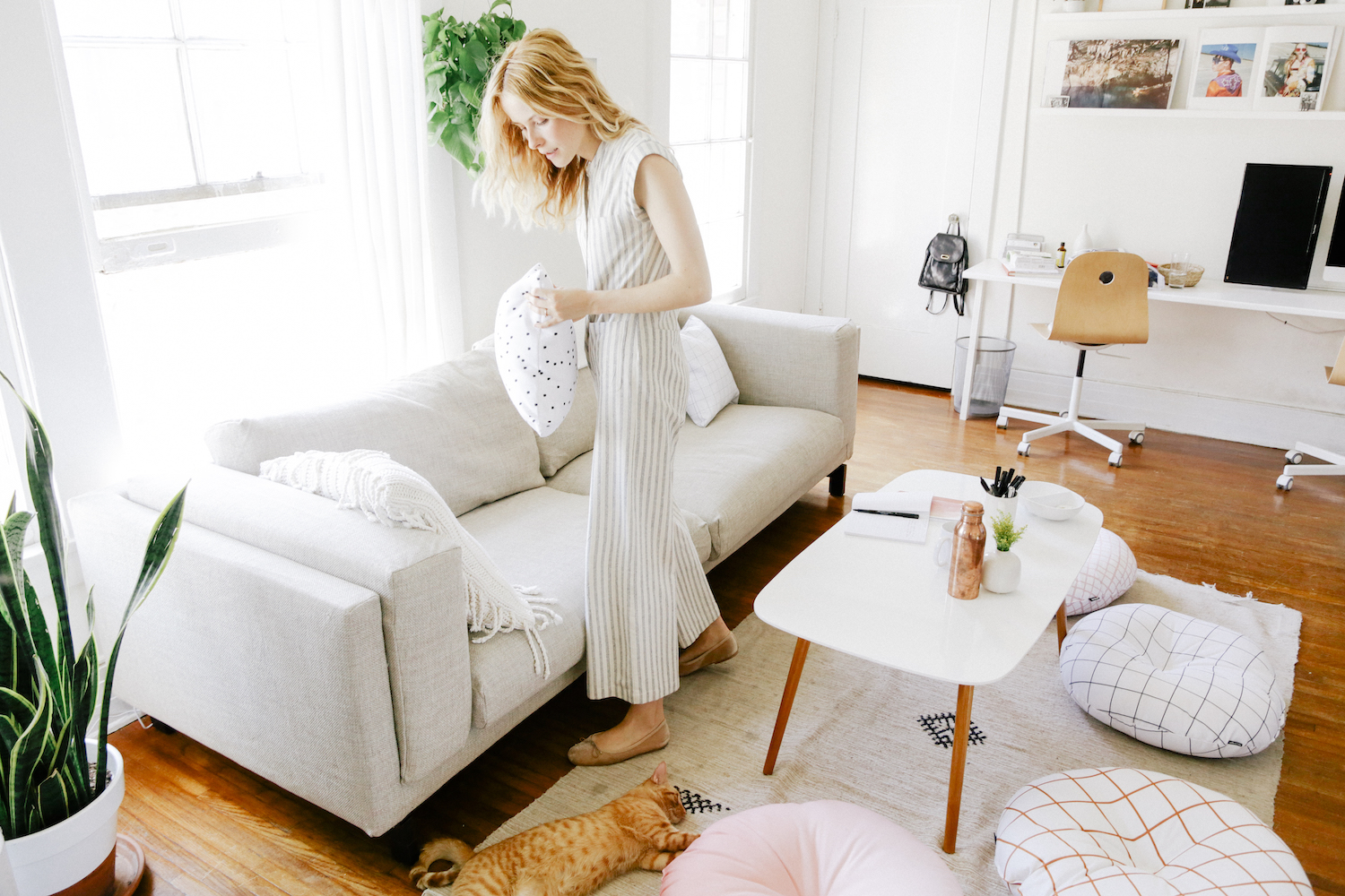
1. Determine your color scheme.
Observe the room you want to “umph” with decor, and first determine the color scheme you want to play in, overall. For me, my colors are neutrals (shades of natural wood, beige, greys, whites) along with touches of warm pinks and oranges. Because I really like this family of colors, I know when adding my patterns, I don’t want to stray too far from keeping the colors and patterns within that palette.
2. Choose colors that flow nicely together.
Before adventuring off to find the pattern you’d like, first keep in mind the color(s) you’ve decided to add. Because I like to keep my colors either neutral or analogous (meaning three shades next to each other on a color wheel), I’m open to adding anything neutral, pink, peach, coral or turmeric. I believe in the power of using our intuition and individual taste, but if that’s not enough, following the color wheel and these little charts may help to understand colors and how to combine them to achieve harmony!
3. Choose your style of pattern.
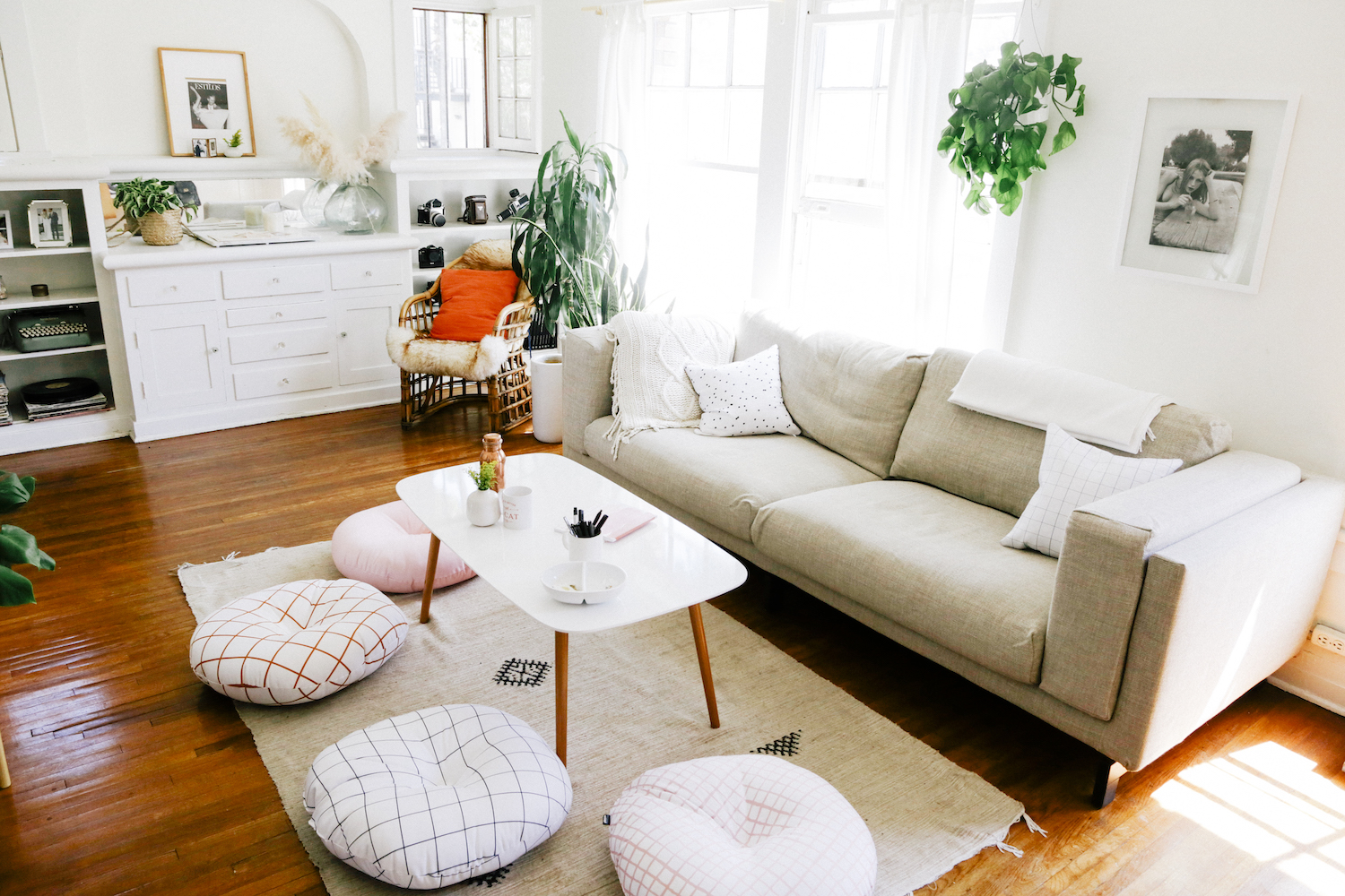
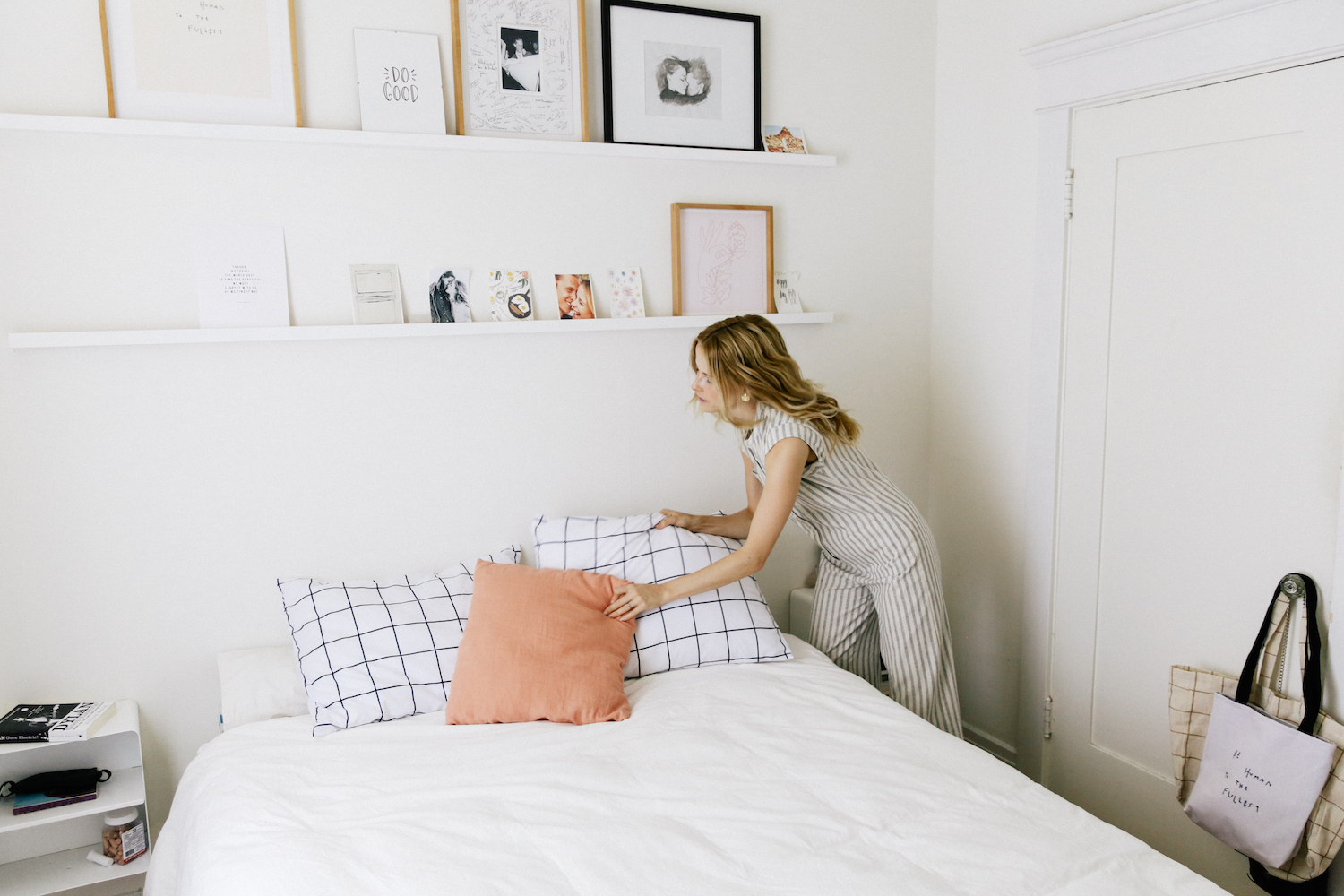
Once you’ve picked out your colors, it’s time to hunt for patterns. What is the style of your home? Is it bohemian? Modern with clean lines? Country? Nautical? Spanish? Moroccan? My home is a mix of modern and bohemian. I do have a few rugs from a trip to Morocco, but for the most part I want to keep any patterns fairly simple by using clean lines and geometric patterns. I really loved the simplicity of a windowpane pattern and found so many great options on Society6!
4. Add more patterns that flow nicely together.
Once you’ve found a primary pattern you love, it’s time to have more fun by adding more! A rule of thumb for me is to either add patterns that compliment in color, style or both. For example, I stacked four poufs by using four different patterns or colors. They each flow into one another either because their patterns or colors are complimentary.
5. Play with sizes and keep it simple.
Another way to have fun with patterns (while still keeping the room fresh and refined) is to vary the sizes of the style of print. In my bedroom, for example, I played with print by using two different styles of windowpane patterns. My primary windowpane pattern is large and simple, while the smaller pillow has a tighter pattern. I then added a minimal spotted textile to contrast the linear patterns (all while staying in the same color family).
Just remember, go with the flow, trust your instinct and individuality, pair your patterns like they’re friends (they have a common interest, right?!) and have FUN!
Photos by Samantha West
Comments