Everyone’s a sucker for a great mug—that’s why we reached out to graphic illustrator David Olenick to get his top tips on how to create funny mugs for your customers.
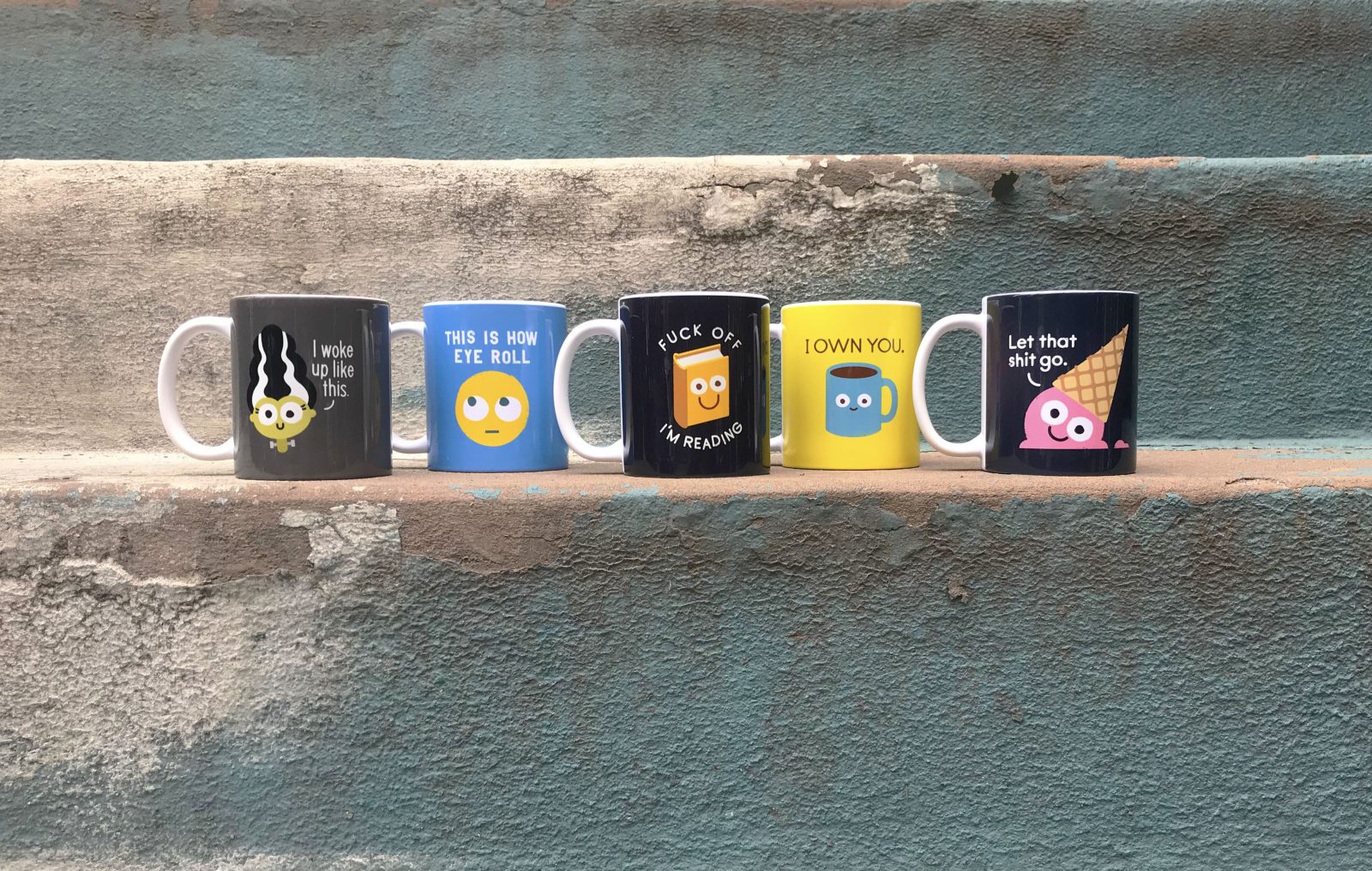
Nobody needs another coffee mug. We all have cupboards full of them that we rarely use. So why are mugs the bestselling product in my Society6 shop? More to the point, how can you, too, create funny, eye-catching designs that inspire people to bring yet another mug into their crowded kitchen cupboards and office desks?
1. Second that emotion
The key is, it’s not really a mug people are buying. They’re buying a way to express themselves. You see tons of products every day on the internet, and you probably admire and appreciate lots of them. Maybe you “like” them on social media, but then you move on. Once in a while though, you want to extend that moment with a product. You want to take it with you; own it. In those cases, you’ve made an emotional connection with the product. Whether you’re about sweetness, silliness, or borderline dangerous levels of sass, you relate to products because they reinforce your identity. You think, “That is so ME”. That’s the kind of moment you want to create with your designs.
2. Get a life
You’re not going to create that moment if you don’t have interesting art, and to make interesting art, you need to be an interesting person. So before you get down to work, free your mind with music & movies, feed your mind with books & museums, and feed your face with inspiring food. Log off, put on some pants, and have IRL conversations, interactions & experiences. If you’re observant, that’s where genuine, innovative ideas start.
3. Curiosity killed the copycat
While you’re out there finding inspiration, don’t be tempted to imitate any artwork or ideas you see. Aside from being uncool and shady, it sells you short as an artist. You’ll end up with inauthentic work, and customers can smell that like pine-scented beard oil on a hipster. You won’t get nearly as strong a response as you would with a pure idea coming directly from you. By all means pay attention to trends, but look for how they’re relevant to your work, or how you can do your own unique take. A lot of times I research trends not to see if I can fit in, but to see how I can stand apart and stand out. Your own voice is the most important thing you offer. It’s the only thing that nobody else has, and that nobody can do better than you.
4. Cream, 2 sugars, and all of the feels
Coffee and tea are a comforting ritual, part of starting and ending your day, or taking a pause in between. Your favorite mug is part of the ritual because it makes you feel some kind of way. So how do you create somebody’s favorite? If you try to anticipate what others will relate to, you end up with something contrived. They won’t feel it because you didn’t feel it. But if you design something that makes you laugh, someone out there will respond the same way. So think about your own morning coffee or afternoon tea. Are you a slave to it, or is it a trusted friend? Do you need it to wake you up, or to help you suffer fools? Does it help you enjoy a good book, or forget a bad day? At this stage we’re just identifying feelings.
5. Stormy weather
Now you’re ready to find the humor in how you feel, and develop it into tangible ideas. Get out the umbrellas, y’all, it’s time to brainstorm! You could sit at a desk staring at a blank page, thinking intensely for several hours, but that would be kind of a drag, no? Avoid the stress of trying to create in a vacuum. You want vibrant, joyful ideas, not forced, stale ones. Your ideas reflect the environment they’re born in, so work in a relaxing but stimulating place like a park, coffee shop, or bar. Do word association, make lists, and sketch with abandon. It’s great if you can do it with a partner, but you can also go it alone. Most of my ideas happen during long walks around New York City when I’m not consciously trying. I know in the back of my mind what the goal is, but I just relax, take things in, and ideas start to flow based on things I see, snippets of conversation I hear, and wherever I let my mind wander. It works every time.
6. Your idea is not as good as you think it is
So you’ve done some brainstorming, and you have a funny idea. Great! Don’t throw a party yet. Play art director with yourself, and pretend it’s someone else’s idea. Does it genuinely make you laugh? Do you feel something? Do you want a hot beverage? Would you buy it on a mug? No matter how you answer, now is the time to examine your idea from every possible angle, including the unflattering ones that give it a double chin. Even if you love the idea, do your due diligence. Come up with as many different versions as you can. Maybe bounce it off a few people and get some input. Most importantly, don’t be too easy on yourself at this stage. Give yourself some tough love.
7. Your sketch is not as good as you think it is
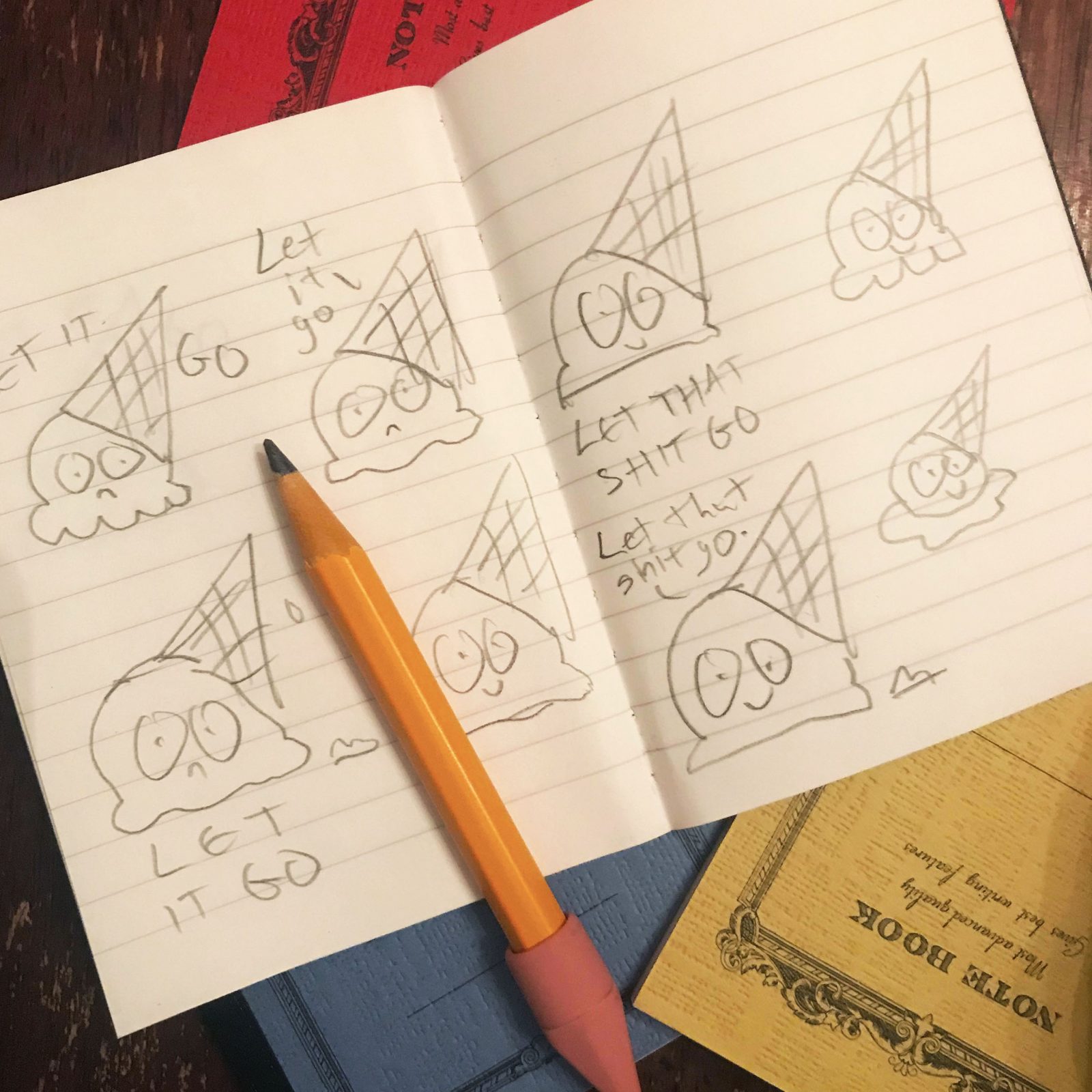
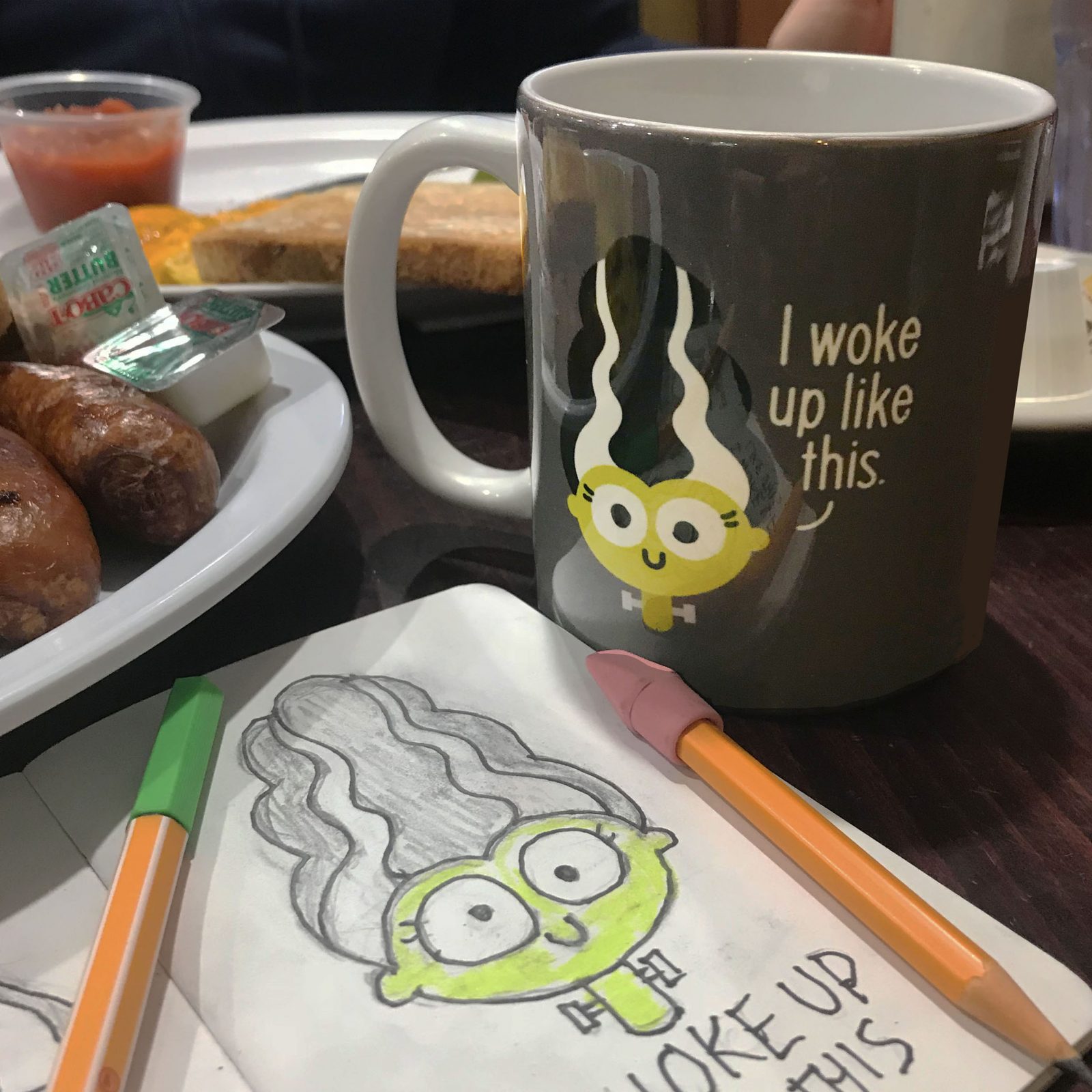
Ok, now your idea is bulletproof. You’re half way there! So how’s this thing gonna look exactly? You probably have a picture on your head, so quickly get it down in your sketchbook. Time to analyze again. Does the way you drew it make the joke more funny, or less funny? Does the drawing distract or get in the way of the joke? Fill at least 4 pages of your sketchbook with different ways of drawing it. Play with different lettering configurations, facial expressions, and levels of exaggeration or simplification. Try every possible layout imaginable, even ones you don’t think will work. You’ll probably see things improving the more you sketch, but even if you go back to your first sketch, now you know it’s the right way to go. The great thing about doing this in your sketchbook is you can try a lot of things fast, and you’ll be dealing with much less guesswork when you’re working on the final design.
8. Approaching the finished line
Before you start work on what will be your finished design, do a little research and pull some reference photos. Even very simple or stylized drawings can benefit from knowing exactly how things look. Then, as you’re working, keep tabs on the legibility of your composition. You want a quick read, because jokes depend on surprise and timing. You shouldn’t have to study the design to get it. This doesn’t mean your design needs to be as simple as the ones I make. Have as much detail as you want – just make sure the layout and light/dark values enable you to read it quickly and easily from a distance. What about color? Maybe the motif dictates certain colors, or maybe you want to create a mood. Maybe you’ve simply noticed that navy blue mugs sell best in your shop. Either way, be thoughtful about color, and make sure it’s harmonious. Finally, if you use lettering, treat it with the same care as the rest of the design. Don’t think of it as separate from the motif(s), or it will look like an afterthought. Make sure it’s fully integrated and consistent with the design as a whole.
9. I’d like to report a mugging
My friends, you may just have a bestseller on your hands… let’s get it up for sale in your shop! Don’t rush through this process. Pay close attention to the pixel dimensions suggested by Society6 for each product. Create your own templates in the software of your choice, to maximize control and efficiency. Utilize all the tools available in the uploader to make sure the scale and placement is exactly how you want it. Congrats, you’re done! Go ahead and pour yourself a cuppa, and commence refreshing your earnings page every 12 seconds.
You’ve created the perfect Society6 mug! One that’ll be great on Instagram, and in a pinch, not bad for delivering hot drinks to your face. It’s a lot of work being effortlessly hilarious, but if you keep it real and make art that really communicates, you’ll create somebody’s favorite mug; the one they spend every day with while the others collect dust in a cupboard.


Comments