Staring at a vast array of colors can be overwhelming. Luckily, Aley Hanson, illustrator extraordinaire, is here to show you where to have fun and where to practice restraint when creating your perfect palette.
Choosing colors can be empowering, liberating or terrifying. As someone who was not always confident with color, I’ve learned a lot through trial and error. Here are my top 5 tips for using color thoughtfully and effectively.
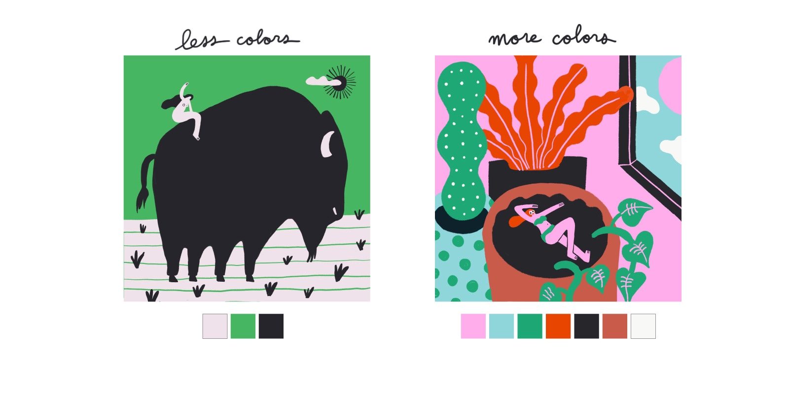
1. Limit your palette
Coming from a screen printing background where each new color requires a lot of effort, I’ve learned to restrict my color palette. I generally use between 3 and 7 colors and rarely more than 9. There are so many good reasons to limit your color palette, especially when you’re first starting out on your artistic journey. Here are a few:
- Having the constraint of limited color choices allows your creativity to flourish, as it often does when it’s forced to create within certain boundaries.
- A limited palette can control the movement of the eye to create visual hierarchy and rhythm.
- Too many colors cause visual distraction.
- Limiting your palette allows you to focus more on composition, value (the range of lights and darks) and form, which will ultimately make your work stronger.
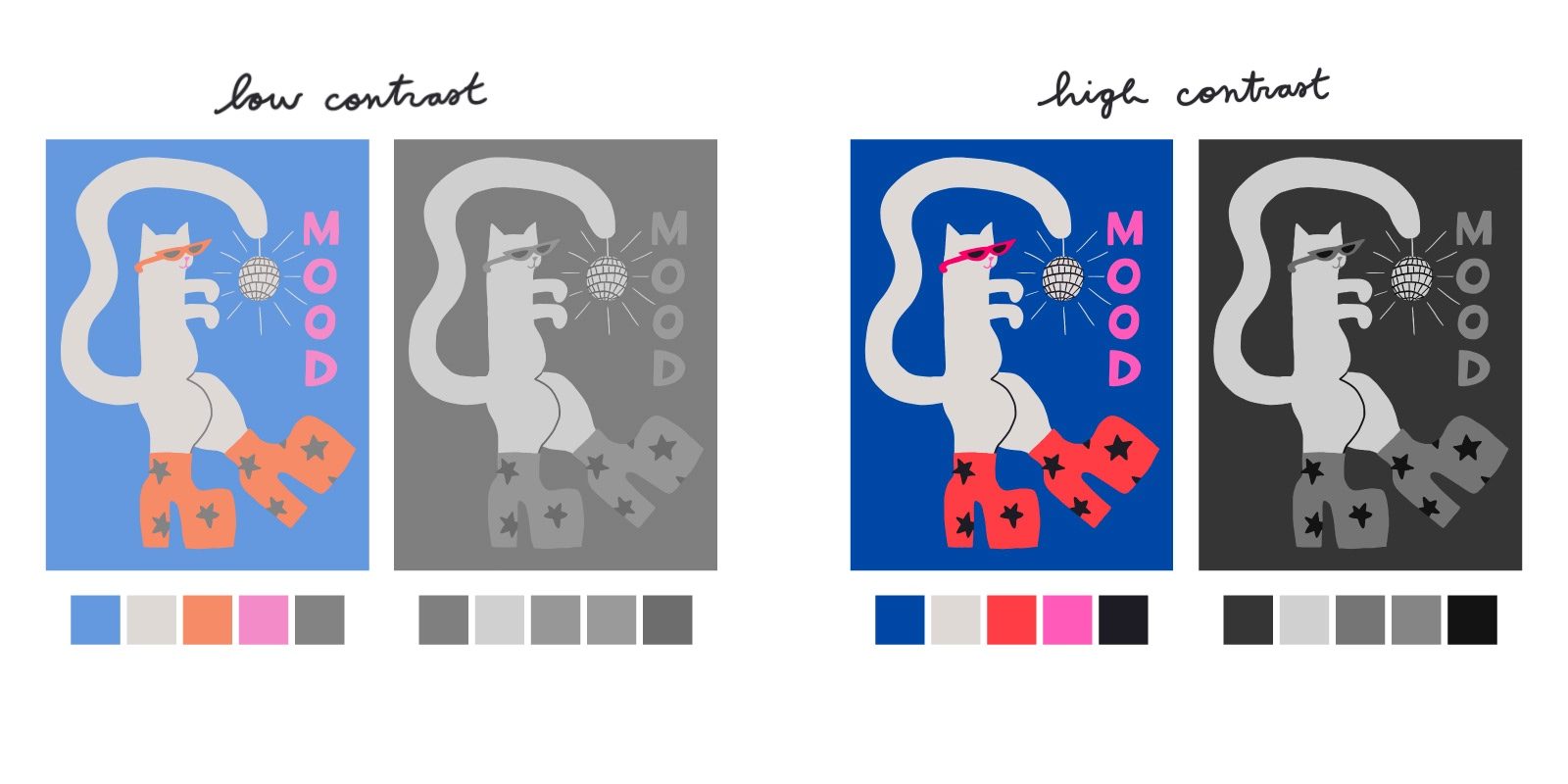
2. Contrast is Queen
Contrast means to “differ strikingly,” and it is the secret to making your work pop. To achieve contrast, you want to include a wide range of value in your palette—so, from dark to light. You can also create contrast by choosing colors that are directly opposite on the color wheel (i.e. red/green, blue/orange, and purple/yellow). Work with higher contrast commands more attention, and work with lower contrast appears flatter and quieter (which can be great if that’s what you’re going for). Two ways to check the contrast of your work are:
- Squint at your work. Blurring it allows you to quickly see the lightest and darkest parts and gauge whether you want to add more contrast.
- If you’re working digitally, flip your work to grayscale and observe how flat it becomes. If it’s made up of mostly mid-tones, add some lights and darks. The eye will often be drawn to the area with the highest contrast. You can use this strategically to direct the viewer’s attention to the most important part of your image.
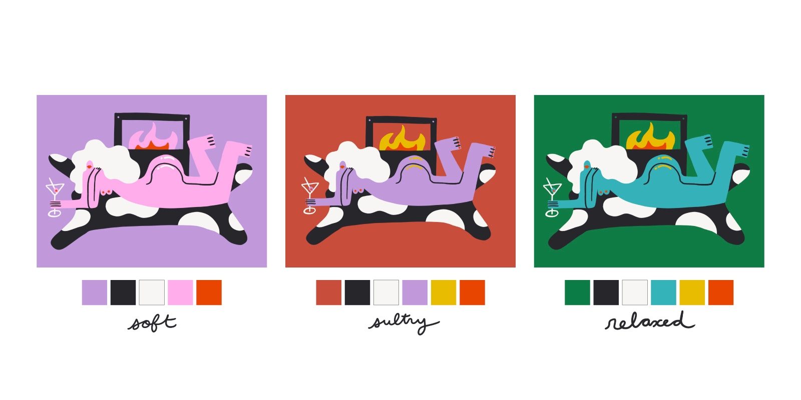
3. Play!
Working with fewer colors allows you to be very playful and experimental with your color. A few tips for color play:
- Make it unexpected. There’s something intriguing about pushing colors of things away from what they are in the real world, (which is why you’ll often find my work filled with pink skies, orange moons, and blue skin).
- Experiment and compare. If you’re working digitally, duplicate your work and create versions with different colorways. (If you’re working analog, quick thumbnail color studies will do the trick.) Compare these colorways and observe how each one makes you feel. Warm colors (reds, yellows, pinks, and oranges) are generally associated with brightness and action, whereas cool colors (greens, blues, and purples) are associated with peace and calm. When you recognize that every color has a temperature, you can use this to impact the feeling of your work.
- Let your work rest for a day or longer. The right color choice is usually obvious with fresh eyes.
- Share. If you have a few colorways you like and can’t decide which one you like best, share them with others (either on social media or IRL), and ask for feedback.
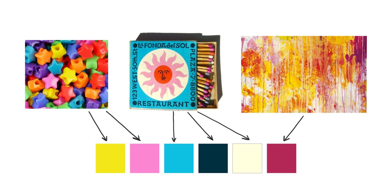
4. Get Inspired
Beautiful colors and inspiration are everywhere. I sample colors from nature, vintage fabrics, travel photos, other artists’ work, food, and good old Google image search. A few tips:
- If you’re feeling lost or overwhelmed, try a little reverse engineering. Make a mood board of art you love and observe what color combos come up over and over. These are most likely the colors you love. Start with these.
- Sample colors directly from other artists’ work. I was hesitant to do this at first, but upon realizing that colors belong to everyone, I started screenshotting art I liked and sampling the palette. (Just make sure you’re directly sampling the artist’s colors and not their work.) This allows you to start with a palette you know you love and also analyze the skillful color choices of artists you admire. Over time, your sampled palettes will meld together to form new palettes that feel more your own.
- Adobe Color is a sweet free tool for choosing and downloading limited color palettes. You can choose themes based on different color theories (i.e. monochrome, analogous, complimentary, etc.), as well as extract color schemes from images. It’s a great place to play around.
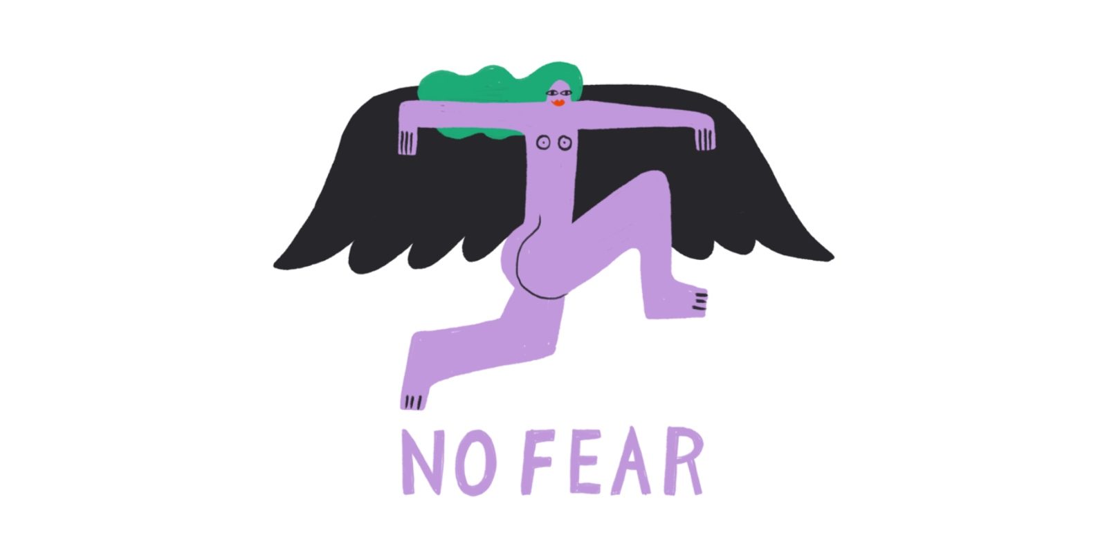
5. Be Brave
Lastly, pushing color too far is better than not pushing it far enough. Push your palette’s contrast and variation to the breaking point, and then, rein it back to a place that feels right. Actively seek out unknown color territory and you might discover something you truly love.
Comments