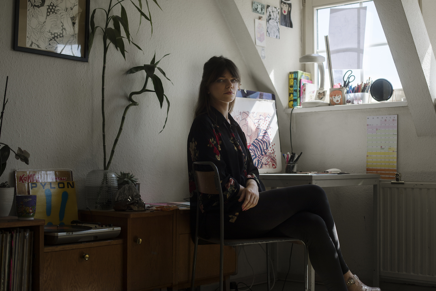
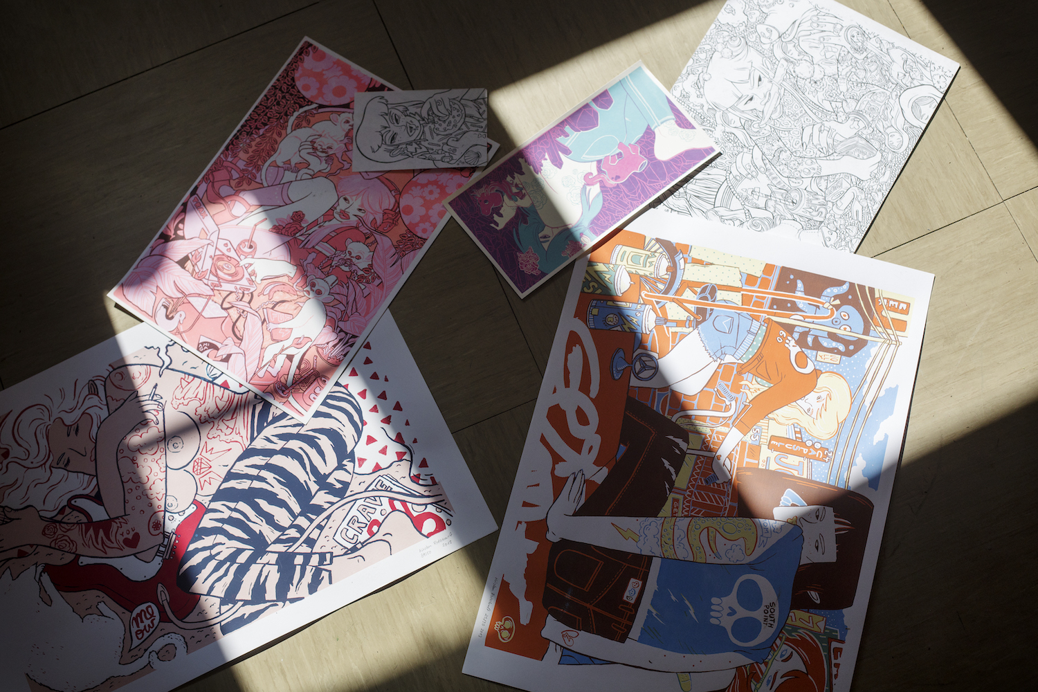
Tattooed guitar heroines, crate diggers and self-proclaimed quirky freaks roam free in the detail-laden illustrations of Kirsten Rothbart.
Influenced by everything from Daria and comics to punk music, the Berlin-based illustrator seamlessly blends equal parts humor and cynicism in her works, resulting in edgy yet elegant portraits of everyday life. Here, we caught up with Kirsten to learn more about her signature style and love of all things pop culture.

The women in your works are just so badass! Who are they, and is there any overlap between them and your own life?
The people in my illustrations are usually fictive characters portrayed in a moment of their lives. There are guitar heroines, zombie-ish princesses, badass gangsters, quirky freaks, tattoo-lovers, proud trash-queens and many more. Certainly there is an overlap between them and myself, but they’re not versions of me, nor who I’d wish to be. They are people who are like me and whom I can understand, who feel the same highs and lows that I do at times and who reflect my own thoughts and feelings, fears, joys and aspirations. When I feel melancholic or bold and cheeky, they do, too.
Music also seems to be important to these women, whether they are playing the guitar or digging through record crates. What genres or artists would they be listening to?
Oh, a whole wide range really. Anything from the late 60’s until today. And any genre I’d say, depending on their mood, of course. But they’d certainly like a good mix of psych, funk, kosmische, punk, grunge, rap and rather exotic South American and Middle Eastern folk. They sure as well appreciate Asian cover versions of Black Sabbath and/ or the Jackson 5. Weird stuff!
And aside from music, what other creative mediums do you pull from for inspiration?
A lot of pop culture influenced me, like cartoons on TV that I watched and comics I read as a kid. I think those 90s cartoon shows like Hey Arnold! later on Daria and whatnot from that era formed my sense of cynicism, realism and humor. Nowadays I get a lot of inspiration from either movies or photography, and of course from fellow illustrators as well. I spend a lot of time on social media checking out other artists works and it often leads me to trying out new techniques.
Overall I’d say I’m mostly inspired by very odd things, let it be architecture, fashion or whatever comes along. Sometimes I walk by places in my neighborhood that instantly inspire me to draw a scene, because they have this odd fusion of beautiful color and shape, yet there’s this urban ugliness, too.

There’s definitely a lot of Japanese influences in your work too, from the soft colors and flat perspective to those intricate tattoos. What draws you to these motifs? Are they influenced by travels by any chance?
Sadly I haven’t been to Asia, yet, but I’d love to go. Japanese art definitely had its impact on me, possibly because I just grew up in that era when manga became very popular in Germany and all of Europe. I read tons of it – and mostly because I loved the art style. Also since I work without a lot of shadowing and highlights in my illustrations I really got quite fond of traditional Asian wood carvings and prints because they helped me understand how to draw landscapes, water or clouds in a rather stylised, non-realistic way. The overall aesthetic just works for me so I let it slide into my own stuff here and there.
Your illustrations are the perfect marriage of soft and hard–they have undeniable edge despite their pastels and feminine figures. Is this effect intentional? What do you want people to take away from your work?
Yes. In fact it’s very intentional. It’s not forced, but I take great care to not let my illustrations look too cute or too dark. I always like to have a contrast in my pieces that is sometimes more hidden than direct. For instance you would find a pretty girl sitting in a total mess, curling her hair with soda cans. I’m just all about leaving some room for interpretation.
A lot of my characters are plastered with tattoos or are located in their bedrooms. Over time I developed this way of telling whatever is going on in the drawings by showing detail. The tattoos on a person or the way they leave their stuff lying around tells so much about who they are and what their situation is. There’s always something chaotic or sinister paired together with harmony and beauty, which seems like a realistic portrayal of life, I think. Or at least that’s what always catches my eye in real life. When I see people or how their homes look I’m always drawn to the small things that disrupt the overall picture.
Sometimes people tell me they get lost in the detail for a while, which makes me very happy because what I’m trying to do with most of my work is exactly that – pull the viewer in for a moment. At first you see a harmonic illustration in all its hues and composition. But when you take a second, more intense glance you may recognize that the image may have a darker undertone. So what I want my audience to take away is of course to enjoy the illustration visually, but at the same time I want to inspire them to make up their own mind about what is going on and to sink into the expression of the moment.
Walk us through your artistic process. How long can it take to put all those details in a given work? And, is there such a thing as too much detail?
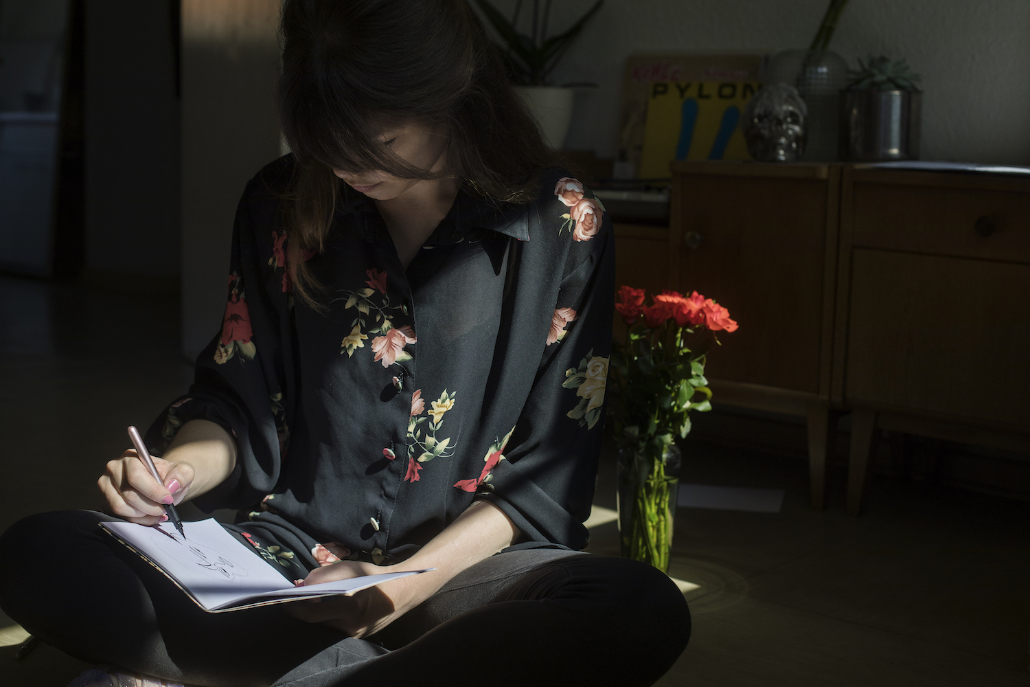
Well it depends really on how focused I am on the illustration. A lot of times I start with a very vague clue of where I want to go with it but then the artwork keeps building up and comes together as I get in on the detail. So basically each artwork starts with a very classic pencil sketch on paper. This can sometimes take up to a couple of days. I prefer to use as few references as possible so I try to figure out perspectives and shapes myself.. and well, this might take me awhile before I am satisfied.
Once the sketch is done I then do the outline with an ink brush, mostly right onto the pencil sketch, which may have some other artists scream in horror right now because most illustrators tend to use light boxes for that step. But that’s how I’ve always worked. Once the inking is finished I scan the illustration and give it its coloring by layering colored textures digitally. Long ago I scanned a bunch of plain sheets of paper that I had soaked with watercolor and I’ve been using them for years.
Currently I am trying to get faster in the composing phase (when I do the sketch) and take more breaks when I do the coloring. I recently figured out it benefits my work a lot when I sit back for a while or take a walk towards finishing the artwork to clear my head and vision rather than force myself to rush the coloring in order to be finished. So, effectively I’d say those bigger, more detailed illustrations can take up to a week or two.
And no, there’s never too much detail, at least in my realm and as long as it serves a purpose. In my case this usually means to stuff a room with items that almost drown the character and patterns on fabric to distort the composition. I’d hate to illustrate a perfectly fine, clean home with a million knick knacks all in line just to fill the room.

How did you land on your signature style? Do you have any advice for those who might still be trying to find that for themselves?
It took me a good few years to figure out my own style. It didn’t happen just like that. So this leads me to the most effective advice I could probably give: practice, practice and PRACTICE! It’s all a process that keeps going on and on.
Draw in a way that seems natural to you. Do it over and over again. And if possible, consult other artists for opinions and advice. Another pair of eyes may see something you don’t. For illustrators who are starting out it’s helpful to find inspiration in other artist’s work. I think that’s how most illustrators I know got to develop their style. If you find something that is visually appealing to you you may pick up a technique and let your own handwriting and ideas form a style of your own.
Also, during my time in art school I kind of picked up a couple of mantras. First one is to keep working until you are truly satisfied with your work. This means not to make compromises. And the other one would be to turn what you may see as your weakness into a feature that makes you unique and stand out. If you prefer rather deviant shaped noses, rock them! Because you are the creator, the god of your own universe.
What’s one of the best experiences you’ve had as an illustrator?
Somebody I don’t know but saw on instagram got a tattoo of one of my characters. When I saw it y heart was pounding like I was on a first date. Thank you so much for that. It’s an absolute honor for me to have someone have my art stitched into their skin forever.
You currently live in Berlin. What’s your favorite thing about the city?
Aside from the notorious cool underground art spaces, the architecture and club scene (all of which probably every major city has), I like how different people get along no matter where you’re from or how much you make. Not because people in Berlin are more tolerant than others but because the common spirit I’ve experienced here is “If you don’t mind my business I won’t mind yours.“ So really, I feel like people are very capable of letting each other live and have their space which creates a friendly climate for everybody to thrive and pursue their vision.
And not to be forgotten: Berliners just looove some spontaneous open air action when the weather is great, whether it be a little rave or concert in the park or hanging out with a drink by a corner store with a radio playing. Winters here are grey and tough, but the second spring comes around everyone is just really relaxed and nice.
Last but certainly not least, we heard you love to depict juice boxes. They’re super cute so we are here for it! What draws you to these and which is your favorite?
Since I am a big fan of pop art I am very drawn to visually pleasing packaging myself. I would sometimes just buy a thing because it looks great. Very often my characters can be seen in their homes surrounded by a mess. Over the years it became a habit of mine to design all their household items and the products they use, like cereal boxes, cigarettes and milk and juice containers. Besides my love for inventing names for the brands I design (“Choco Locos – the cocoa breakfast crunch that will make you loco!“) I don’t know why exactly I have so much fun doing this. It just seemed logical to me to let the characters I create live in a world that I create to my liking as well.
Photos by Cristoph Mack
Comments