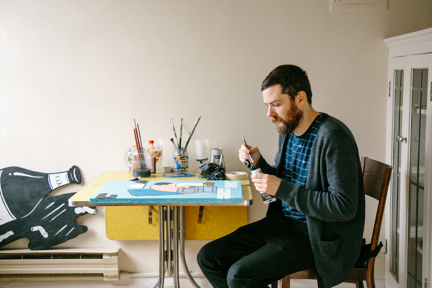
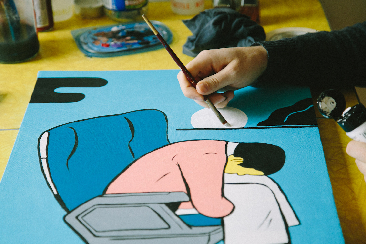
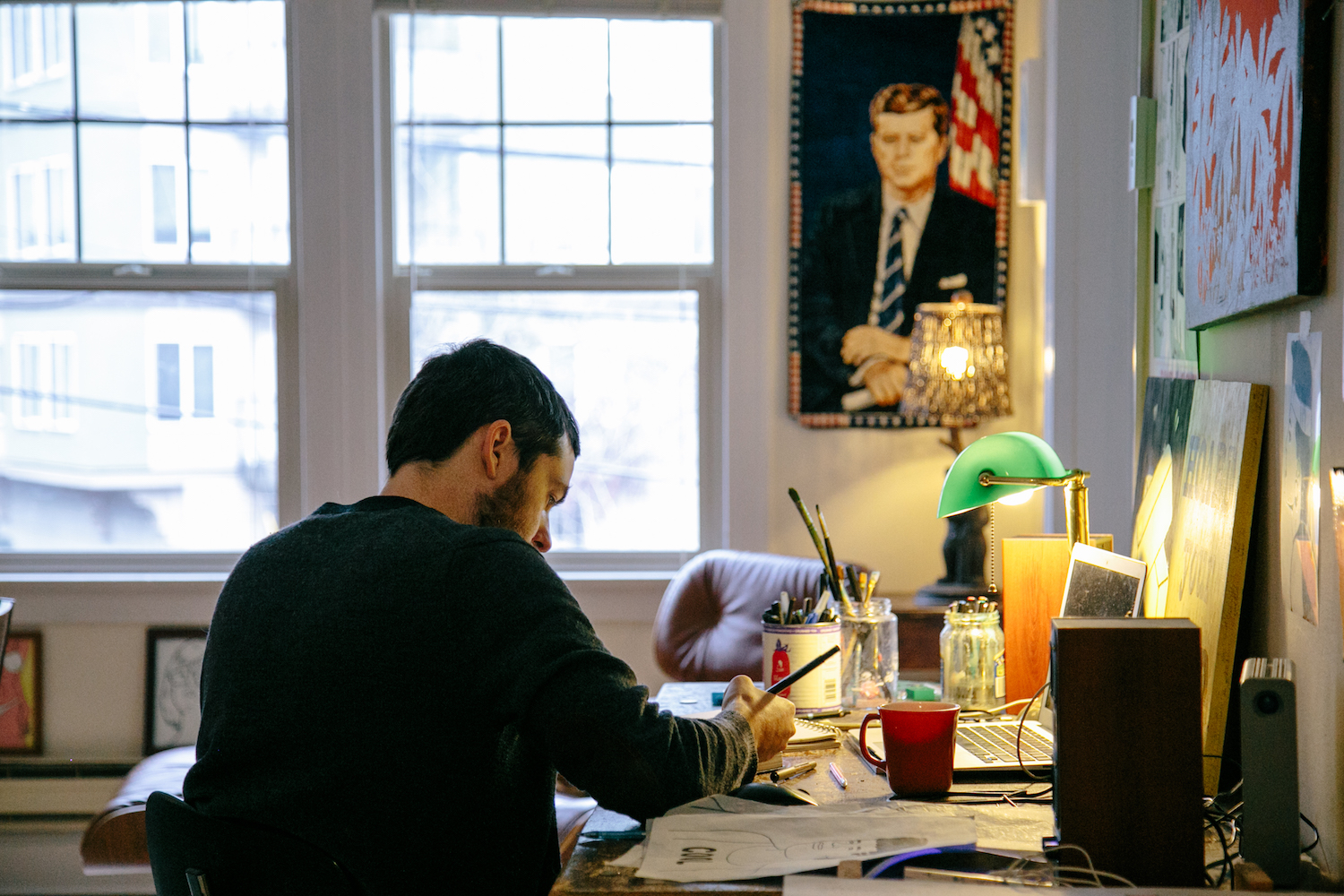
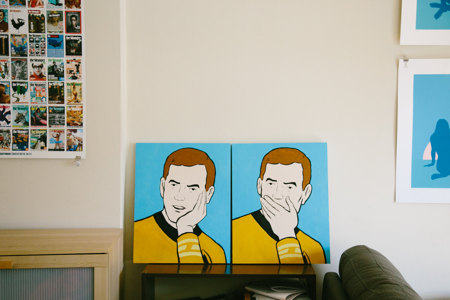
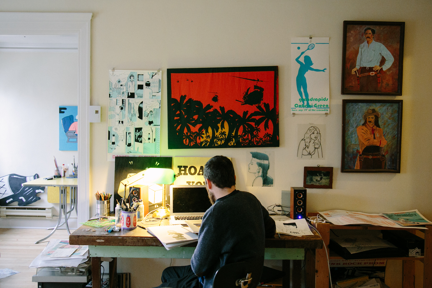
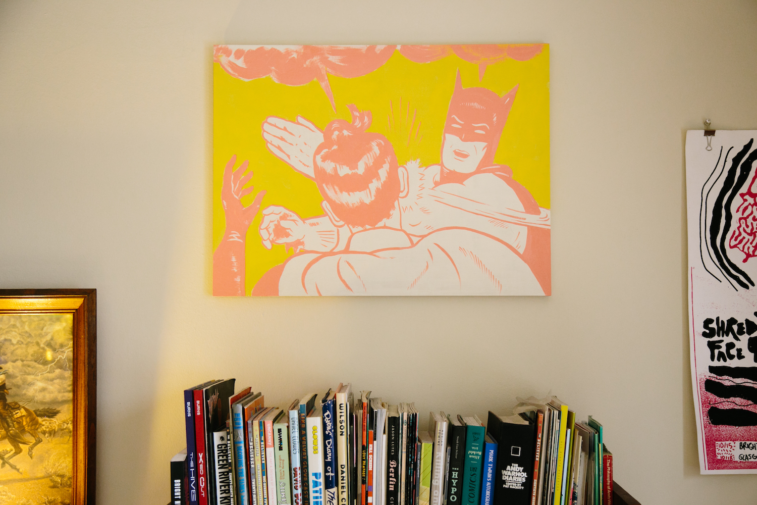
Mike Force doesn’t want to make you look good. Or anyone for that matter, as his approach to portraiture is realism over aestheticism. Taking cues from comic strips and 20th century greats like Patrick Nagel and Andy Warhol, Mike makes bold, relatable pieces in bright, board game colors. But however steeped his work is in the Pop Art tradition, every piece manages to feel incredibly unique, as if it was born solely in the creative vacuum of his mind. Check out our interview with the Seattle-based artist below and peek Mike’s work in our latest Art Quarterly 2.1.
Most of the characters in your illustrations are not portrayed in a very flattering light. Is there a specific statement you’re making with this choice, or is it purely for comedy?
Most people are very unattractive. Actually, I didn’t really realize I was doing that! But people say things like “why does she look so dumpy?” and I’m like, “I think she’s hot!”. But yeah, I like realism and making people look sort of bored or agitated. I really dislike idealized, cartoony characters so I try to inject some measure of humanity if possible.
I love that your candy store color palette is the opposite of the heavy neutrals used by many artists and designers in the PNW. Do you think this helps your work stand out?
I hope so. I like pastels. I love tennis because of the outfits. I like drawing people in a sort of preppy style. I want to live in a cigarette ad from the 70’s. It’s sort-of a nostalgia for the pink, soft style of the late 80’s: Patrick Nagel, Kelly Kapowski, trapper keepers.
What is your favorite human emotion to depict?
Existential dread. Boredom. Disgust.
How long have you been working professionally as an artist?
When I was at Pratt I worked in the computer lab, just sitting there for hours. I drew a picture of a dorky tourist family. I physically mailed a DVR to The Stranger because email couldn’t handle large files back then. They put it on the cover. That was my first real paid gig, in 2004.
Are you someone who seeks inspiration or do you take a more organic approach and let it “come to you”?
I once walked past a hardware store that had giant technical paintings of light bulbs and fixtures and washer/driers cut out of wood. I wanted them so badly. I think that’s what pop art is all about. Old comics or ads are great. I’d say half the time an idea comes out of nowhere, onto the page and the other half I’m inspired by someone else’s work.
I love your Andy Warhol comics. Did you have a favorite comic strip as a kid?
The Far Side. My aunt met Gary Larson when he lived in Seattle. As a young kid I hated almost all authors except for Roald Dahl. I also got into Dan Clowes pretty early, when I was maybe 13 or 14. Eightball was obviously for grownups and I loved it.
Mr. August
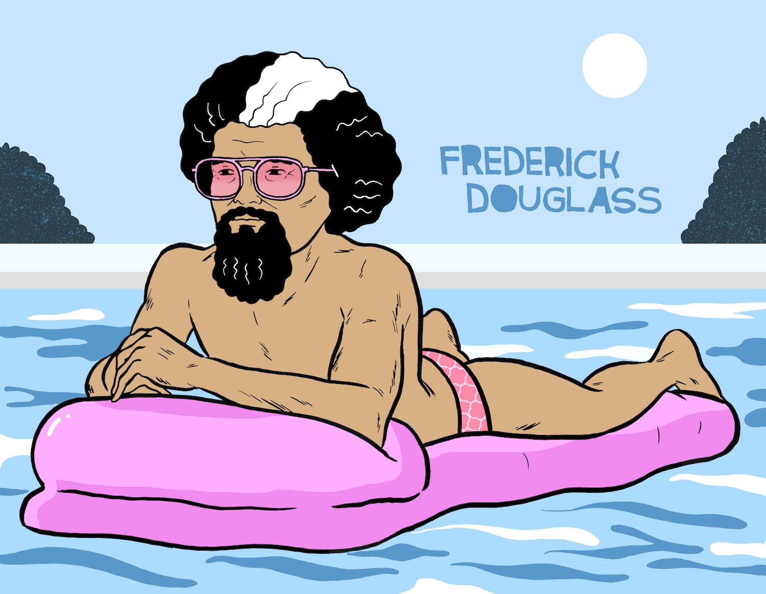
The blending of high and lowbrow seems to be a really successful approach to comedy and your work on historical figures plays into this perfectly. How do you approach a project like that?
It’s similar to Drunk History I guess. I like drawing historical figures because there’s a backstory that people know about, and then I can add my own slant. I love high brow art a lot, but I dislike my own work and think of it as very lowbrow and dumb. I think that’s why I like Lichtenstein and Warhol so much because all of us are inspired by other people’s work.
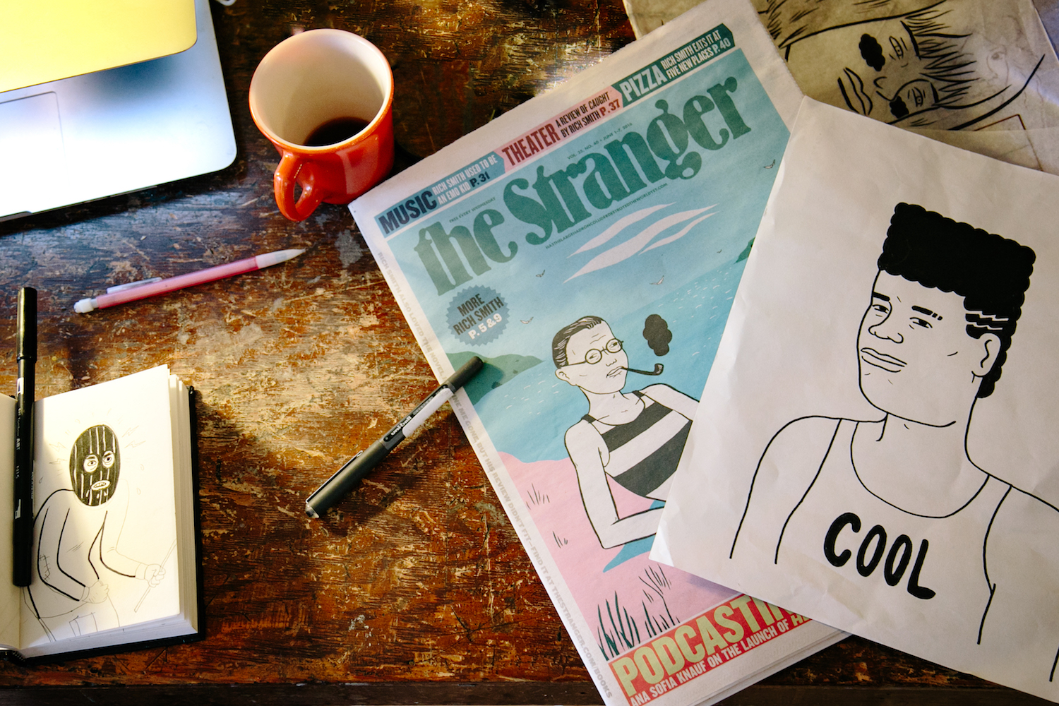
Besides our own quarterly, your work has been in print many times. Is it still exciting to hold one of your illustrations in hand?
Yes. I think for a lot of illustrators, the printed version is the final version. The digital version is unsatisfying. Like when you see your drawing on the ground in a rain-soaked alt weekly, it is genuinely satisfying, cuz it makes you feel real. If everything were just a bunch of jpgs, life would be depressing.
What do you feel is your Achilles heel as an artist? Your greatest pitfall?
Other than heavy alcohol abuse, drugs and depression? Probably my biggest pitfall is that art directors don’t hire me enough. I would like to do more work in advertising, for reals. My biggest achilles heel is that nobody likes my shit on Behance!
Answer these, quick!
Do you believe in ghosts?
Sure. I’ve had creepy experiences in a house haunted by a disabled guy who died in a fire in the 60’s. The neighbor kids gave him acid as a prank and he set the attic on fire accidentally.
If you could create a show poster for any band (current or past) who would it be?
Hall & Oates or Modest Mouse.
Go-to TV show to watch when you need a laugh:
Broad City!
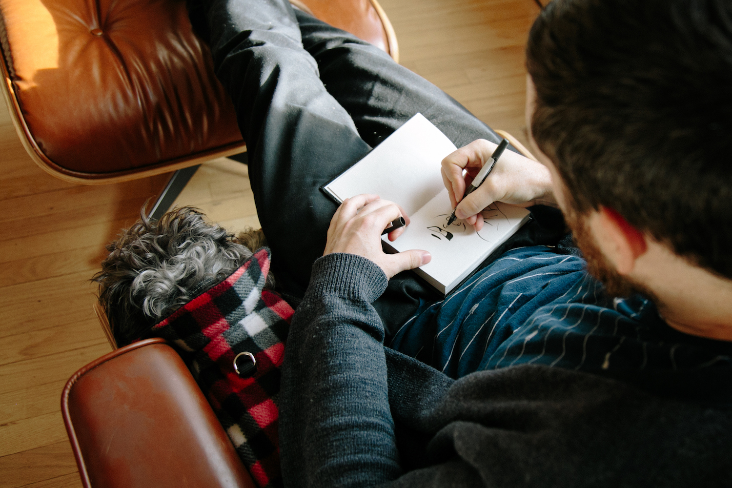
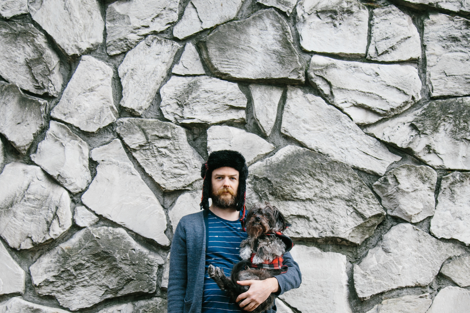
Photos by Linzy Witherspoon.
Comments