If you run across Chris Schoonover’s work online or in a magazine, you’ll immediately want to see more.
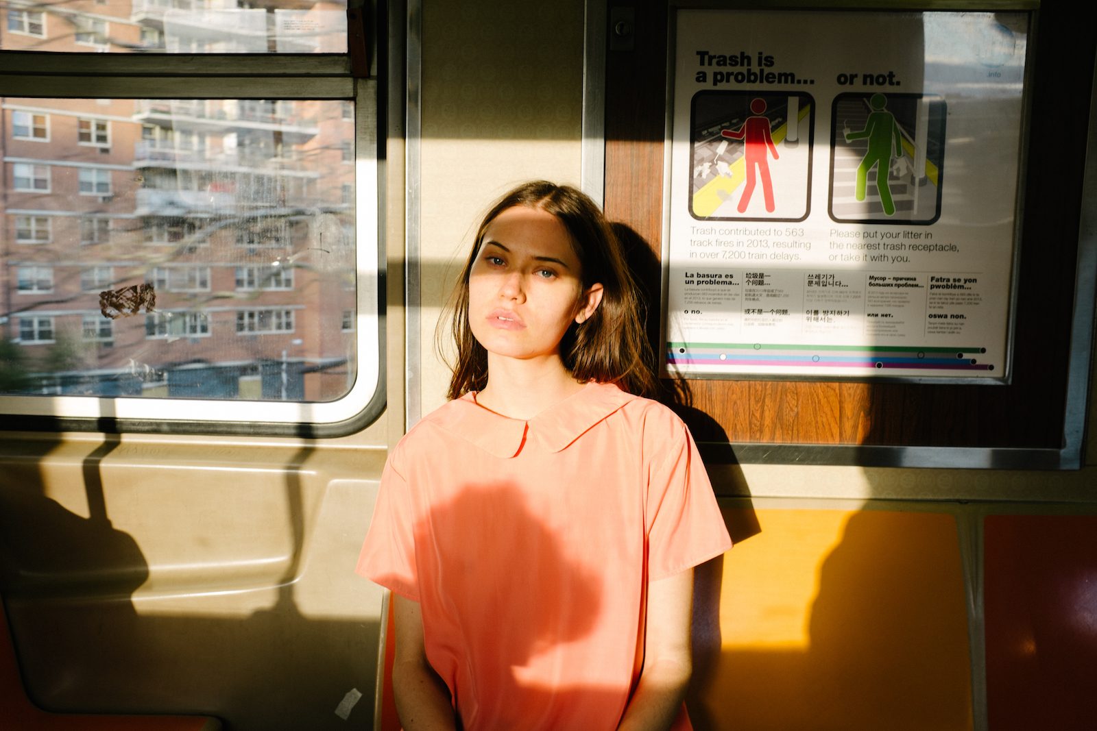
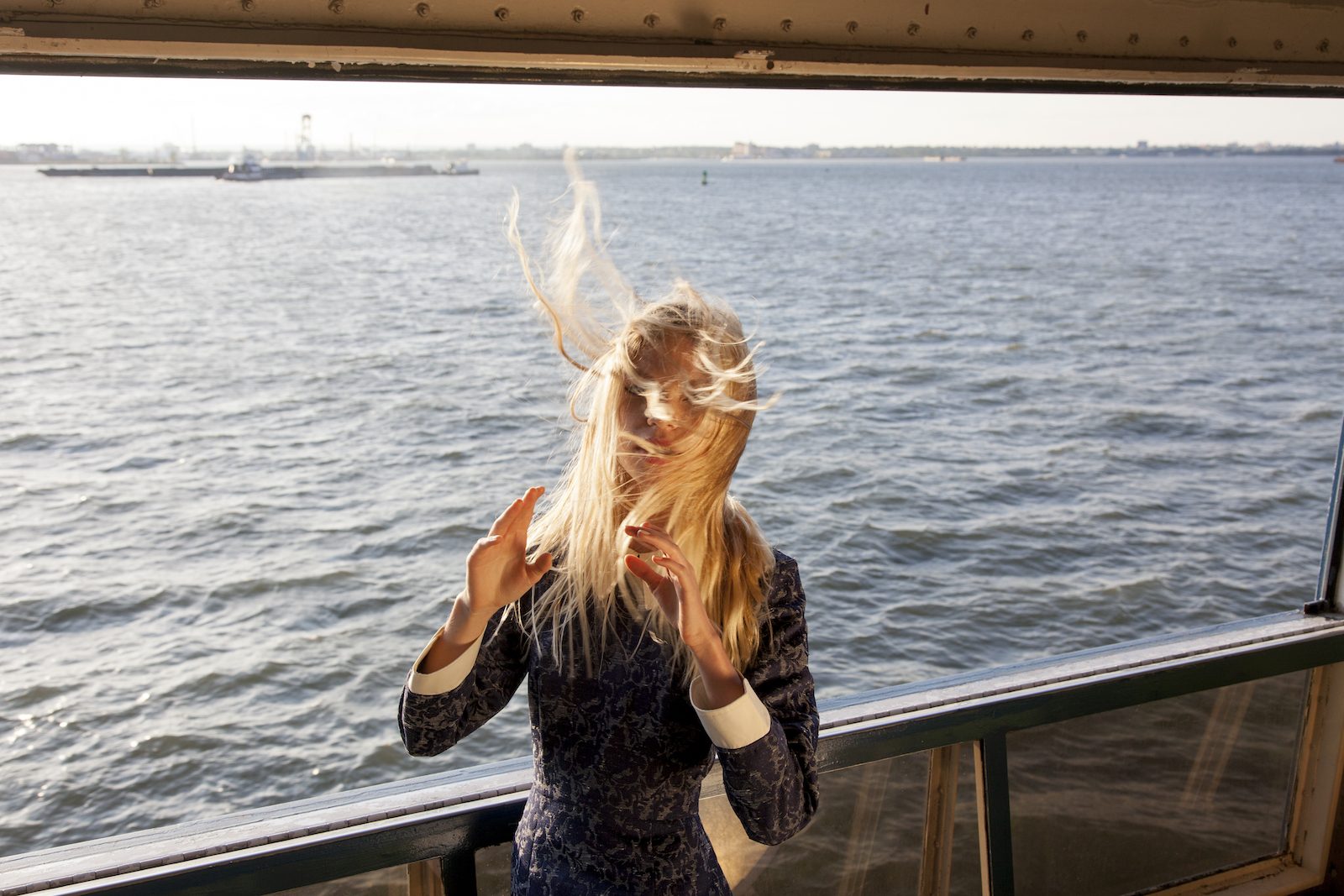
Brilliant lighting, masterful colors and unexpected compositions make Chris’s work sought after by brands like Adidas and Givenchy or bands like Dua Lipa and Blood Orange. In the age of Instagram (the app that launched a thousand careers), we talk to Chris about how he stays unique, yet on trend, retro yet current and about how life’s challenges can always change you for the better.
Hey Chris! Tell me a bit about yourself—how did you end up in New York City?
I grew up and went to school in Southern New Jersey. I had a great family upbringing—dad, mom, two brothers. While I was getting my Bachelors in Advertising, I realized I had no real skills to offer anyone in exchange for money so, I faked my way into the art school at my university. I drew a 10 piece portfolio the night before my interview and I’m not sure why they let me in, I’m not even ok at drawing! Following school I worked at Home Depot for a year driving a forklift and cutting wood. A year after graduation I got a job in graphic design and got married, but three years later that was all coming to a close. I didn’t really love graphic design the way I used to and I ended up going through a divorce, which isn’t a happy thing, but it’s definitely an important part of my story.
During my last year of working as a graphic designer I started to get really into Instagram as a hobby; taking photos was how I dealt with my stress. I got SO into it that it was distracting me from my job and when the divorce happened, I was pretty lost. I didn’t have anything to lose, so I started taking a ton of trips to get better photos. I was going to New York (from NJ) almost every weekend to work with different models and stylists. I began to get offers from fairly large companies to take photos for them. So I left my design job and moved to New York with a good friend of mine, so I could start growing my photography career. Once I got to NYC I hit the ground running and started to develop my book in and out of studio. Now I’ve lived here for almost 4 years. I’m also very happily married to my beautiful wife who encourages me constantly.
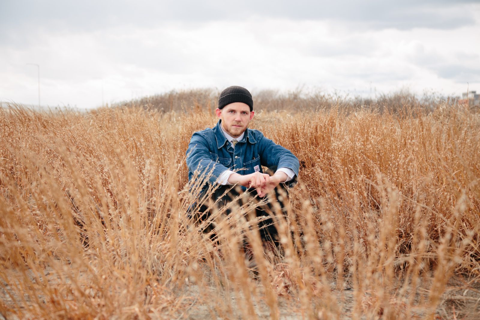
“You won’t make it very far if you’re afraid to move on from a process or style.”
How long have you been pursuing photography? When did it become a primary interest of yours?
I’ve been taking photos seriously for about 5 years now. I started by taking photos of things in my home and then moved outward. I tried landscapes for a little while, but then I got sort of bored with that. I realized that people make photos a lot more interesting to me, they add another dimension. I wanted to take pictures of people, but I didn’t really know how to find people that were interesting to me in suburban NJ. A body of work that was particularly inspiring to me was “Hustlers” by Philip-Lorca Dicorcia, so I started to go to the city and take pictures of people on the street. I then found that I wanted a little more control over what the people were wearing, where and how they were positioned. Fashion photography seemed to be a way to make that happen.
Color is obviously a really important aspect of your work. Tell me a bit about how you achieve the desired color palette for a specific shot—through specific types of film, editing in post, styling on set etc?
There are always colors that I naturally gravitate towards, but It’s not an exact science. I wish I could say that I look at a color wheel and go from there, but I don’t really have rules for myself, I just go with what I think feels right. I spend a lot of my time looking at the photography work of others. I do a ton of research before every shoot looking at positioning, colors, locations. A lot of my inspiration comes from works of the 60’s and 70’s. I always try to make a lot of things happen color-wise on set/in camera. It’s not very often that I change a color of a background, or outfit in post.
A lot of your photos have a very retro-feel, like the kinds of strange polaroids you’d find in your parent’s basement. How do you channel your vintage vibe without letting things tip over into kitsch? How do you keep it modern?
Just like color, there are styles that I gravitate towards. A lot of my favorite music, architecture, design and art was made in the 60’s and 70’s. It was a really beautiful time for culture, but I realize that we have to move on and make something new. When making work that has a retro feel, It’s really easy to fall into kitsch. It can happen in a ton of ways: using bad costumes, cheap props, or overused symbols. It’s important to add something new to the mix so it’s not a parody of what’s already happened. I try to keep up with what’s going on with fashion at the moment. I use old cameras, but then shoot something new with it. It happens to be a time where fashion lines up with my current style choices. Everything is 60-90’s inspired, so it works. At points I have to shift what I’m doing and start using different techniques and tools to keep my work forward thinking. It’s very important. You won’t make it very far if you’re afraid to move on from a process or style.
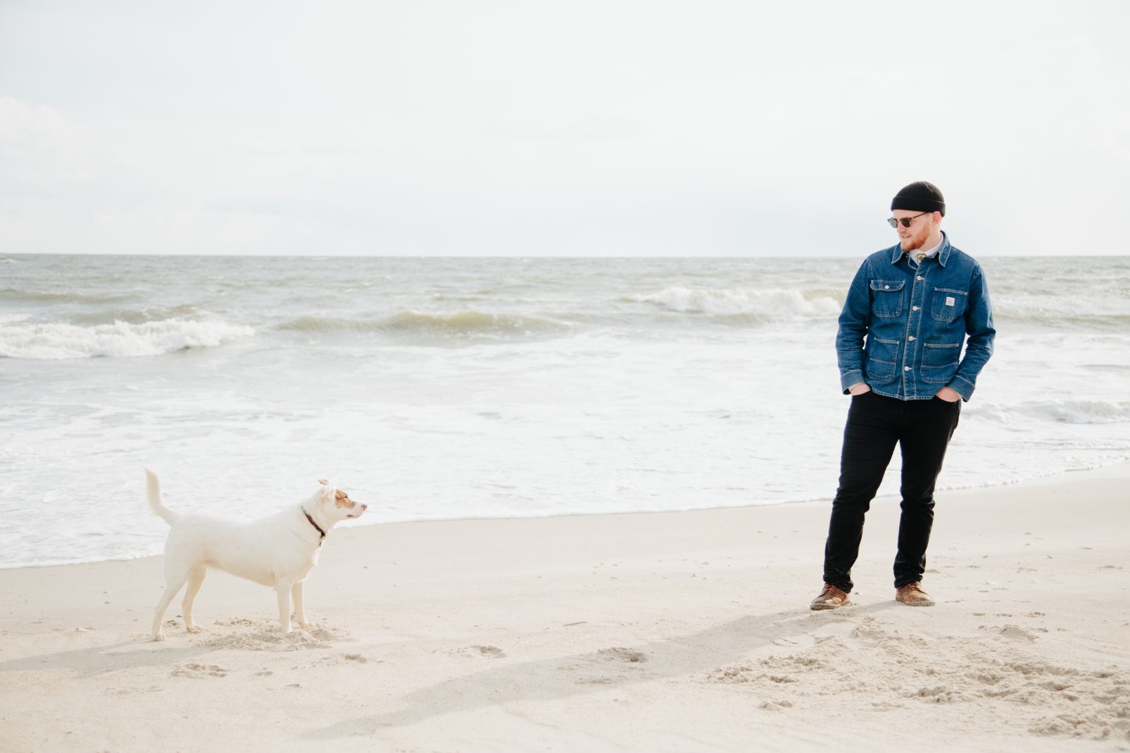
On that note, it seems like a lot of creative mediums (photography, art, fashion) are playing in that retro-ironic space right now. There was a recent Balenciaga campaign that got a lot of hate, but at the same time, people can’t stop engaging with it—like the Seinfeld tennis shoe-look or mom jeans. What are your thoughts on this? Why do you think it’s so popular and how do you play along without getting caught up in the trendy aspect of it?
First of all, I love that campaign. I’ve been following the photographer’s work since the Flickr days; my brother and I would look at it all the time. The fashion world is having a very retro time right now. That comes with brands falling on each side of the kitsch spectrum. That campaign made a lot of sense for Balenciaga, the people that brought us platform Crocs. It’s a niche brand with a niche campaign. Definitely not for everyone, but they’re reaching who they want to reach. The world is moving at a super fast pace. Trends are over in days because we see so much. You have to do something really wild to make any sort of wave. Whether people think it’s good or bad, they’re still talking about it, which is good. I think it’s important to keep up with trends so you know how to move forward and figure out where nobody else is going. Go for something timeless. It’s not easy, but totally possible. Add a new variable. Take away a variable. Just build on what you’re seeing. Let it go when it doesn’t work.
You shoot a lot of portraits. Do you have a particular way you like to engage with a model to make them feel comfortable?
I like my sets to be very calm and accommodating, but no matter how much you do to make that happen, people are people. Models will be uncomfortable from time to time. A lot of my portraits are very formal, so it doesn’t really matter for that style so much. If you can feel a little bit of tension, the best thing to do is just take a break and maybe chat with the person if you’re so inclined. Kindness is usually the way. Music and food helps too.
Now that you have a pretty recognizable and popular style, when you work with brands do you find that they want you to art direct and do your thing or do you still often have to work inside a box they create for you?
I’d say about half and half. Some clients like me to pitch them something, while others already know what they want. Sometimes it’s easier to have boundaries drawn so you can work within parameters. Even if there’s an art director, usually they’ve chosen me for a reason and respect my opinion. I’m always fine with collaboration if the other person is prepared.
Would you talk a little about your thoughts on what Instagram has done to the art of photography? Pros and cons?
There are a lot of ways I could go at this question. It’s definitely a huge reason that I’ve been able to get my work out there, and the platform has presented me with opportunities that I never would have gotten otherwise. On the negative end of things, I think it does create a lot of noise. There are a lot of not great photos out there that are blocking out really awesome pieces of art. I think it’s also making us question what art really is now that anyone can have a gallery and an audience. It’s flipped things on their head things for sure.
You’re also a director—what do you get out of working with film (moving pictures!) that still photography can’t give you?
I really love working with film, but it’s a completely different medium. My mind struggles to figure out what to do with all of the extra frames. I’ve embraced that. So, the videos that I have made are very photographic in nature. Scenes with just a little bit of movement. Film challenges me to figure out what’s important to me. Photography is great because it leaves so much left to the imagination whereas film gives you so much extra time to explain.
Finally, what things are currently inspiring you the most?
Lately I’ve been looking for something new, but here’s a list of artists that come to mind:
Guy Bourdin
Philip-Lorca Dicorcia
Brian Wilson (Beach Boys)
David Hockney
Steve Miller Band
David Sims
Richard Edwards (Margot and the nuclear So and So’s)
Photos by Jonathan Schoonover
Comments