Pros and cons of the top social platforms every artist should consider being on.
Angella D’Avignon offers a quick pros and cons breakdown for popular social platforms along with some great insight from the S6 artists already using them successfully.
A crucial part of building your brand is leveraging social media, not only share your work with a larger audience, but also to connect with clients and fellow artists. Consistency across platforms is key and it’s also important to find your community. Each platform from Instagram, to Facebook, Ello to Behance offer benefits and disadvantages that are worth considering before you build your creative empire.
1 | Instagram
More and more these days it seems that Instagram is the ultimate platform for mobilizing visual work.
PROS: Its latest update that allows users to include multiple images in one post makes it that much easier for an artist to share projects by post rather than by image. You can share a variety of content from works in progress, timelapses, videos, and finished work. Engagement with fans, brands, and clients is casual, with easy to use direct messaging and not to mention the ephemeral feature instastories that you can use to snap quick day-in-the-life vids, or live feeds of installations, or studio processes that all disappear within 24 hours.
CONS: Most features are only available on the mobile app, ads are distracting, certain algorithms can lead to your posts getting buried meaning some people may never see them in their feed, and growth-hacking companies and bots skew with authentic engagement.
Artist Mica Angela Hendricks, who goes by Busy Mockingbird, says that Instagram is where she feels most comfortable and has the largest following. “I love the fluidity of hashtagging imagery to find like styles. I’m a very visual person, so I feel most connected there, and have the best ability to respond to and communicate with people.” Kit King also loves the ‘gram: “Instagram specifically is very visual, and since art is a visual language, it’s the perfect place to engage with and build your audience.”
Another from Leah Flores–she finds Instagram to be the most effective: “I engage with my followers most frequently through Instagram! I love the platform as it is driven by visuals which lends itself really well to artists! I also love their hashtag system and all of the feature accounts that help you cast a wider net to find potential new customers!”
2 | Facebook
Facebook has become the standard social media in that literally everyone has it (with rare exceptions) making its reach universal. Facebook is the great equalizer.
PROS: Very simply, it’s great for networking professionally and personally and for building micro-communities and niche interest groups. Everyone’s on it.
CONS: Facebook updates its interface often which makes it difficult to get the hang of. Not to mention since everyone is on there, your embarrassing aunt may take your post as an opportunity to ask you about your ex or new job and blow up your spot.
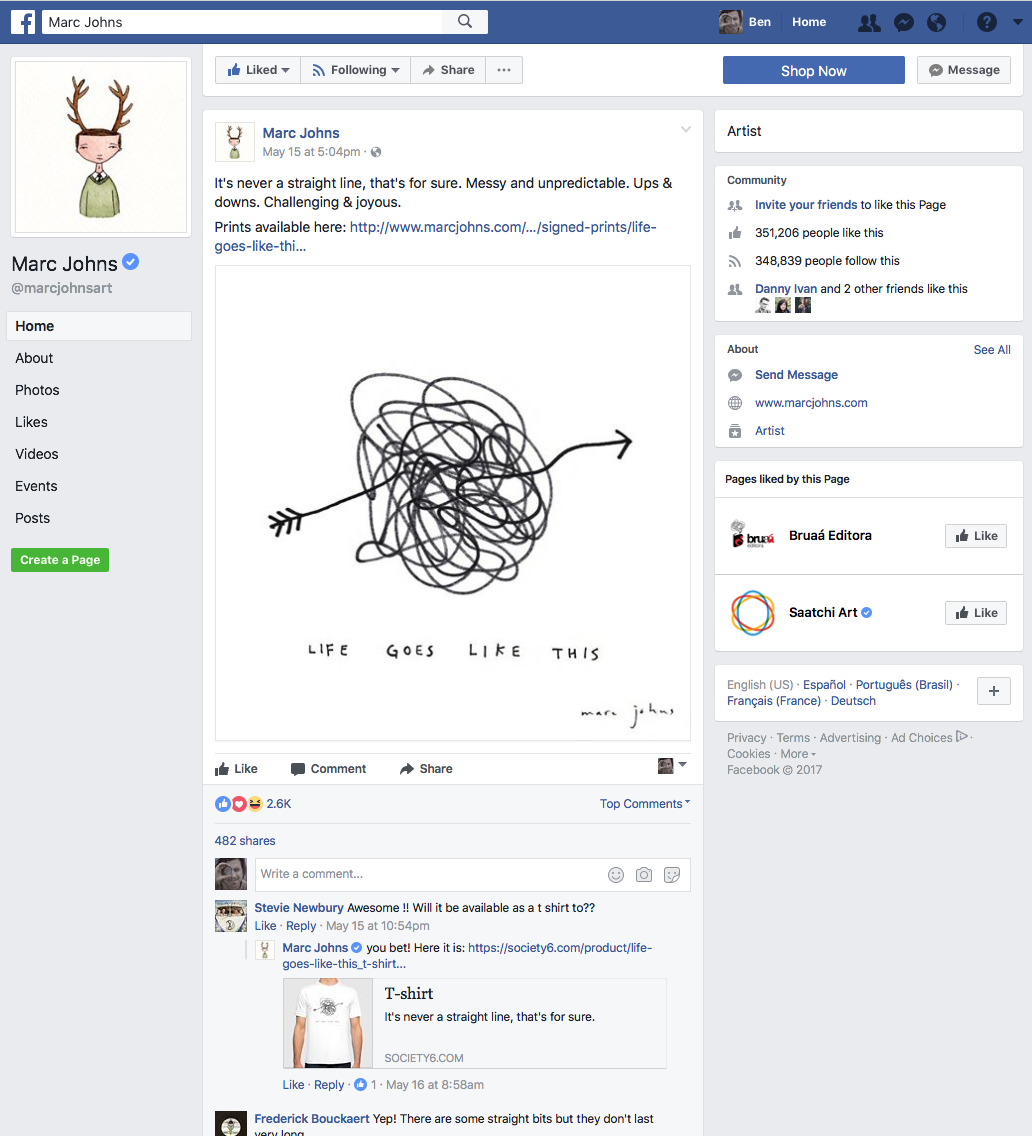
With that said, Facebook can be tricky. Ask Marc Johns who says algorithms tend to misplace his posts, “Although I have a large following on Facebook, I find that their algorithm prevents a ton of followers from seeing my posts. Also, if I am promoting a time-sensitive free shipping deal on Society6, I’ll get a bunch of comments from people who missed the post because it didn’t show up in their timeline until it was too late. But Facebook is where everybody is, so I keep posting there.”
3 | Twitter
Pithy and quick, Twitter is a great medium to interject yourself into the “discourse” as the kids call it. The only catch is that the timeline moves fast so it’s easier for your image to get lost in the flood of information, breaking news, and memes.
PROS: Simple to use and great way to connect with people and search conversations. You can pin your latest work on your profile so when people look you up that’s the first thing they see before all your witty jokes (wink!). Gifs pop off the screen amidst Twitter’s sea of words. To promote images, you can use a part of an image as a thumbnail and pair it with a link to your site. Think of it as a splash page or a quick promo.
CONS: Watch out though, Twitter moves rapidly with the news and all those hot takes, which means you’ll need to post at regular intervals for maximum exposure.
Robin Eisenberg’s gif game on twitter is worth checking out. Twitter is great for networking and hanging out. Marc Johns mentions, “Twitter has become less and less of a promotion channel and more of a place to hang out. But I still post new work and S6 deals there.”
✨?✨ pic.twitter.com/hqsyRGDm3C
— Robin Eisenberg (@eisenbergrobin) April 25, 2017
4 | Pinterest
Pinterest is a great platform for sourcing images and products and has more recently geared itself towards e-commerce rather than creativity.
PROS: It’s perfect for tasks, moodboarding, and notoriously – for weddings. Pinterest’s image based interface gives your content a longer shelf life making your post evergreen – meaning it’s continuously discoverable and therefore relevant for months and even years to come. How’s that for exposure?
CONS: Pinterest works more like a search engine than a social media platform, so your images may get lost or saved as someone’s inspiration which is cool, but might not be your prerogative. It’s like visual solitaire for inspiration. On mobile, it will always redirect you back to it’s app, so anyone who isn’t signed up won’t be able to access your images unless they download the app.
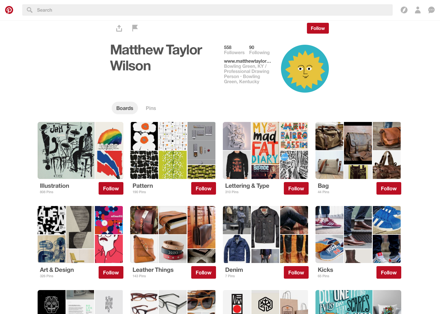
Matthew Taylor Wilson sees it as a visual forum and it’s worked out: “I’ve done well – and I attribute a lot of success to Pinterest. I also pin everything (as multiple different products) to Pinterest – and it gets a lot of pins and ends up in front of a multitude of different people that way.”
5 | Tumblr
Who doesn’t love Tumblr? User friendly and utilized by thousands of creative people on the web, Tumblr has earned a reputation for being among the more ~artsy~ social platforms making it a prime environment to share work whether it’s your latest, professional, or experimenting with a new style. All are welcome on Tumblr.
PROS: A Tumblr page can function as a complete website, it’s very visual and on trend, it’s great for discoverability and exposure – especially when you get reblogged. Templates and custom HTML/CSS feature allow the user to do what they want with their own Tumblog. Also, the queue features allows you to set up posts in advance and at intervals that you set yourself. Meaning you can be posting your work regularly for weeks at a time without ever logging in.
CONS: On the flipside, the lack of structure can be a little overwhelming when you get started.
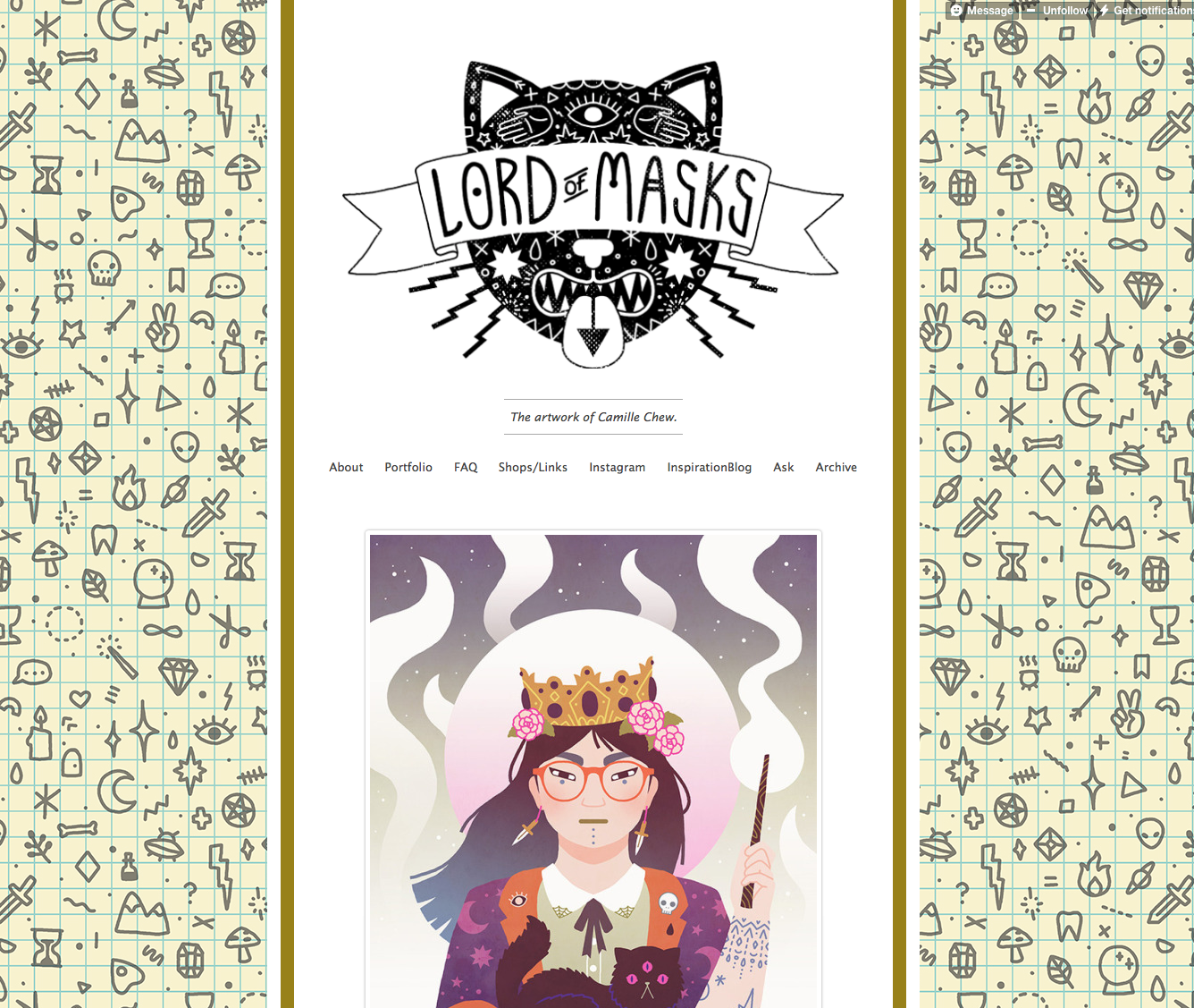
Camille Chew, aka Lord of Masks prefers Tumblr above all other platforms and seems to have it down pat: “I engage the most with my audience on Tumblr. It’s the social media platform that I’ve been on the longest, and thus have the largest following on, and it has a pretty interactive community. Messaging allows me to have one-on-one conversations with people, and the Asks people send give me the opportunity to share longer answers, and even include pictures, to questions about my work and process.”
6 | YouTube
Since it’s inception in 2005, YouTube’s platform has empowered millions of people to “broadcast themselves” and their ideas.
PROS: For better or for worse, content continues to have a life long past the time you publish and it’s great for searching and discoverability. In addition to this, your content can be embedded on almost all platforms which allows you to share your video all over the web. YouTube provides plenty of opportunities to monetize, sponsor, partner, and create additional revenue channels.
CONS: Video content creation can be the most time and labor intensive.
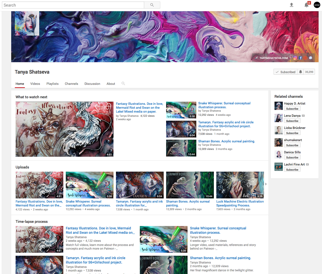
Tanya Shatseva loves YouTube: “YouTube is a special one and can’t be compared to others. If you are able to film your art process it’s a must because it involves people in your creative world like no other platform does!”
Silvia Pelissero, also known as Agnes-Cecile, has amassed an impressive following–over 300,000 subscribers, by posting timelapses of her inspiring process as well.
7 | Behance
Behance is largely a portfolio site and tends to be a little more professionally oriented than the other platforms.
PROS: As a community it allows for plenty of interactions and online networking within your field and beyond. It’s free to sign up and present your work and provides statistics and metrics for views and comments on your work. There’s also a chance to be featured in curated galleries and networks.
CONS: Because it’s so vast it can be extremely difficult to get your work seen just from the sheer volume of creatives using the platform, which uses the same exact layout and look for each and every profile.
Bianca Green has insight: “Every artist creates different artwork. And with every style you have a certain audience and type of customer. So every platform works differently for everyone.”
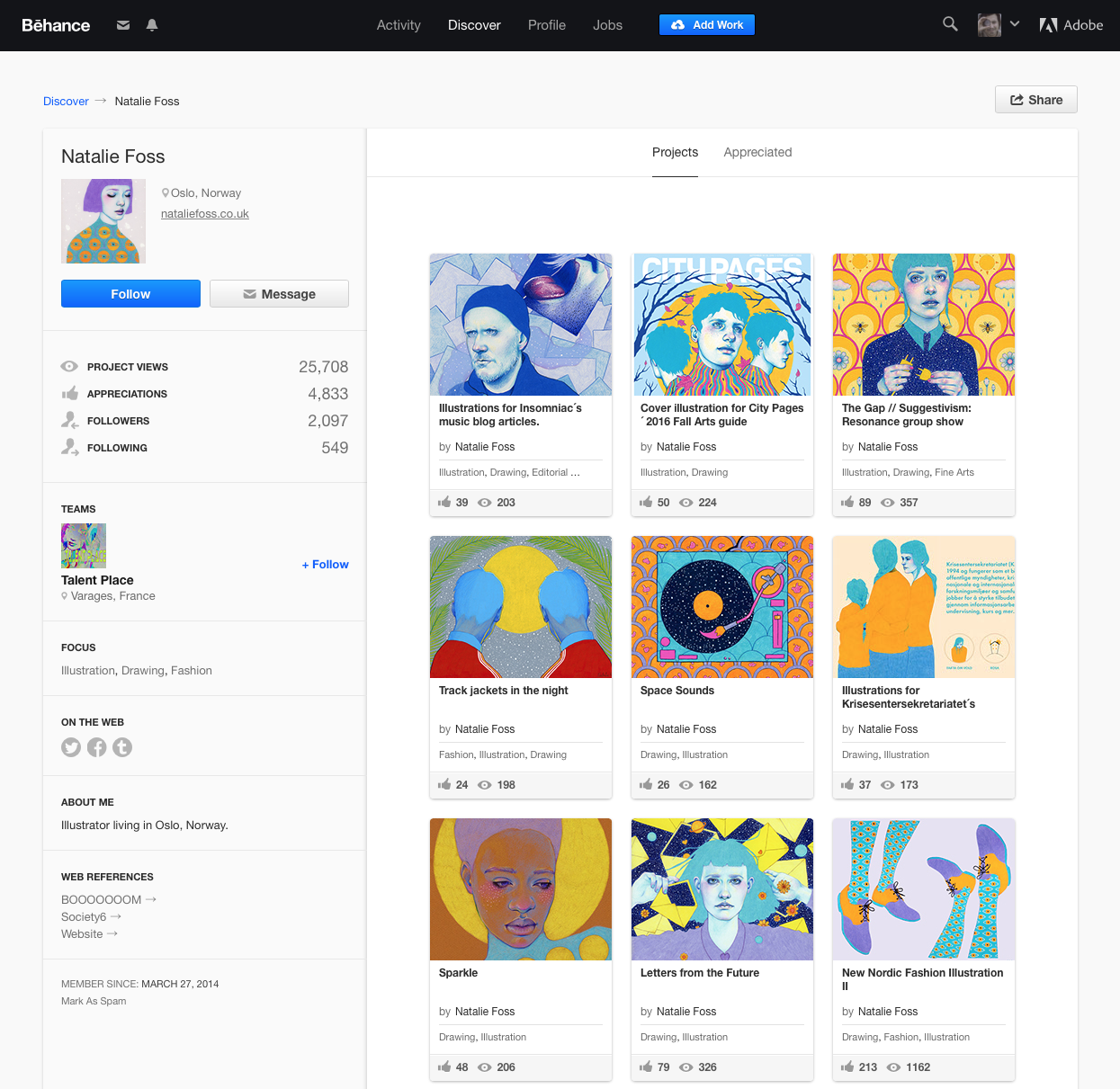
Here’s an example of Natalie Foss’ Behance page…
8 | Dribbble
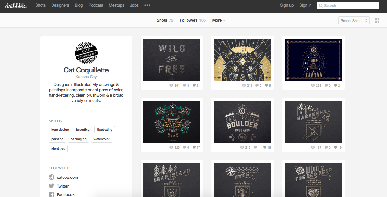
Dribbble is a community of designers who share screenshots of current work with a high level of online interaction. It’s invite only so everyone’s vetted making the quality of work higher than most portfolio sites.
PROS: Users have the potential to find and gain jobs from Dribbble’s jobs page.
CONS: Getting invited is half the battle. You’re only allowed to upload 800×600 images and artist’s with big followings dominate most of the views on the site.
Cat Coquillette is a huge fan of Dribbble: “It’s a community of designers who showcase works-in-progress of graphic design projects. It’s a great place to go when you want to get inspired or receive feedback on a new project you’re working on.”
9 | Ello
Ello is advertised as an arts-focused Facebook and since it’s fairly new, the jury’s out on how useful it is for artists.
PROS: Jobs! They’ve recently started connecting brands, publications and creatives. Also, it’s ad free and users get access to a large creative community.
CONS: It’s fairly inclusive but private.
Natalie Foss says Ello is worth the risk: “Things are still going a bit slow there, and there is not always much action when you’re post something, but they do a lot of good collaborations and are arranging some exciting competitions now and then, which can get you “out there”. They also have features like a “hire me” button and you can link to your shop when you post a product etc. Worth trying!”
Tobias Fonseca is on the same page: “I’m enjoying Ello, my work there when featured gets really good attention. It’s a good art platform.”
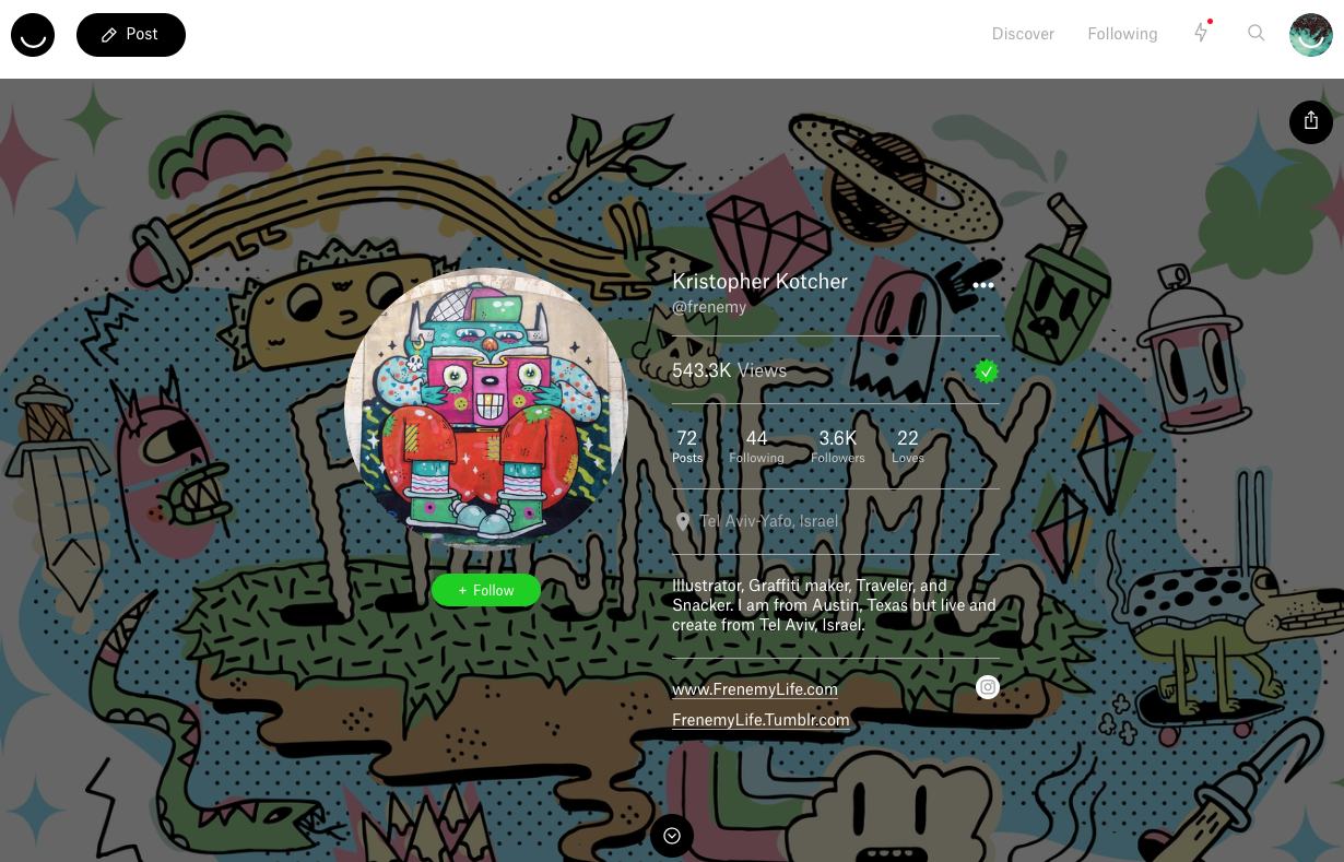
Here’s a good example from S6 artist, Frenemy…
10 | Website
It’s all you, baby. This is a must-have.
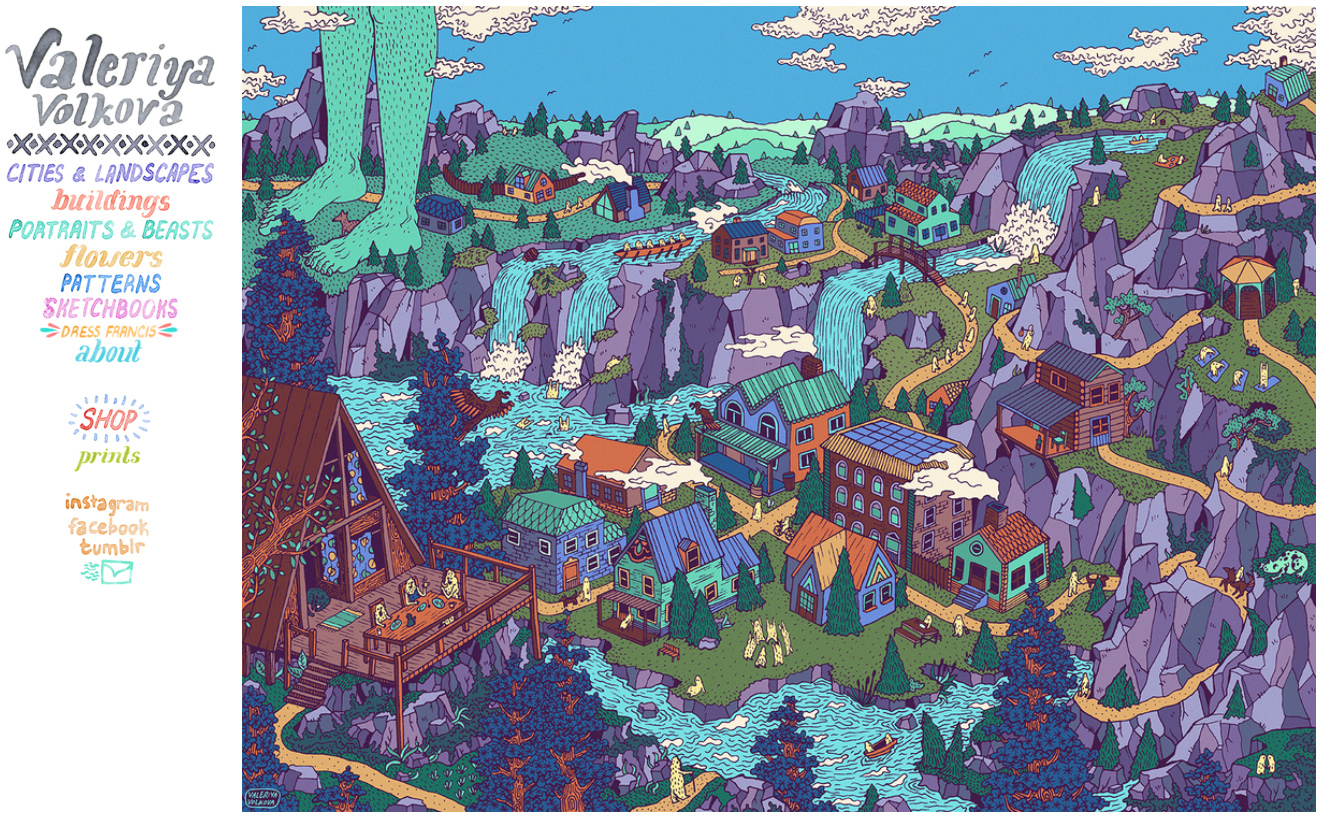
PROS: A website is always good to link back to because you can post your entire portfolio or your best works independently. A bio can help visitors get a feel for your philosophy. From design to layout and text, a professional website can make all the difference for mobilizing your career.
CONS: Updating it regularly can be a pain, especially if you’re busy and making work regularly.
Lisa Argyropoulos has great insight into how to put your work online: “There are always new/emerging platforms that come about. Do your research. If you’re networking with other artists, ask them if there are other places to post, etc. Not all platforms work for everyone. Varying factors, audience, styles, etc., all play a part in this. It’s all trial and error so don’t get discouraged!”
At the very least, a profile on each platform is advised for the sake of being discovered, but beyond that, nothing will be beat diving into each platform to find out what fits your approach. The goal being to find out where you should spend your time. Is it all on Instagram or should you divide your time amongst all of the above? As you explore each platform further, please share your findings for the sake of everyone else in the comments below.
Article by Angella D’Avignon
Feature Artwork by Frenemy
Comments