Welcome to the final installment of our four part social media series with artist Christine Lindstrom!
Christine is the founder and designer behind the brand Mai Autumn. With her highly engaged Instagram following, she’s been able to successfully develop and monetize her business through social media. We turned to her for some helpful tips and tricks on how to utilize social media as an artist. Here, she outlines how to stage beautiful photos for your social platforms. Read more below!
One of my favorite parts about social media is telling a story through photos. How you stage your photos adds another layer to your artwork by letting your fans and followers see what you’re about outside of the art itself. Here, I lay out some tips and tricks to create engaging photos that speak for themselves.
1. Lighting, Composition, Quality
It goes without saying that your photos should look as professional as possible, but that doesn’t mean you need to have any fancy equipment or advanced photography skills. If you apply some simple rules of proper composition (i.e. my favorite—the rule of thirds), and some bright, natural lighting; anyone can take a great photo in this age of smartphones and endless editing apps. Some great apps I use to color correct or add moody filters are ColorStory or Adobe Lightroom. Both of these apps give you the ability to create consistent photo effects so your feed appears cohesive.
2. Props and Environment
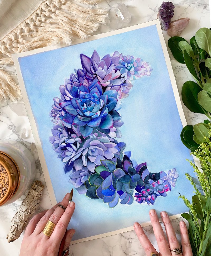
If you’re only posting plain images of your artwork, you’re missing out on an important and fun aspect of sharing images on social media – telling a story with your image. One way to help tell a story is with a flat lay. A flat lay is a simplified scene that fits within the perimeter of an image. You should include a variety of objects and details (props) that denote the mood of the scene. You’ve certainly seen these before when other artists take images of their work surrounded by their supplies, or an image of their studio work area, surrounded by plants, candles and other bits and pieces from their life.
Another way to tell a story is by setting up a scene where your art or design might actually be seen “in the wild.” An example of this would be your standard “in a room” view of art on a wall. Either way, the props you use, and the environment you set your work in, will give the viewer a feeling for how they could picture that art in their life, or how they can relate to it on a deeper level.
3. Ordering Samples and Rendering Mockups
Society6 has opened the door for artists to see their work on a variety of products and items to use in everyday life. One great way of letting your fans and followers see how amazing your work looks on any product that Society6 sells is to order samples. Photographing real products in the environment you would use them in is a surefire way to get people to notice and, hopefully, purchase them. Of course, ordering product samples costs money, so if you’re not looking to invest in actual samples yet, there are also a variety of mockups that can be purchased on sites like Creative Market.
(Side note: I find it fun to design things for myself and then the samples are just things I actually get to use, but with my art on them!)
4. The Human Element
People like to interact with and see other humans. By seeing a human element in any social media post, our brains light up and our interest is piqued. This can be achieved by staging your photo with your hand visible and your pencil at the ready, or you actually holding the art or product. And, if you want to jump in there and show yourself with your work, even better! It may seem like a simple addition to an image, but if you get in front of your camera, you will see that your followers pay attention to it just a little bit more.
I hope all of these tips help to improve your social media photography, as well as add an element of fun to your feed. You are the one creating your online persona so embrace sharing your story through images in the same way you do with your art.

Comments