It’s impossible to look at the work of Steven Rhodes and not smile.
His satire-filled nostalgia takes you back to the childhood you miss (and are simultaneously glad you never had). We sat down with the Australian artist to find out more about his inspirations, obsessions and how truly loving something can turn work into play.
Hello! Tell us a quick bit about yourself and where you live:
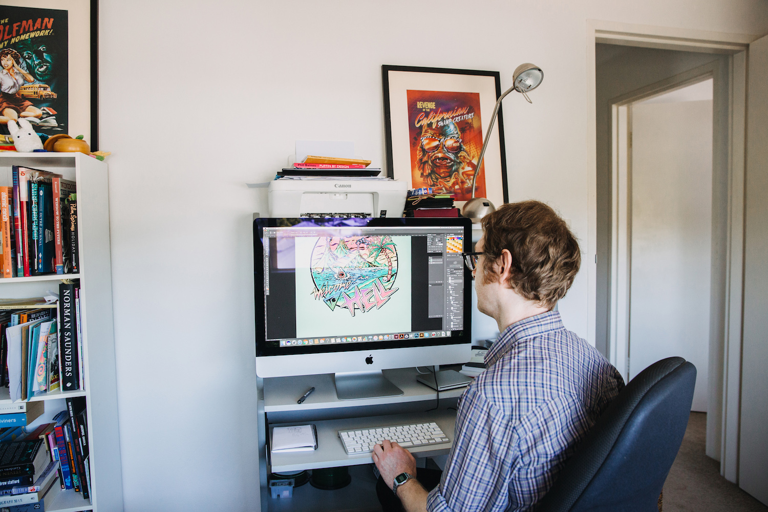
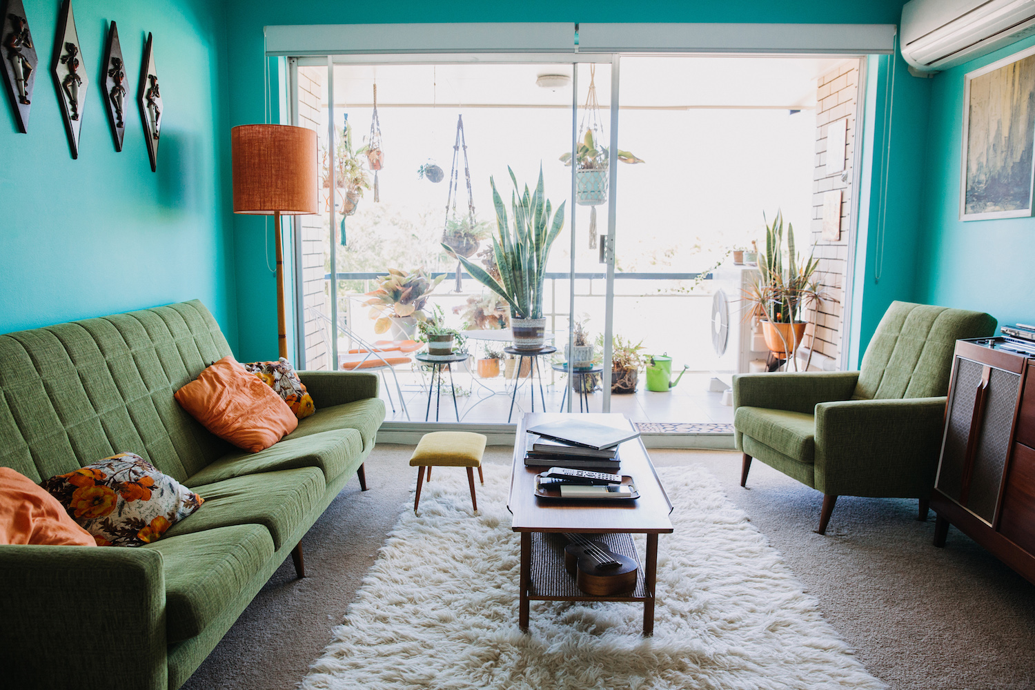
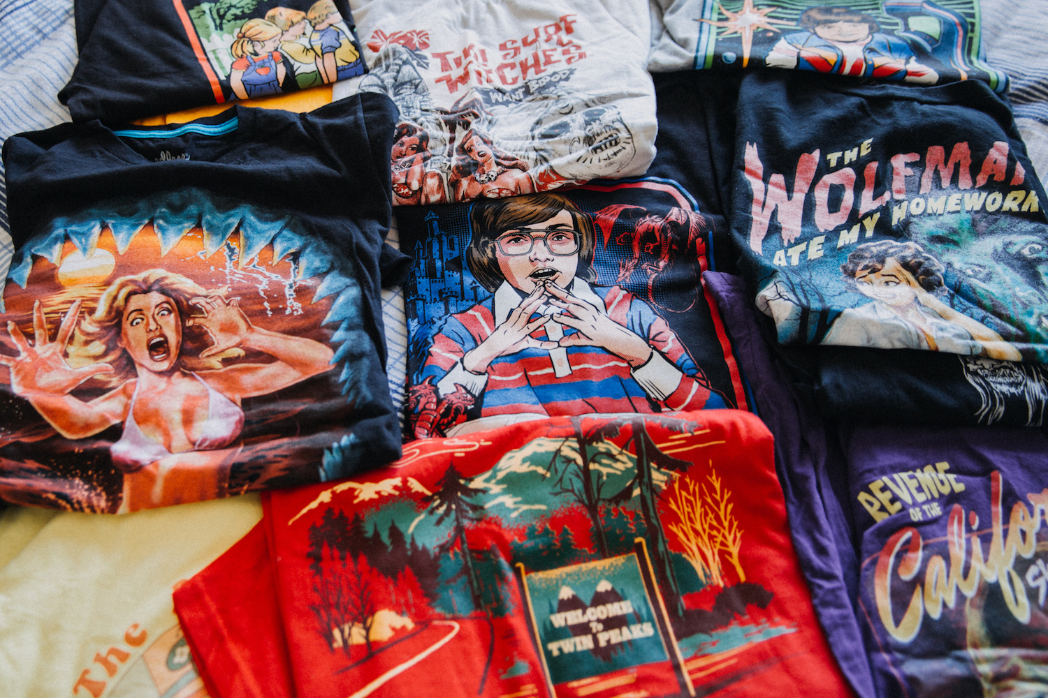
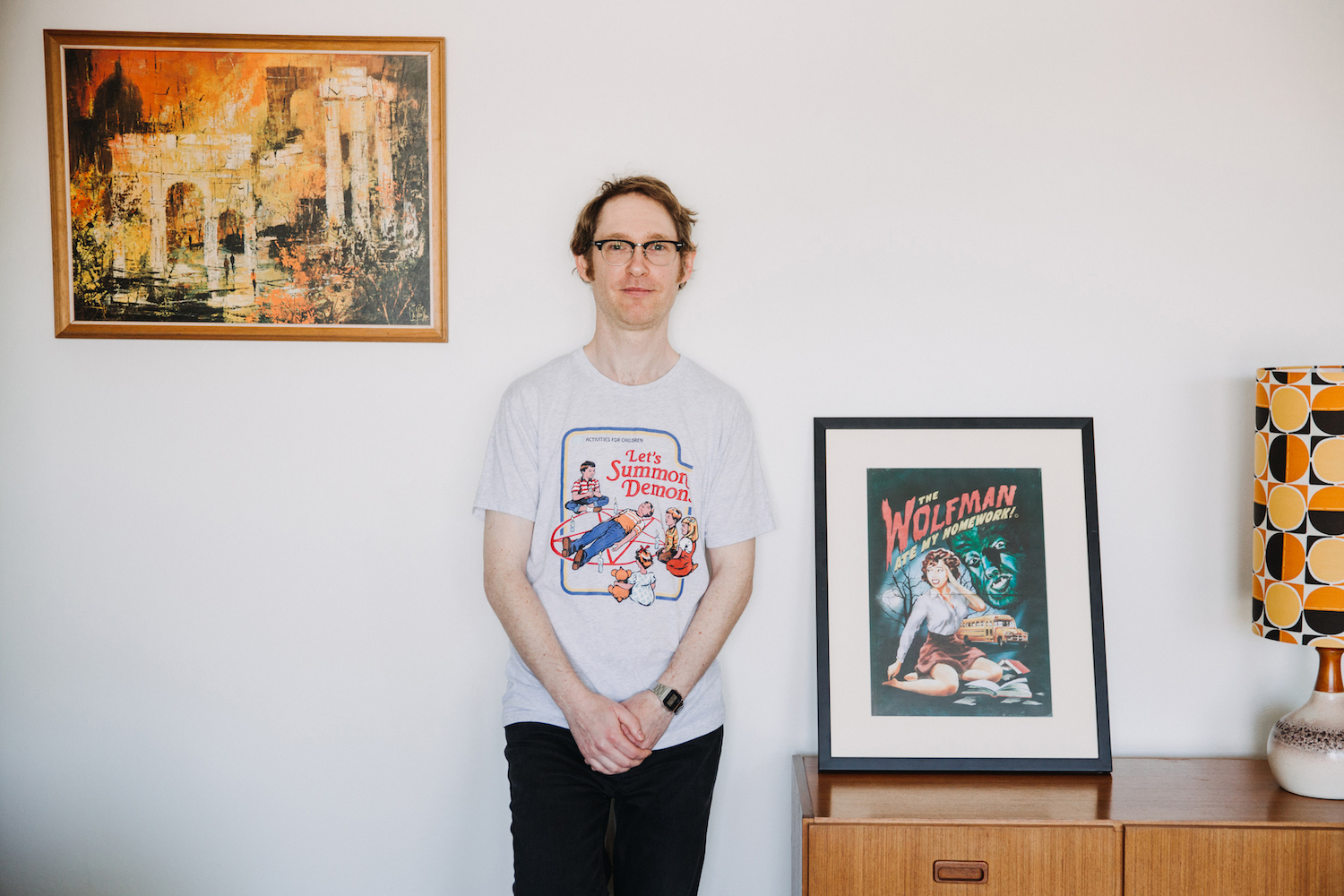
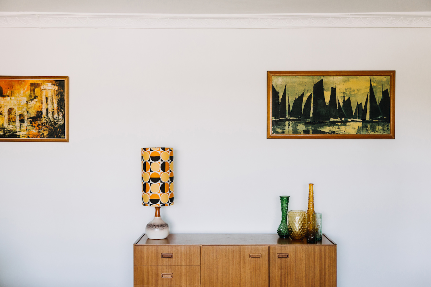
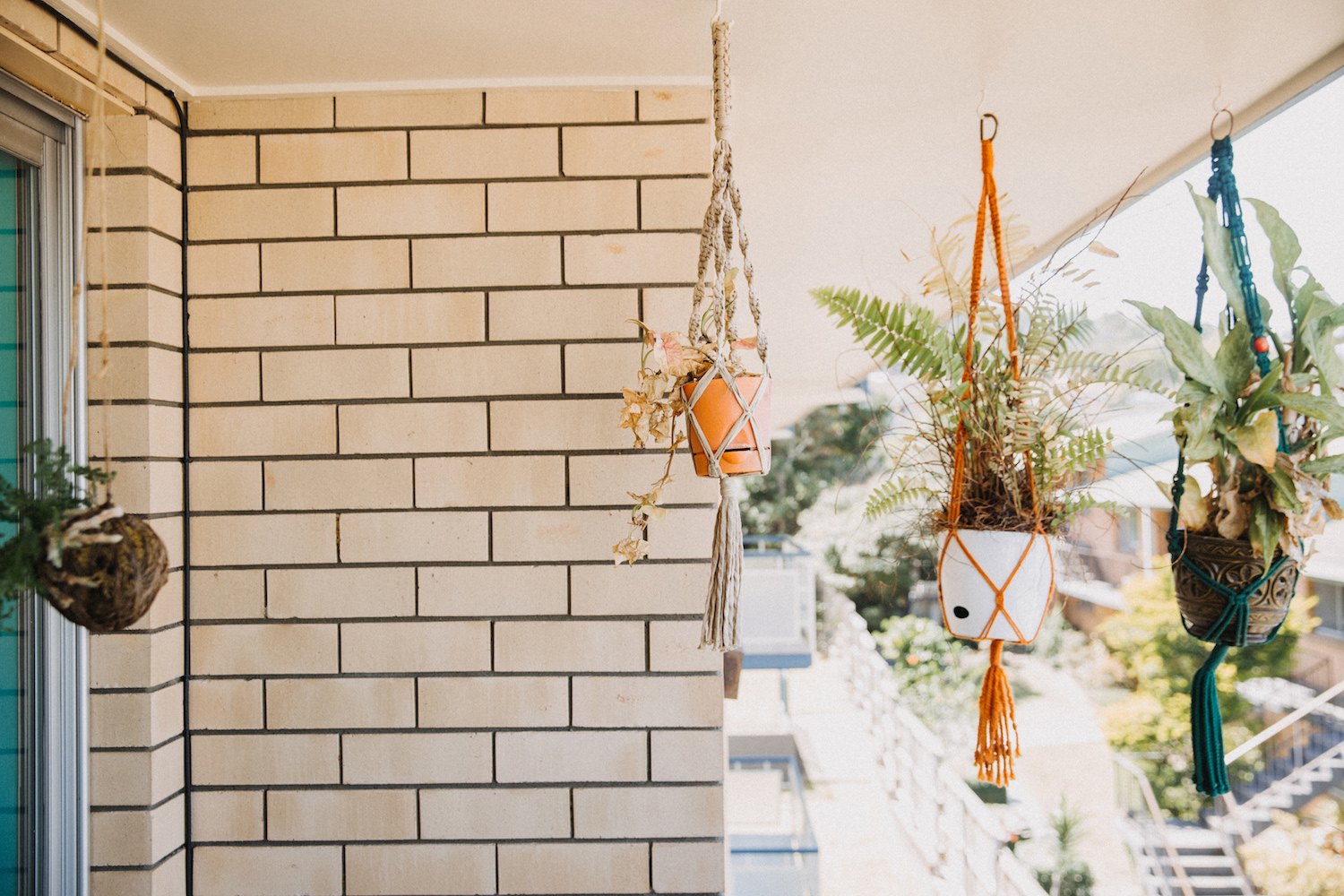
Hello! My name is Steven Rhodes and I’m a graphic illustrator from Brisbane, Australia. My work pays tribute to everything from vintage horror & sci-fi, 50s pulp, mid century modernism to 70s kitsch and 80s neon. Basically anything in the realm of retro. I live and freelance in a small apartment with my fiancé Claire which we’ve decorated in mid-century modern style.


Have you always been interested in art? How did your current style develop?
Yeah art has always been a massive part of my life ever since I was a kid. I used to do a lot of painting and drawing and then I studied graphic design about 10 years ago. After that I began doing more digital art and incorporating typography into my designs and it’s just been a gradual process of constantly making work that I’m excited about. My love of all things retro started creeping into my designs until it kind-of took over.
Your work is obviously influenced by TV/movies—what genres of film inspire you the most?
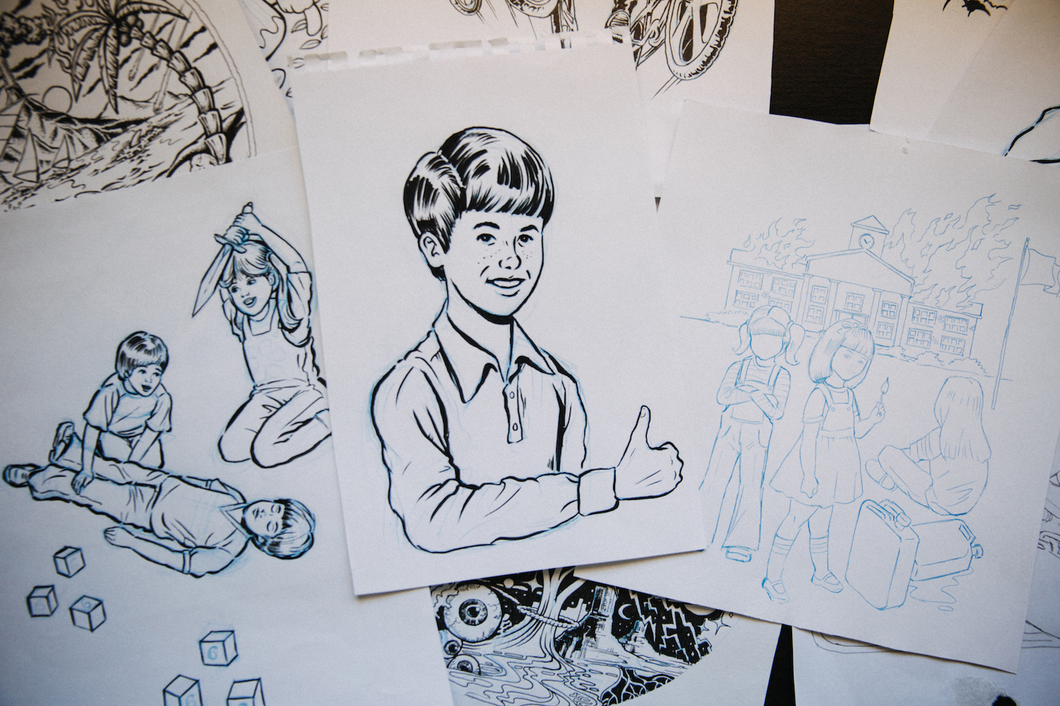
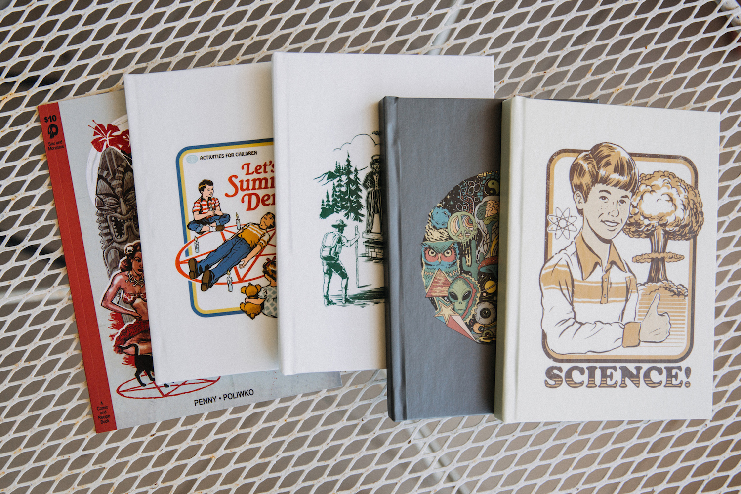
Movies and movie poster art are a massive influence for sure! It’s changed a bit over the years. I really like 50’s-era science fiction and horror movie posters. Also film noir and pulpy crime novels have some amazingly evocative (and sleazy) cover art. Lately, I’m a lot more into those gloriously trashy hand-painted VHS covers from the late 70’s and into the 80’s and kids book covers from the same era. Even the kitschy opening title sequences from 80’s sitcoms and Saturday morning cartoons inspire me a lot too.
Everything you do is so funny and fun and bold, but also incredibly technically proficient. How have you developed your graphic design skills over the years?
Thanks! I think with a lot of the work I do, I’m replicating a very specific genre, so the idea is to represent that style as accurately as possible, but with adding my own little subversive spin on it. So really it all comes down to researching and studying a lot of reference material from that era. Fortunately I happen to love all that stuff so it never seems like hard work. It can be a pretty time-consuming process though because you do need to have a pretty solid understanding of a genre before you can start reinterpreting it.
People seem to really be responding to retro these days—why do you think that is? To you, what is it about nostalgia that’s so beloved?
I think a big part of it is looking back fondly on your childhood memories and trying to recreate a bit of that magic. We love looking at our old photo albums and seeing our terrible fashion choices, that garish kitchen wallpaper and all the rad toys we used to have (that are now collector’s items!). I was a kid through the 80’s so we had Star Wars bed sheets, the original Transformers and He-Man toys and Teenage Mutant Ninja Turtles t-shirts. It was a golden age of oversized denim jackets and bad haircuts. And more recently shows like Mad Men and Stranger Things have helped to popularize various eras and bring them back into the mainstream.
Do you do a lot of client work? If so, what is your favorite + least favorite aspects?
I still have a full-time job as a graphic designer so there’s only so much client work I can take on at the moment. Now that I’ve established my own graphic identity I really like the fact that clients will seek me out specifically and commission work that’s right up my alley and I’m excited about. I guess the hardest part is managing clients expectations about what the outcome will be. You need to have very clear communication all throughout the design process to make sure both parties are going to be happy with the result.
Your work is so recognizable—what advice would you give to a younger artist who is trying to find their style?
Thank you! Well, it just takes time. I don’t think there’s too many artists out there that graduate art school and just start their careers fully-formed. It takes hours and hours of practice and constantly producing work, seeing what works and what doesn’t and refining and evolving and experimenting and failing and trying again. I think if you’re really driven and love what you do, it will all come naturally in time and feel more like an organic process. To a degree everyone starts out by replicating their heroes, but eventually you start finding those elements that make you unique.
I love the variety in the fonts you use, how do you find them/create them?
Again, I try to be authentic to an era so I’m always looking at what fonts were popular at the time. Type is such a great way of instantly communicating the feeling or a time period; it’s like a design shortcut in some ways. I love the way typography and illustration work together and I guess that’s why I’m so drawn to things like book covers and VHS art as it’s a fusion of graphics and information. I use a lot of preexisting fonts and then customize them accordingly.
Do you start each piece with a concept in mind?
I’m generally not the fastest designer, so if I’m going to dedicate a bunch of time to something I want it to be a solid idea. So a good concept is definitely the starting point and then I consider the best way to illustrate that idea. A concept could be as simple and vague as having a title in mind or I might have the entire design flash into my brain. If I’m still thinking about it a few days later, I know I’m onto something.
Finally, give us some of your fave S6 artists:
There’s so many ridiculously talented artists on here but Hillary White Rabbit, Circa 78 Designs, Robin Eisenberg, Joshua Kemble and Gimetzco come to mind!
Photos by Aimee Catt
Comments