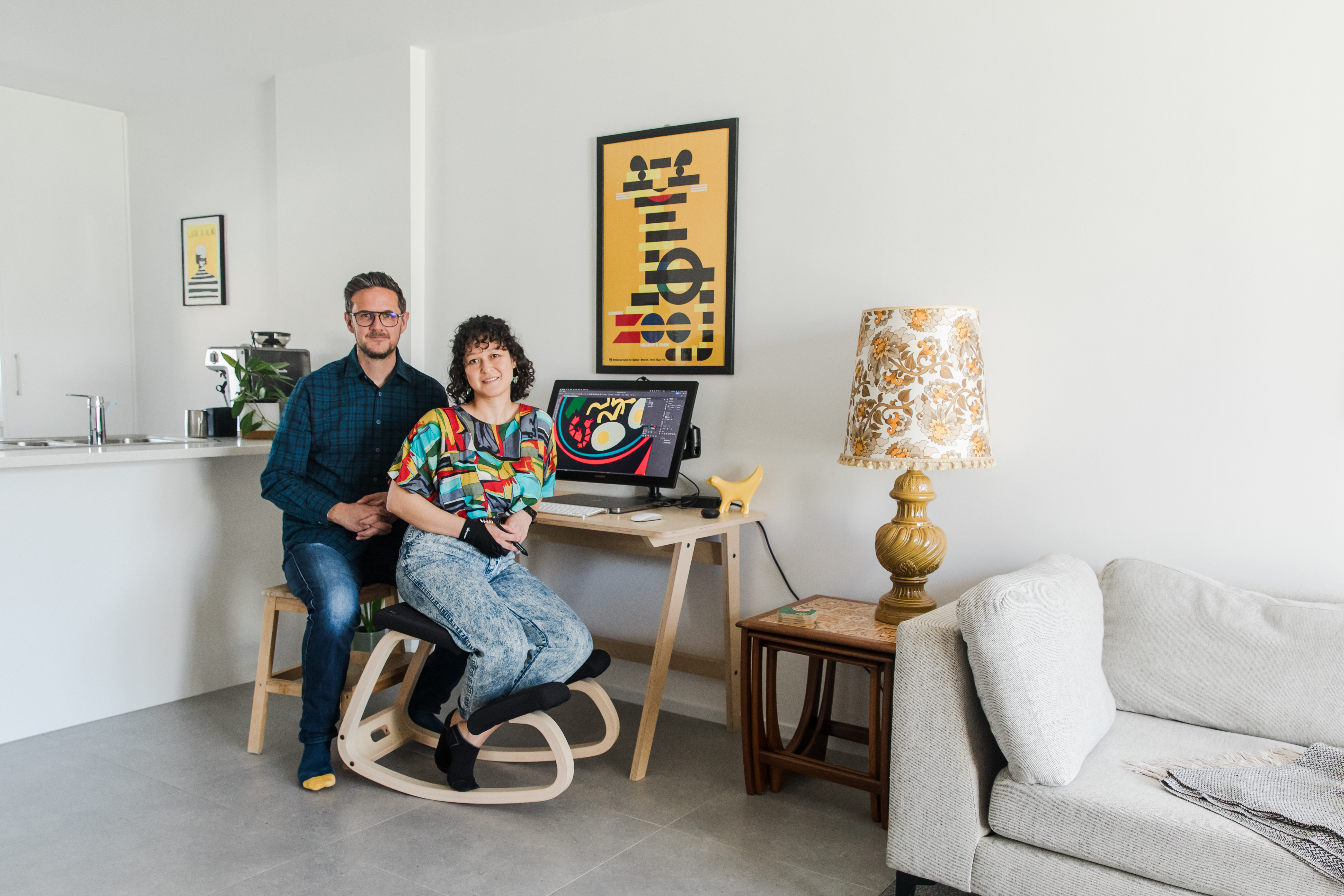
When Suu-Min Ang and Mark Scott-Davies first crossed paths, they were both working at Apple’s store in London.
At the time, neither could have imagined that their professional encounter would evolve into a dynamic artistic partnership. Today, they are known as Fox & Velvet, a creative duo whose name has become a hallmark of bold, retro-inspired designs. Drawing inspiration from mid-century legends like Paul Rand and Saul Bass, their work blends vibrant color palettes with charming imagery, often featuring themes of food, drink, and travel.
Curious about their creative process, we reached out to Suu-Min and Mark to delve deeper into their fresh, inventive perspective and hear about the art movements that fuel their work.
Tell us about yourselves! How did you meet and come to work together?
We met while working for Apple in London and, after traveling together for a year, decided to start something of our own. We wanted to pursue something creative, so we opened a shop and filled it with a few designs. It went really well, so we continued with it and never looked back.
How did you come up with the name Fox & Velvet? What does it mean to you?
Before we opened up our shop, we sat around Mark’s mum’s kitchen table, brainstorming words we liked the sound of and combining them. It was less about the meaning and more about the way it made us feel – when we got to this combination, it made us feel happy and we went with it.
Can you describe your working relationship? How do you collaborate to create each piece?
Once we decide on a topic or subject for a print, Suu-Min creates the initial illustration, and Mark takes on the art direction. We look at the colours, we look at the layout, we look at the typography and just go back-and-forth until it feels right, usually simplifying rather than adding to it. Mark studied advertising at uni, and in his course you would always work as a duo, so that style of working comes really naturally to him. For Suu-Min, having Mark in the art direction role allows her to work more intuitively and stops her getting stuck in that loop of “is it okay, is it good enough?” because we’ll come to that together later on.
Your work frequently features food items like cocktails and condiments. What draws you to the culinary world?
We like to create designs that evoke emotions and feelings in people. One of our first collections was our city prints, and then after that we moved onto food and cocktails, because travel, food, & drink play a huge part in peoples’ lives and the memories that they create. The subjects which we choose are really important – we wanted to find things that meant something to people – obviously we we make art that we love and that we’d put on our own walls, but also it’s about what it means to the person who owns it – a favourite drink, memories of a particular dish or that kind of thing. Things which like represent moments in their lives, things which are important to them something that people can take and put their own meaning on it.
What artists or art movements do you draw inspiration from?
We have always been drawn to mid-century design, artists like Paul Rand, Saul Bass, who worked in that beautiful, bold, modernist style. We also take a lot of inspiration from jazz record covers, and retro book covers and kids books. The string that ties them all together is that when you’re looking at poster design, book covers, record covers, kids books, you’re trying to confine a really strong message to a finite space, you’re trying to summarize what is usually an abstract concept and make it fit into a rectangle or a square or a book and make it so that anyone who is looking at it can understand what you’re saying. All these artists and designers had simplicity as a hallmark of their art, everything on the art board had to have a meaning otherwise it couldn’t be there, and that is something which we try to emulate in our own work.
As creative collaborators, do you have any favorite artistic duos or teams, either from history or the present day?
Going back to the mid-century designers who we loved, Paul and Ann Rand made some beautiful kids books which have always been favourites. The work that they produced together is gorgeous and really stands the test of time, once again it’s so simple that every work and every shape on every page is exactly right – no more and no less than what it needs.
Who do you love being compared to? Who can you not stand being compared to?
We’re very influenced by mid-century design, so if people say our work has a classic, mid-century graphic feel, we’d see that as a huge compliment. We aim to capture the same mindset as that era, though we don’t focus on replicating it exactly. We don’t mind being compared to other artists, once we’ve made the piece and it’s out in the world it’s up to the viewer to interpret it for themselves, so if someone sees our work and makes a connection with a different artist and that makes sense to them, then that’s great.
Do you have any advice for people trying to break into today’s art world?
Focus on creating art that you genuinely want to make rather than following trends. Things change so fast and the only thing that you really have in your control is the work which you choose to create. In our experience, if your art means something to you, it’ll resonate with others too.
Photography by Lydia Rachel