Recently, S6 artist and musician Nik Ewing travelled to Mexico City where he had the opportunity to sit down with collage artist and graphic designer Ricardo Ortega of Natural Values.
Here, they chat about finding unexpected meaning in each other’s work and how Ricardo’s series about God and man helped him get through cancer treatment.
Nik: How did you start making art?
Ricardo:. I studied graphic design at Faculty of Arts and Design (FAD) at the National Autonomous University of Mexico (UNAM), but I’ve always felt an attraction to art. When I had to choose what I wanted to do with the rest of my life I thought that making art here in Mexico City would be too difficult and that I needed to do something else to live or make money—I hate talking about the business side of things. But then I saw an opportunity to do some art just for me; I started to upload things to my blog, Society6 or my website and people who liked it came to me in a natural way.
N. I get not wanting to talk about the business side, but it is a real part of art. You have to survive; you can’t just do it for free. There’s a trade off, you have to think about paying rent.
R. I like graphic design a lot, but it’s just another field of mine, another area of my attention which provides me with what is necessary to live.
N. I assumed you did graphic design for clients (as so many of us creatives have had to do) but you’re able to separate that from the art that’s just for you. I’ve only recently understood that—that different parts of your brain make different things.
R. The FAD didn’t just have a program for graphic design, it included other art forms, introducing us naturally to the art world. The school isn’t divided by majors. You can you go to a painting or design class if you have a different emphasis, so there were different types of artists in the same classroom. It’s not so academic and strict. We experimented and learned not just about techniques and theory of art, but also the theory of communication. Other art universities teach you how to be a businessperson, but here, you could just go into any classroom and no one is asking, “What are you doing here?”
N. Blending all the fields together is interesting, instead of just going to school to learn a specific technique. That’s what I like about your work. There are elements of photography, graphic design and collage. It’s not just one thing. They mix and inform each other. There is not just a singular way to express yourself.
R. In the beginning, my work was drawing based, more visual. I made a series of drawings about “the people” or as they’re called in popular sense, Huichol. They are our ancestors.
In the beginning of light there was a blue deer who ran from the people. They tried to hunt him, but were unsuccessful. A few days later they chased the blue deer again and he stopped because he wanted to give them the gift of peyote. This is the beginning of how they saw the light and the cosmology of that.
“We are all in the same place, all made from the same dust of the universe and all small compared to that universe.”
N. Do you feel a pride in Mexican art and do you try to communicate a specific Mexican point of view?
R. It’s important to me, but most people who like my graphic art aren’t from Mexico. Foreign people don’t have the same Mexican education as I do.
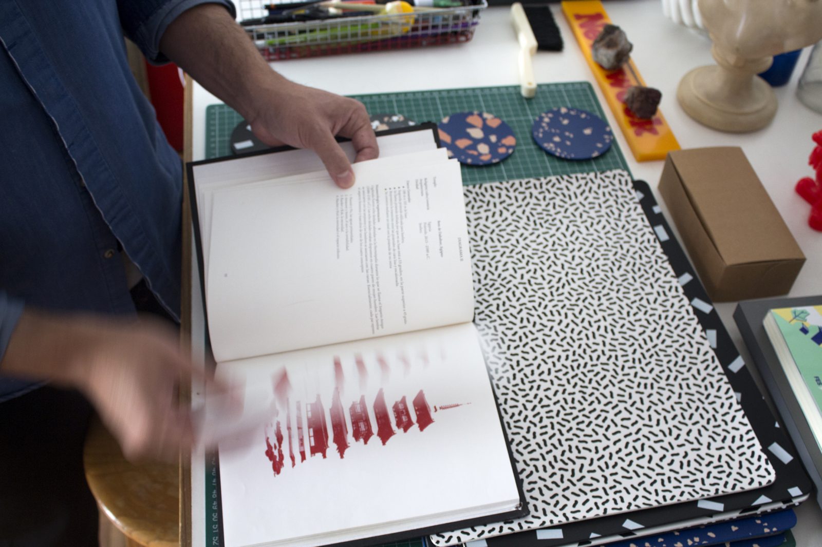
I made pieces for Society6, a series about the cult of death, of what Mexico means to me. We Mexicans have a close relationship with death, especially with Dia de los Muertos. That was the beginning of the term “Natural Values” for me, which is how I see the connection between the cosmos. We are all in the same place, all made from the same dust of the universe and all small compared to that universe. I try to represent the connection between animals and cosmology and all we are.
N. Another aspect of your work is your use of color, almost hypercolor. The buildings, streets and architecture here have a lot of color. Mexico City is a unique city. I see that in your work.
R. One piece is about culture, but another is about color. Mexico is a very colorful country. Dia de los Muertos and the classic markets of Mexico have explosions of colors. I like that you mentioned that! Maybe I haven’t even realized that about my work, but I like that you noticed it. I really like how people interpret my work from their own experiences and point of view.
N. I’m an outsider looking in.
R. Maybe I don’t even recognize that. I have a specific knowledge of my work, but there’s a thing that only you can see. It’s great that other people can see those things without having to be told.
“…people have [the desire] to believe in something, in God—the spiritual part that all people need throughout all of humanity.
N. We live with ourselves everyday and we don’t see the small changes that occur. Yet the reality is that we are always taking in influences, the art we see, the films we watch, even the food we eat. They are all a part of you but you don’t always recognize the details. So when I see Mexican color in your art, you see “just the normal color I use.”
R. I’m pretty sure if we chatted about the films we like, you’d see their aesthetics reflected in our art. But, some of references are universal no matter what city you’re from.
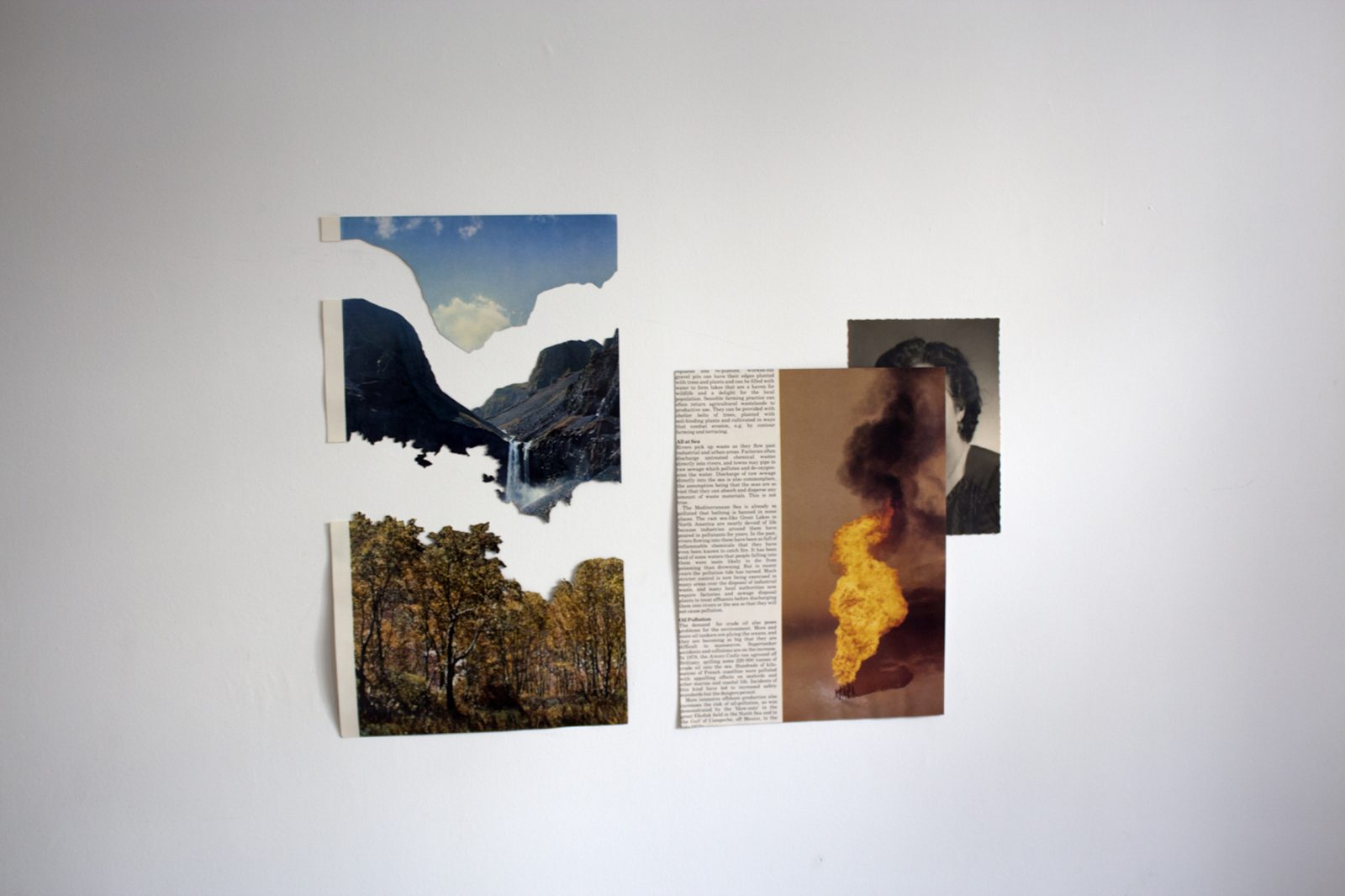
I made this series about trying to connect, like something about God, spirituality and the things we don’t understand—to communicate something.
It’s about the need that people have to believe in something, in God—the spiritual part that all people need throughout all of humanity. People construct buildings to connect to these gods. I wanted to show the dogmas of the people. In traditional religion, the material things are kind of universally pointing up, in a pyramid way. The Calvary Hill in Christianity, the pyramids in Egypt, stupas in Buddhism; all the buildings are the same. I fragmented the buildings in a symbolic manner that was important to the specific culture and religion. For example, the Christian symbol is broken into three parts for Father, Son, Holy Spirit. I emphasized red pigment through this series, as it’s the color code that brings us together—the color of our blood.
N. I love art and design that communicates something beyond just eye candy, something that just “looks really rad.” But conveys meaning AND looks really rad. There is purpose.
R. Like the talk earlier about university, there’s the technique and then there’s the vision of artists. When I working on this series I had cancer, it was a very important time in my life.
N. Wow, that adds even more meaning to it.
R. I don’t know why, but I felt I had to do that series at that moment.
We had three conventions or workshops to support the project. At the first workshop, I had just finished chemotherapy and I didn’t have hair or eyebrows. It was strange for others who didn’t know me to see my transformation. Every four months we had those workshops and so at the next one I had a little more hair, a few more eyebrows. I naturally have long straight hair like you, but when my hair started to grow back, it was curly like an afro, like a sheep, it so was funny to see! For the final one I had finally started to look normal again.
It was very symbolic that I had the experience of working on this project, an experience of my heart.
N. And you’re well now?
R. I’m well now. This was in 2011.
N. I was talking “oh meaning in design!” but this brings much more meaning than just the numbering and symbolism of religions.
R. I like to talk about it because it’s important to me. It’s important for people who see my work to know that I have experienced that. The series was a moment to stay honest with myself.
Comments