Want to use color like a pro? Writer Ashley Tibbits tracked down our design crush, Dabito to give us some expert tips on how to transform your space with tone.
When we bring up the term “color wheel,” at least half of you out there are probably transported back to high school art class, trying your damndest to remember WTF a tertiary color is. Even as grown-ups, the pantheon that is Pantone’s endless index of colors can still be as intimidating as those initial impressions of color theory, especially when it pertains to how to beautify your interior space—but it doesn’t have to be so scary. To prove the point, we wrangled up design guru/blogger/self-described color enthusiast Dabito to break down how to decorate utilizing some concepts of color theory which he believes are foolproof even for us novices (relax, you’re not going to be tested on this).
As evidenced by his cool, colorful abode in New Orleans, the LA-native is not shy when it comes to using all the crayons in the box. His expert eye can also be seen in his photography for the best selling book The New Bohemians (and the upcoming handbook), his own blog Old Brand New, and countless other stellar sites on which he’s shared his tricks of the trade. In perusing the pics of his perfectly placed plants, the seamless mix of various ethnic textiles, and ability to find the most insane vintage furniture pieces, it can be easy to feel like your home looks like a dump in comparison, but one of Dab’s favorite tools to use, color, can spruce up your space significantly. In fact, he uses some key principles of color theory to create both interest and harmony. As a way of experimenting, Dab redecorated his sleep sanctuary three ways: one balancing a space with complimentary colors, creating unity with analogous colors, and subduing the space with a monochromatic scheme. Here’s how it turned out.
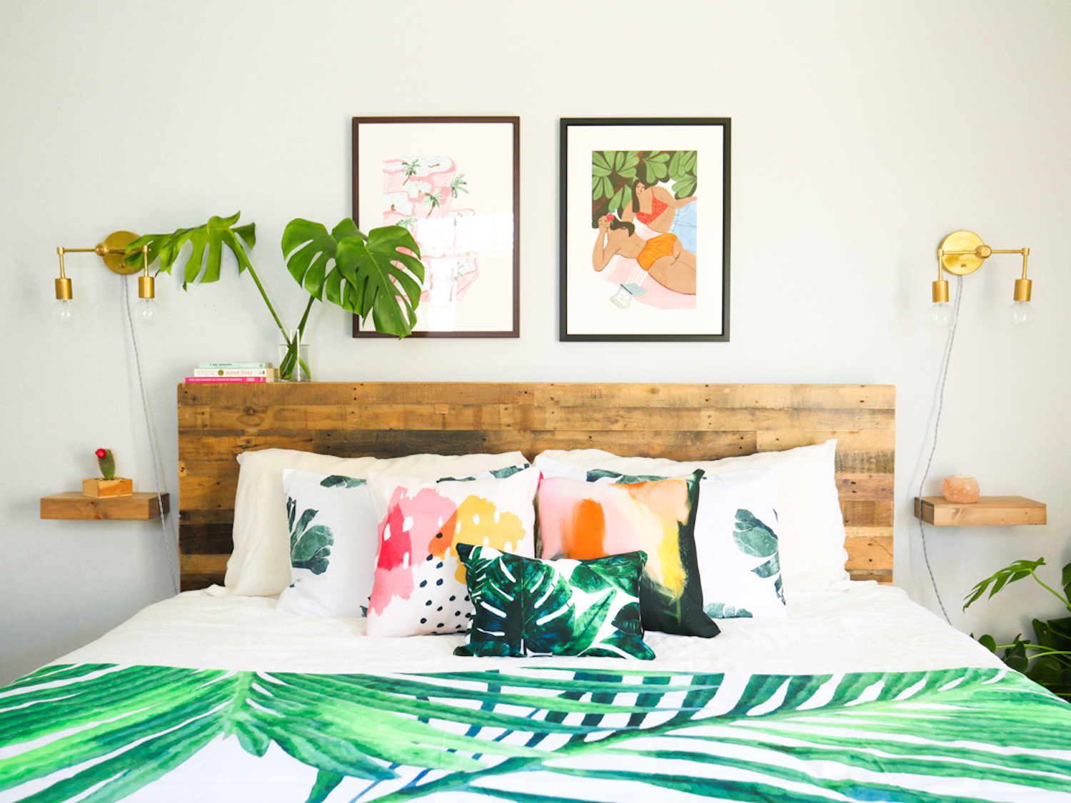
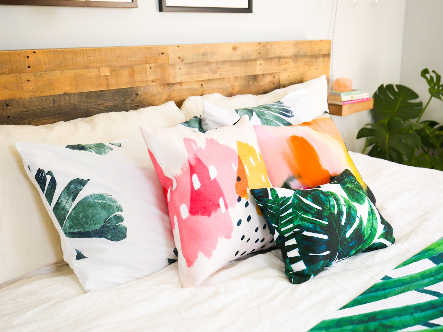
Warm & Cool Contrast
“Using colors opposite one another on the color wheel is the type of scheme I probably use most often; I think about it in terms of balancing the room’s warm and cool colors. I wanted a summery, tropical vibe, so I focused on adding pink and green (think watermelon) accents throughout the room. Admittedly, I love me some plants, so this became my “jungalow” room—I loved the lush palm prints, which paired perfectly with all my plant babies. The pink in some of the playful Isabelle Feliu prints balanced all that greenery so well and created a lovely harmony throughout.”
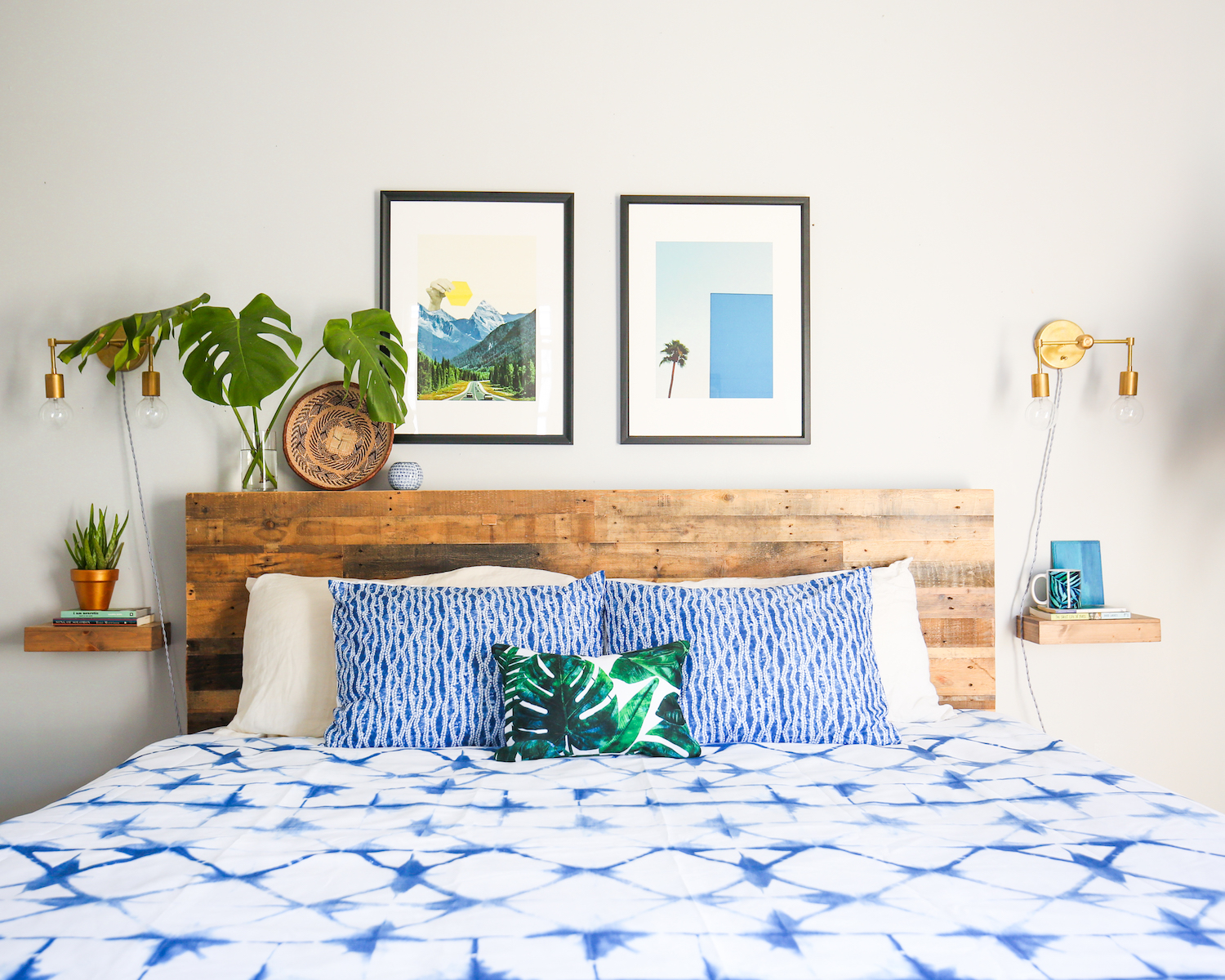
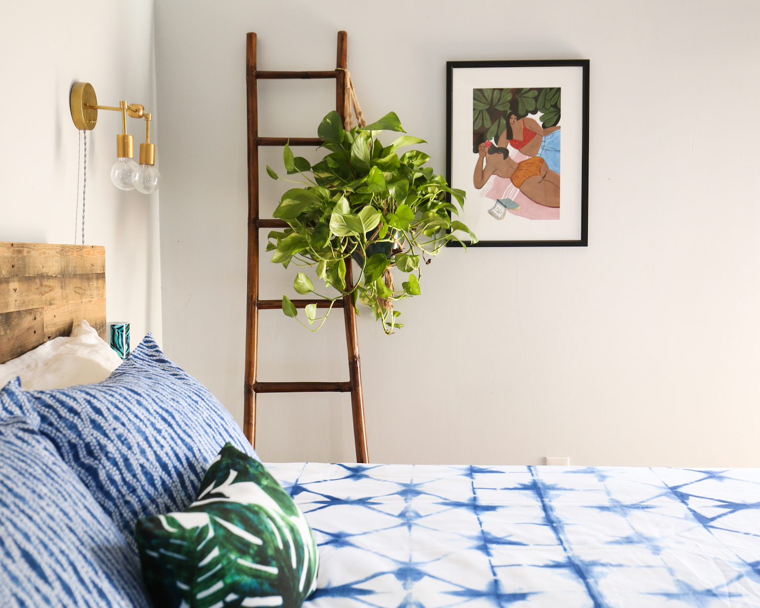
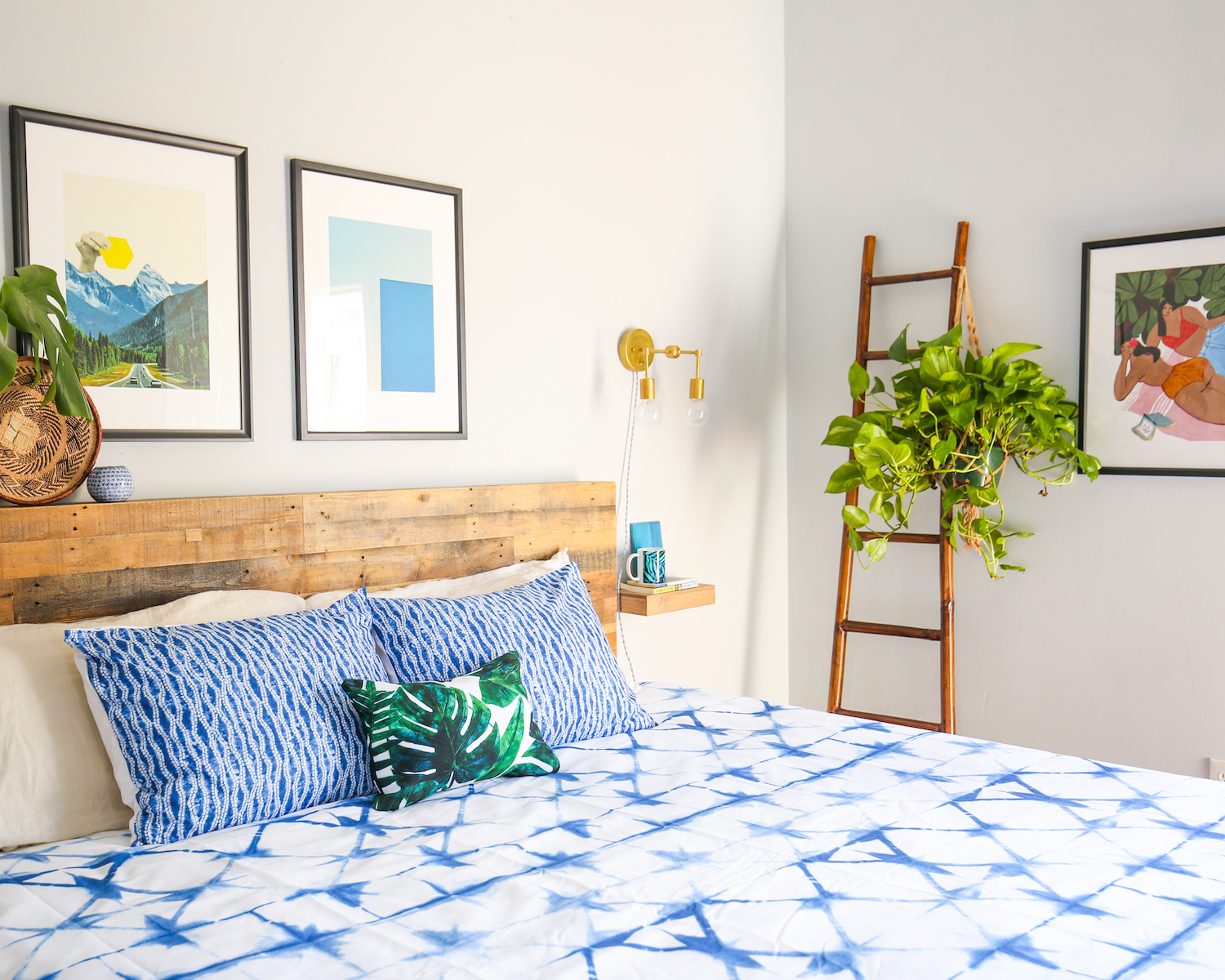
Analogous Colors
“Let me break down the terminology: analogous refers to three colors next to each other on the color wheel. Typically, it’s a primary (red, blue, or yellow) with a secondary on each side, but it can also be two primaries and the secondary color they create. In this case, because I wanted to try setting a really serene, tranquil mood, I picked blue, blue-green, and green. The centerpiece is this shibori duvet. It’s not screaming blue, but because of the beautiful pattern of the dye, it totally grabs the eye. I noticed that choosing colors in the same family gives a subdued effect, especially in comparison to using complimentary colors. There’s still a lot of visual interest from the pieces I chose, but overall feels so much more chilled out.”
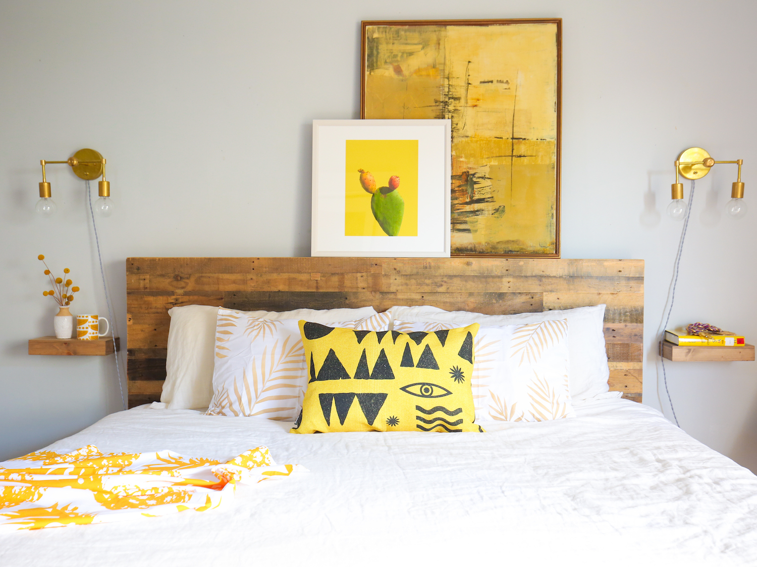
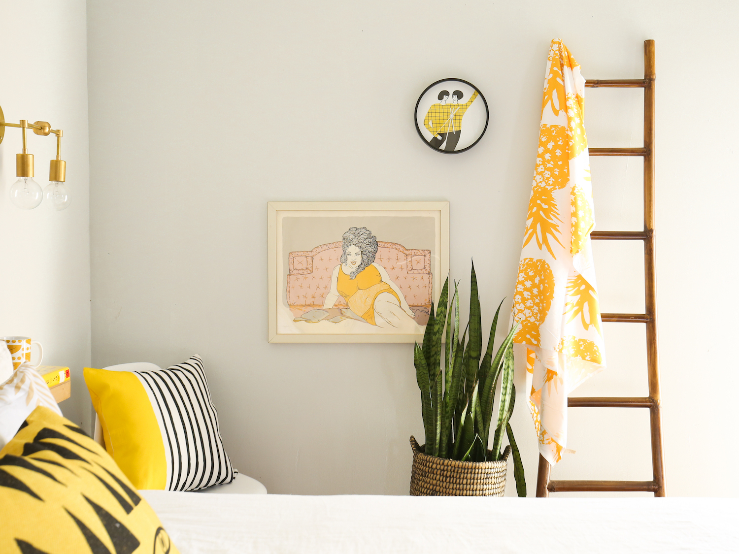
Monochromatic
“This yellow room, featuring all different tints, tones, and shades, was my favorite (and as you can see, my photographer Beau’s puppy Foxy was also a huge fan). In retrospect, it’s a pretty bold choice for a monochromatic room, because yellow is such a bright color by nature, but mixing together lighter and darker variations kept it from being overkill. Also, I made sure to keep plenty of neutrals around to ground the space. That kept the yellow from getting monotonous, but I think it still really pops and makes the space feel cohesive. And you can’t deny, it has such a happy feeling!”
Photos by Beau Ciolino
Comments